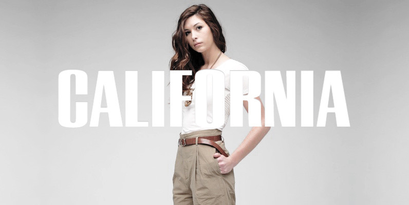
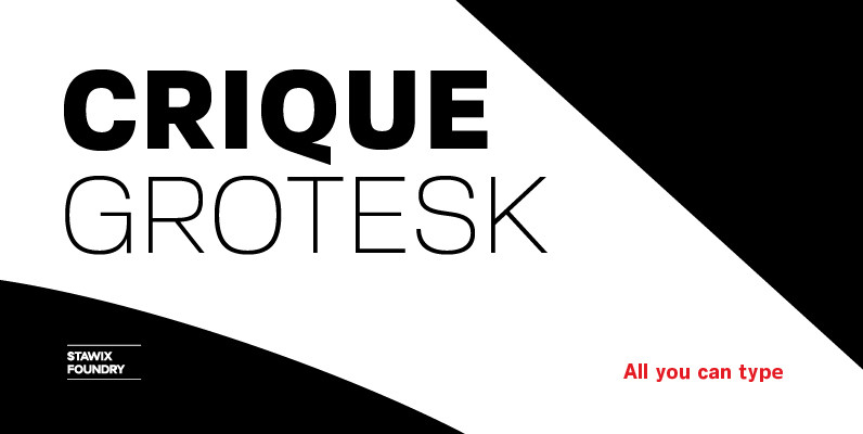
Anzeigen Grotesk (Advertising Grotesk) is a heavy, condensed sans serif in the style of typefaces popular in the early 20th century. It has a large x-height, short ascenders and descenders, and is best suited for advertisement as its name indicates. It should only be set in larger sizes because of its narrow, closed character shapes and small counters. The Haas’sche Schriftgiesserei traces its origins back to the printer Jean Exertier, during the second half of the 16th century. Business later passed on to the Genath family. In 1718, Johann Wilhelm Haas (1698 – 1764) from Nuremberg was hired. He later inherited the company as recognition of his efforts. After 1740, the business was run under the Haas name. In 1972, the entire type program from Deberny & Peignot in Paris was added, followed by that of the Fonderie Olive, Marseille in 1978. With Linotype’s acquisition of the D. Stempel AG, they became the majority shareholder. In 1989, Linotype completely assumed the company.
Save 10% off YouWorkForThem fonts with the code: MRSAVE10

