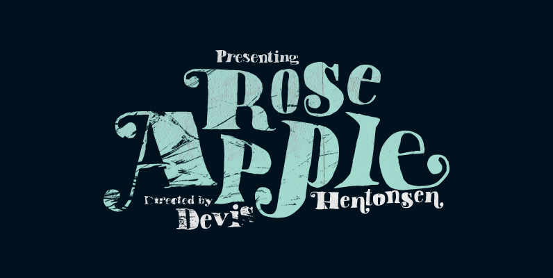
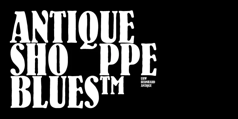
Attic Antique replicates the warn, weathered text in a friend’s old copy of John Burroughs nature essays. It shares the wide spacing and ample serifs of the Century faces. Use it to represent age, to suggest photocopied archives, or to convey a general feeling of old-bookishness.
Whereas Attic Antique has numerous potential display uses—from drop caps to headlines to poster type—it also holds up amazingly well at small point sizes and has even seen use as body copy on occasion.
Attic Antique has two styles, a roman and a true italic; both have such OpenType features as true small caps, old-style and lining forms, numerous ligatures, and support for Central/Eastern European languages.

