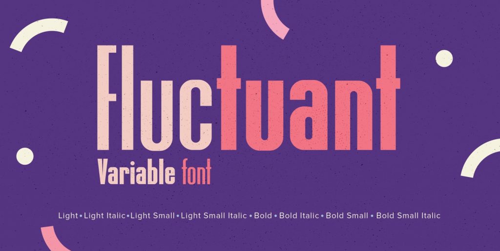
A very glitzy Blitz! I always wanted to design a typeface that was top heavy, but I never new how not to make it look like Antique Olive, until recently I had an idea. My new family is very readable despite it being top heavy, thin on the low end and thick on the upper end. The font gets a special shine because of this effect. And it stays readable despite its special design. Your designer of surprising typefaces Gert Wiescher
Save 10% off YouWorkForThem fonts with the code: MRSAVE10

