Beneath the dominant signifier of identity, a surprising dimension of Bodoni is revealed its core architecture, stripped of the famous high contrast cloak. Further subverting typographic norms, a monoline of even width (in all but the heaviest weights) here describes capitals, lower case, and serifs. And yet a certain quaintness is evident; this is, after all, both deconstruction and historical fiction.
Save 10% off YouWorkForThem fonts with the code: MRSAVE10
Related posts:

June 6, 2014
Serif
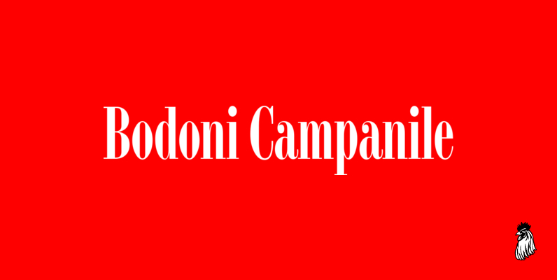
Bodoni Campanile Font
Bodoni Campanile was originally designed by R.H. Middleton for Ludlow, circa 1930. Digitally engineered by Steve Jackaman. Published by Red RoosterDownload Bodoni Campanile

May 30, 2015
Serif
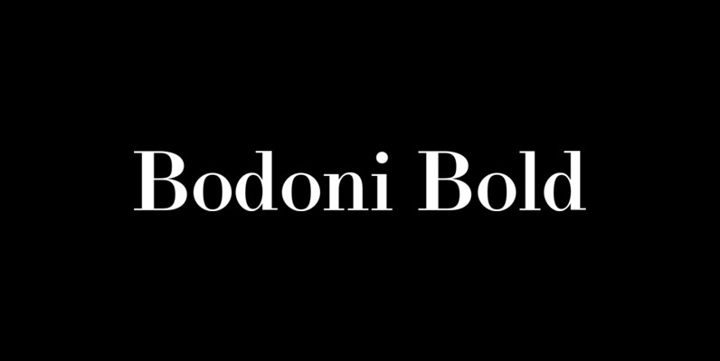
LTC Bodoni Bold Font
Bodoni Bold was drawn by London based type designer Dave Farey for Lanston Type during one of his alter-ego bouts as Giambattista Bodoni in the early 1990s. This font presents the unusual opportunity to use a Bodoni as body copy.