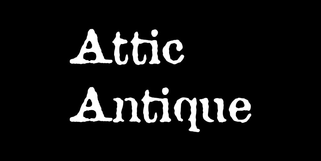
The name “Bonsai” seems appropriate for this font for two reasons: its source of inspiration—some top-heavy text type I found in an old handbook on bonsai from the Brooklyn Botanic Garden—and its glyphs’ resemblance, however vague, to the ancient miniature trees of Japan. When used in text blocks, Bonsai accurately replicates the look of a print job struck with worn, overused lead type.
The face works well at either small point sizes or in display situations. It’s frankly one of my favorites. Bonsai has two styles, a roman and a true italic; both are full-featured “pro” fonts, with true small capitals, old-style and lining figures, numerous ligatures, and support for Central/Eastern European languages.

