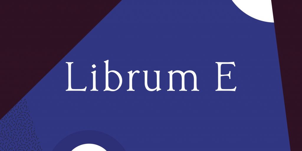
This is the display version of Librum. Librum means “book” in Latin, which I thought was appropriate. Bream is Latin for proclaim—appropriate for display work.
The fonts are very close to Librum-Book and Librum-Italic, with the same OpenType features. The glyphs are modified a bit to make them a little more elegant, but that’s not very noticeable.
Mainly, the letterspacing and kerning is tighter and more carefully fit to large point sizes.
As for classification, I like oldstyle, venetian, geralde, english oldstyle. There’s discrete modulation, slanted crossbars, full brackets serifs of medium thickness and sharp cut ends.
For a great deal on the Librum Book Design Group, all fifteen fonts, please look at the bottom of the Buying Choices tab!

