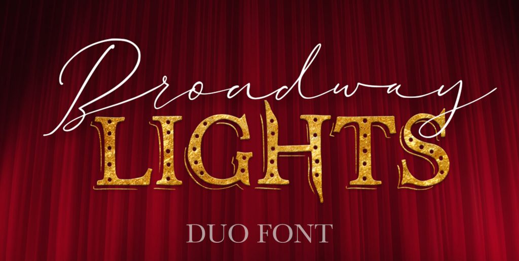
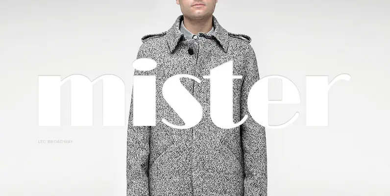
Originally designed by Morris Fuller Benton in 1925, FontHaus’s 1995 revival is based on a design named “Novelty Broadway”. Characters were referenced from “Commercial Art of Show Card Lettering” by James Eisenberg, published by D. Van Nostrand Company in 1945. This Broadway is classic Broadway but with some charming differences such as a slanted lower case “f” a remarkable lower case “g” and a high-waisted upper case case “R”, as only a few examples. It was named “Novelty” because the alphabet incorporated a concave design feature in the tops and bottoms of each letter. These differences allow this version to possess much more personality than that of all other Broadway designs on the market. It looks almost hand brushed, has soft edges and is no where near as sterile looking as all the other digital versions. It feels very 1925!
Save 10% off YouWorkForThem fonts with the code: MRSAVE10

