Category: Tech
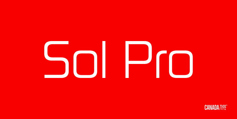
Sol Pro Font
Based on the classic Sol design by Marty Goldstein and C.B. Smith, published by VGC in 1973, Sol Pro goes above and beyond the call of revival/retooling to include plenty of optical improvements to the original design, more weights, italics,
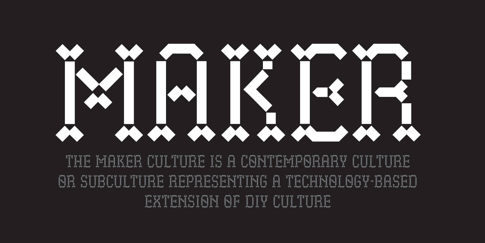
Maker Font
Maker, the font, pays homage to the Maker constructivist culture. Especially the sparked community interaction, and exchange of ideas through social meetings in shared spaces. With Maker you have hints of a Gothic minuscule heritage and pixel components that is
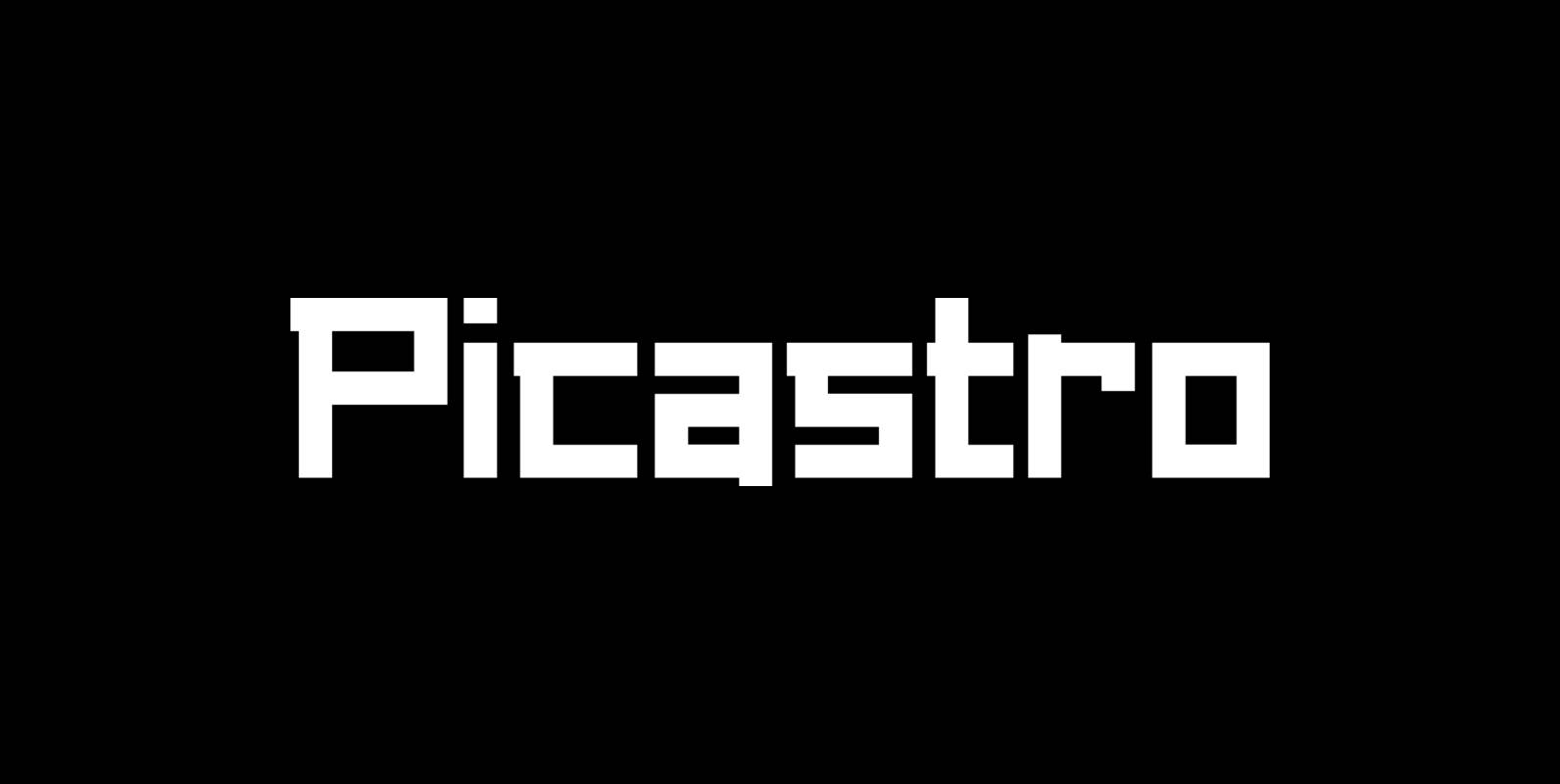
Picastro Font
Marit Otto about Picastro: The revolutionary typeface. Picastro is a fusion of Picasso and Castro. Don’t be alarmed by the second name! It is no political statement. Both characters represent different qualities in the typeface. The Picasso influence is the
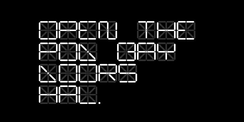
C13 LCD Font
A super technical display typeface born of a desire to improve upon the mundane typography rendered via traditional liquid crystal displays. Not for amateurs. Published by cypher13Download C13 LCD
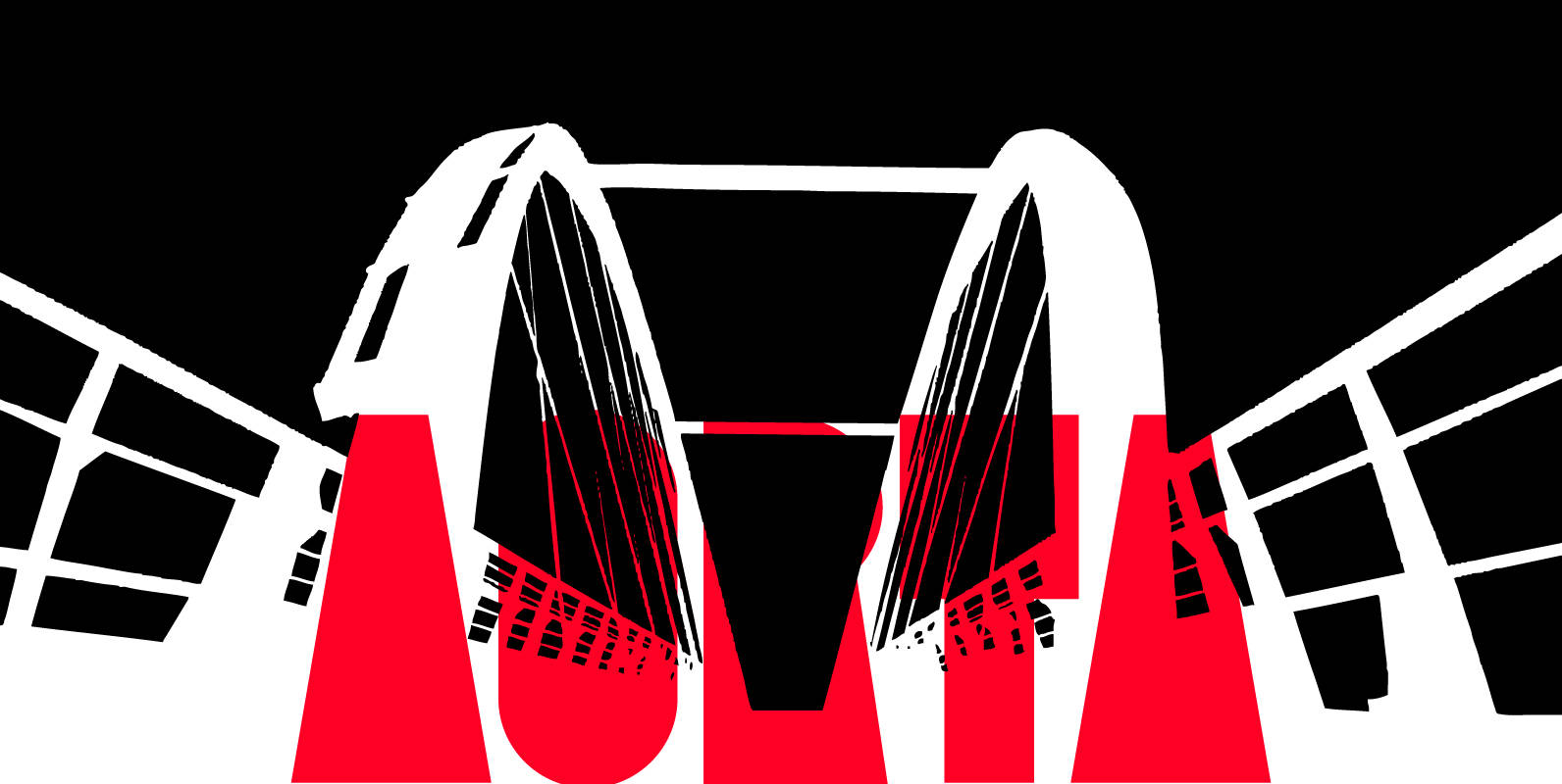
Aorta Font
Aorta was designed for independent subcultural zine. It have stencil in place of lower-case and digit stencil in place of old style digit. Aorta good for headlines, posters, editorial design… Aorta have condensed proportion and good in solid matter. Published
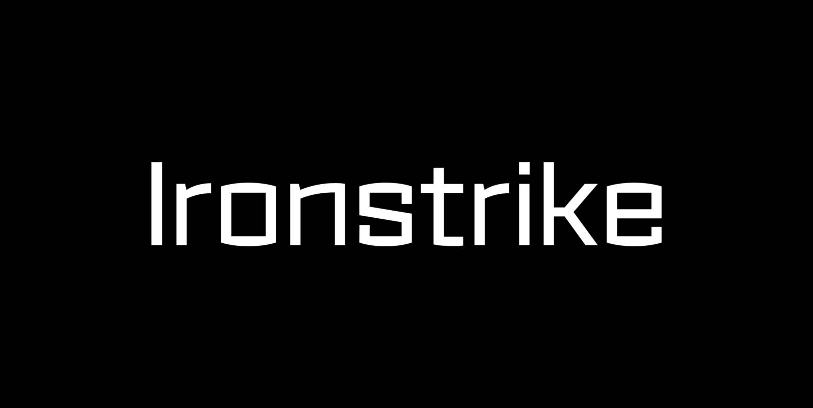
Ironstrike Font
Ironstrike pays homage to industrial and constructivist lettering. Rigid shapes and tall lowercase letters evoke strength and technology. Seven weights with matching italic fonts step up to your tough design challenges. Fine light weights emphasize white space and powerful heavy
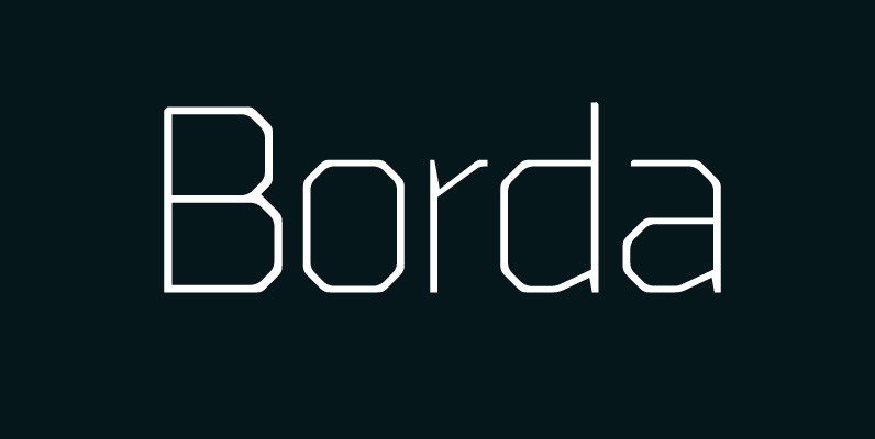
Borda Font
A carefully drawn geometric typeface. Exacting angles are combined with smooth corner details to form a clean, legible font with a modern appearance. The compact nature of the letterforms allows for great use of space across text layouts. Details include

Portal Font
Portal was originally created for a posters and book covers. Mostly suitable as a headline font and for all kind of “space” themes. Portal Strips style brings us extraordinary feeling with his optical illusion. Everything that you need to do
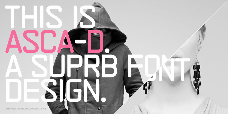
ASCA-D Font
ASCA-D is the latest version in the ASCA series from Suprb and the Subtype foundry. After the original version titled ASCA, ASCA-D was later developed as a lighter and cleaner version to represent Diesel’s online presence in Sweden for Diesel
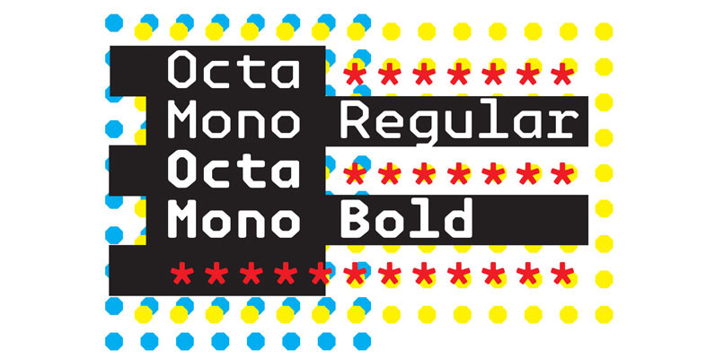
Octa Mono Font
Octa Mono fonts are primarily intended for heading, display and decorative use. A close relative to Alert, Octa is angular by its structure but soft-outlined typeface with modern industrial strength expression. Octa Mono is two weight fonts of upper and
Trapper Sharp Family Font
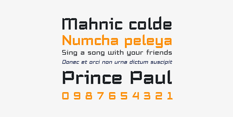
Trapper is so named because it exploits a typographic design mechanism known as ink traps purely for graphic effect. Ink traps are a device used by type designers to create significantly higher legibility under adverse printing conditions, especially when the

Astral FY Font
Astral FY, a font to predict the future… astrological signs included! Co-created by Fabien Gailleul, Jérémie Hornus, Alisa Nowak The Babyfonts, a new range of creative products, by FONTYOU. Because we know that designers need to play with original and
YWFT OneCross Font
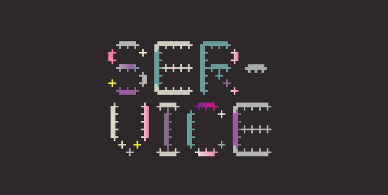
Comprised entirely of “plus signs” of varying weights, YWFT OneCross had its genesis in YWFT OverCross (2002). When it was reworked later that year in order to create a more integrated blend of positive and negative space, Over became One,
Ruman Font
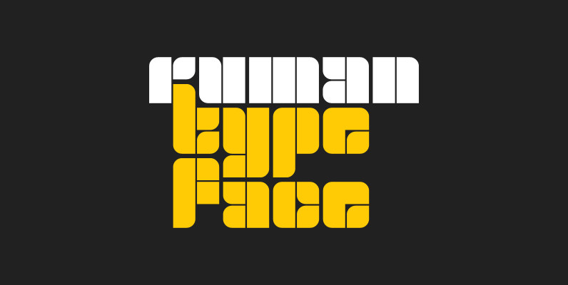
Ruman is a decorative and display typeface suitable for logotypes and posters. It’s another very simple origami style font working well especially with short words, that look almost like an abstract picture. Published by Juraj ChrastinaDownload Ruman
Slash Font
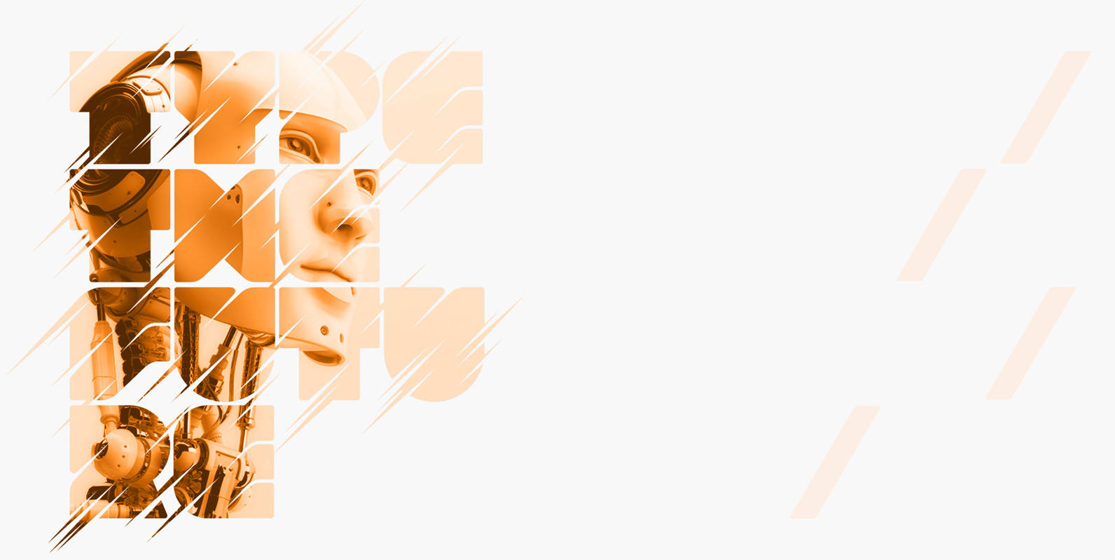
Slash is an experimental, all-caps, no-nonsense display typeface designed by Superfried. Slash, as it’s name suggests, is bold & makes no apologies for it. Sculptured from solid blocks, it features distinct incisions & intricate curves to articulate the separate glyphs,
