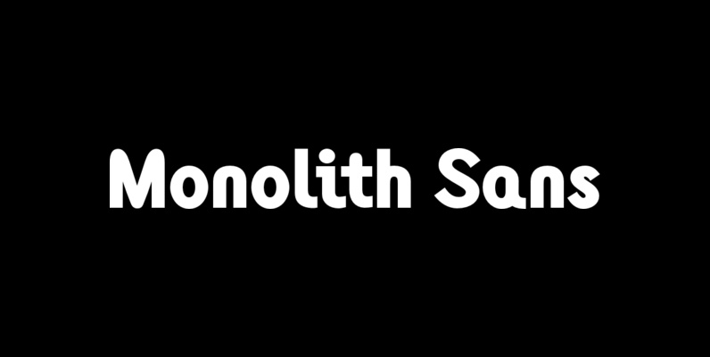
The typeface was designed after seeing a photocopy of some News Gothic text where the ink had faded on the bottom of each character. As character recognition is generally based on the top half of a character, readability was never compromised. Rather like Antique Olive the characters have a top heavy look when viewed straight on, however, as most type is read at an angle with the top further away than the bottom this top heavy look is diminished.
Save 10% off YouWorkForThem fonts with the code: MRSAVE10
Related posts:

November 20, 2014
Sans Serif
Monolith Sans Font
Designed by Tony Mayers in 2004, Monolith Sans is a unique and modern sans-serif type design. Published by ABCTypesDownload Monolith Sans

September 5, 2014
Serif
Generation Uncial Font
Generation Gothic, has already proved to be very popular with leading magazines including Later, Computer Arts, Ultimate Golf and Spark Magazine. This collection introduces complementary Generation Headlines which seek attention and create impact; Generation Uncial (which isn’t just for mystics