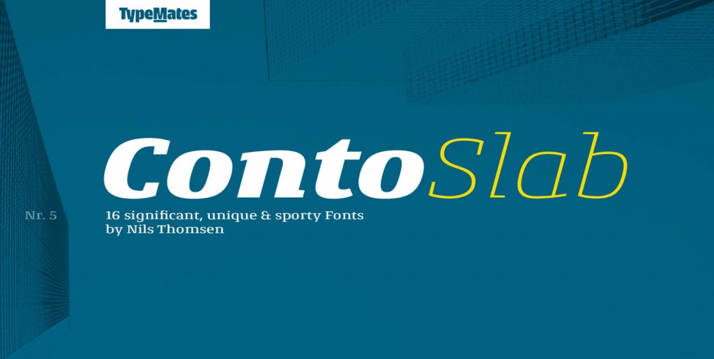
The Conto super family is a powerful and clear typeface for complex corporate typography. From essential text to captions, tables and advertising, the 64 weights have the flexibility to fulfil your every typographic need. The Conto family is simple, serious, elegant and independent.
Conto’s minimalist and simplified lowercase forms, combined with contrast that ranges from the mono-linear in the thin to the pronounced in the bold, mark the typeface as an independent and striking design. But with its remarkable number of discretionary ligatures, you’ll find Conto isn’t just useful for setting text and headlines, but for logotypes and lettering.
From elegant thin to strong black, each of Conto’s eight weights is available in four widths (compressed, condensed, narrow and regular) and contains around 880 glyphs to support all Latin-script based languages. Each weight also includes small caps, all the figures you need for serious typography and, of course, case and small-cap sensitive punctuation and fractions.
In memory of Peter Bruhn:
Conto was to have been published at the Fountain Foundry. During my studies at the Hague, I interviewed Peter (the interview is printed in the book 158 Answers). We had a nice exchange about my typeface and after giving feedback and corrections, he decided he was going to release Conto.
Thank you for your help, Peter!

