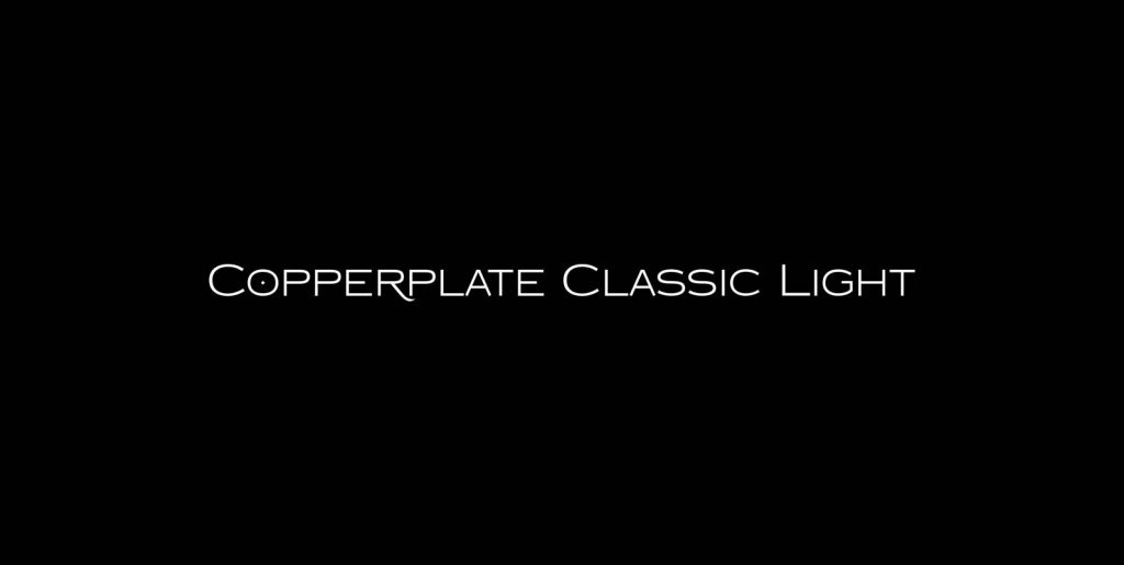
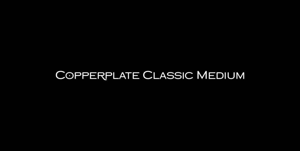
“Copperplate” was the classic nineteenth century engravers typeface, consisting of capitals and small caps only. Among others (for example Deberny & Peignot) F. W. Goudy’s cut for ATF around 1901 is probably the most widely known.
Copperplate typefaces are traditionally used for business cards and all that “serious” stuff. My “Copperplate Classic” is a completely new design, based on some old samples. To make it look more up-to-date and elegant, I gave it some extra swings here and there. The old fonts were all designed with clogging corners or “points that can break off” in the minds of its designers.
Today we do not have those problems any longer, so I could give my “Copperplate Classic” real sharp pointed serifs. For variation I designed a sister that has swashes on the capitals. And to round things off, I designed a third set of capitals only (wide ones on the shift and narrow ones on the lowercase). I ended up with 3 sets of 3 – Serif, Sans and Round – all in the same weight!

