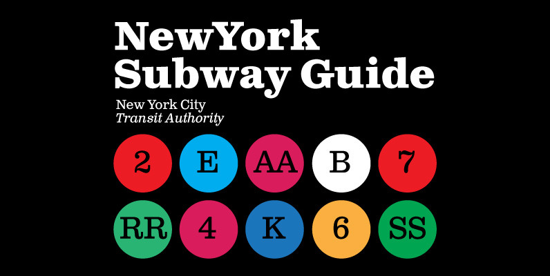
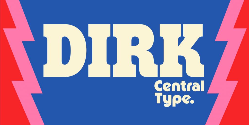
A deconstructive variation of ”Clarendon“
DéFormé was born out of the distortion of the time-honored ”Clarendon“ letterforms, in which the stems and thin strokes have been reversed.
Thus, a typeface was created which will remind some readers of a Western typeface, and others of the ordinary typeface of a typewriter.
Actually, it is still a robust Clarendon, which has survived ists disfigurement quite well. DéFormé, like its ”mother“, is easily legible, in spite of the inherent emphasis which one is not used to seeing.
Clarendon, Serif, Ingofont, Deforme, Slabserif, Slab Serif, Deconstructive, Deconstruct, Decorative, Headline, Display


