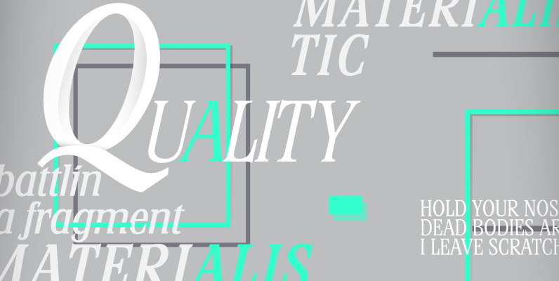
“Edito” is a completely new body copy-font. The special thing about this font is, that all serifs have the same height. So no matter if you take the thinnest cut (A) or the fattest (F), you will always have aligning serifs.
I started “Edito” as an experiment. I tried to enhance the classic and sturdy “Times” font. But I soon discovered, that it would be more efficient to take only the basic idea behind “Times” – the robust design – and start from scratch. It turned out a real solid and useful typeface for everyday use. In due time I will add a couple of extra cuts.

