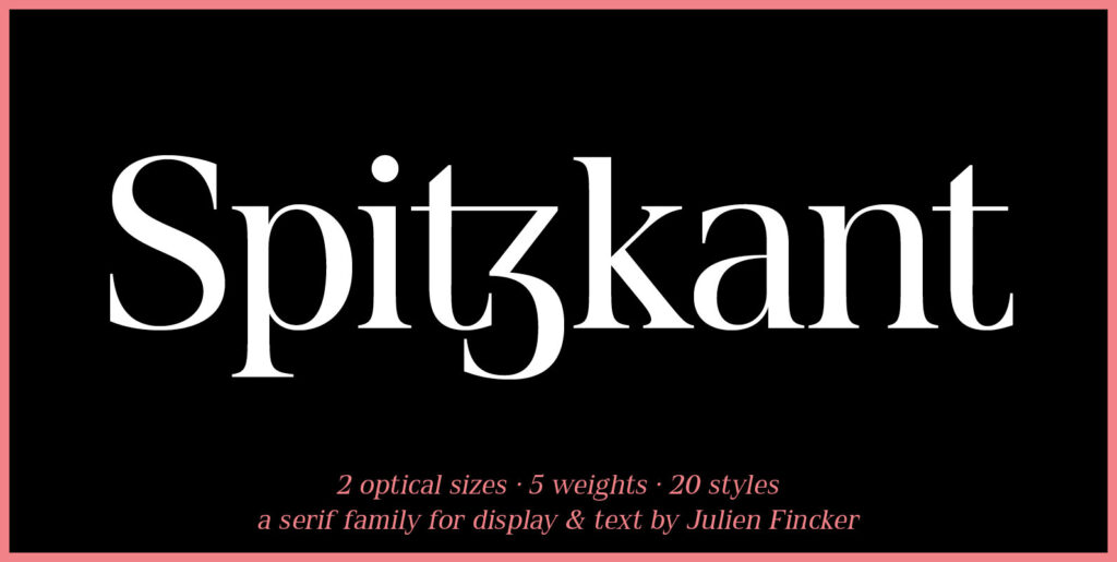
When I first approached this design back in 2003 I wrote myself a design brief that called for a simple sans serif “avec serifs” (with serifs). Its emphasis needed to be on text usage but to be at home in display sizes. A range of weights with a controlled step from one weight to the next, uniform character sets, spacing and kerning throughout the range. Attention to openness of counter spaces would be paramount to work in text sizes. Matching italics should be true italics not merely slanted – with a cursive feel.
During extensive testing I decided to include a suite of ligatures to eliminate the hairline gaps that occur between slab serifs at display sizes. The user may activate “Discretionary Ligatures” or “Stylistic Set 1” for ligatures that are not included in the Standard Ligatures (ff, fi, fl, ffi and ffl).


