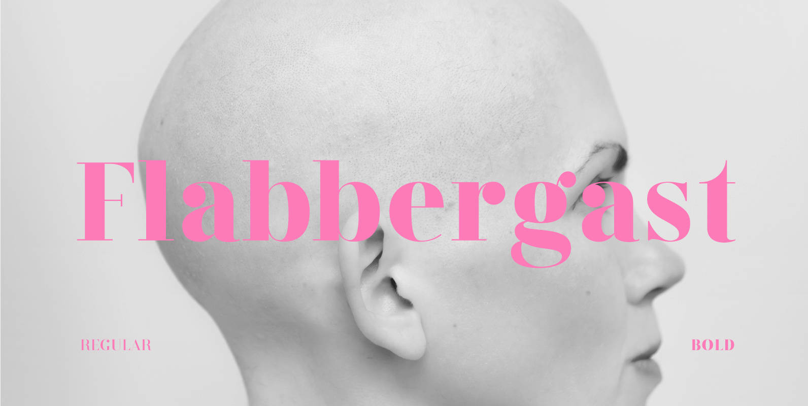
For the better part of 2015 I spent my type design time on Flabbergast, a Didone for headlines with wide language support. After creating all of the design for my game Assumptions using Didot, I felt inspired to create an even higher contrast font, for print and web. I set out only to make one weight (regular) but fell in love with even heavier verticals and added a bold weight.
Save 10% off YouWorkForThem fonts with the code: MRSAVE10
Download Flabbergast Font


