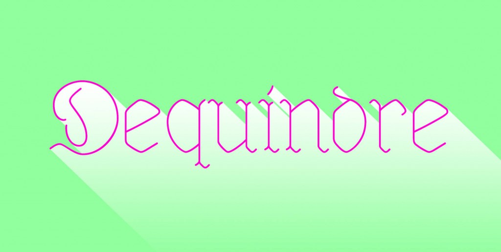
This font makes the impression to be a blackletter font (Fraktur) but it really only is little squares and triangles stuck together in a flip or flop way to form the glyphs. Only a few times did I have to leave this system – like for the degree or brève glyphs. In order to make this experiment somehow useful, I added a set with swings on the capitals. I think it all looks very good and can easily be used like a blackletter.
Save 10% off YouWorkForThem fonts with the code: MRSAVE10

