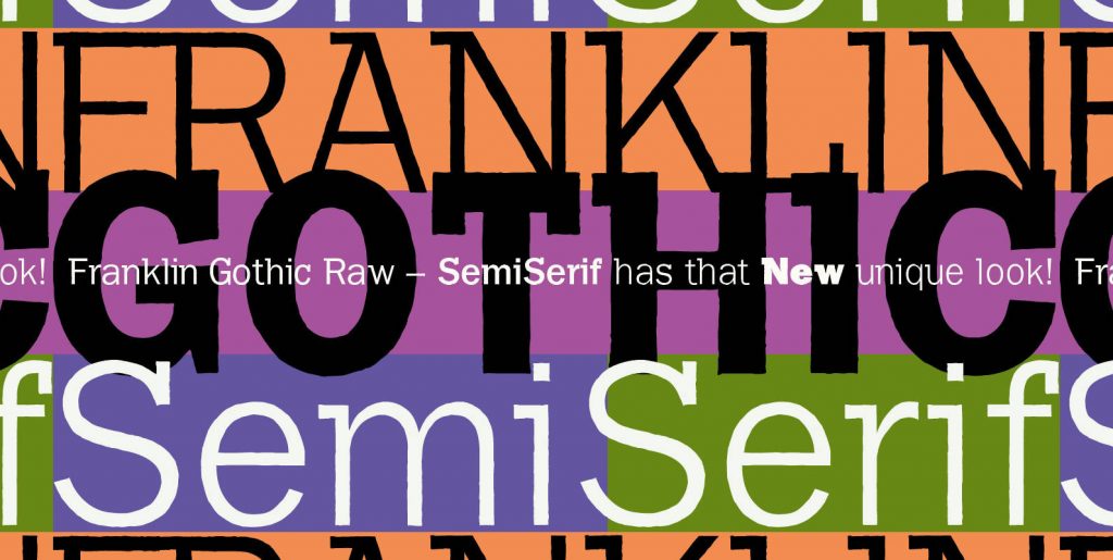
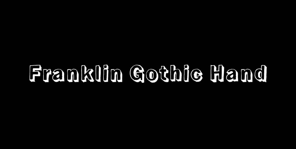
When drawing a new font, there is a time when the final form is found – almost – but the curves are not slick and clean yet, that’s what I call the “raw” form. Raw – no sweeteners added! In this family I tried to redefine this moment in type development for the eternally beautiful “Franklin Gothic”. I call the design “Franklin Gothic Raw”, not to be confounded with “rough”.
The family can be used like any good normal typeface, you hardly see any difference to a conventionally cut “Franklin Gothic” in small sizes. The charm of the design becomes obvious the bigger it becomes, then it enhances your design with its imperfections in the outline.
“Franklin Gothic Raw” is therefore an extremely versatile family. I created the cuts, that I considered necessary for the seasoned designer who knows what he’s doing.

