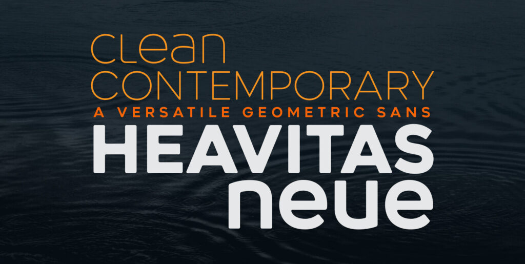
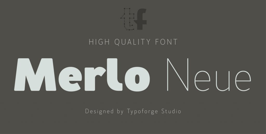
Glyphic Neue was inspired by the Op Art style of lettering in the United States that ran rampant in many photo type houses in the 1960’s and 1970’s. The Glyphic Series from the Franklin Photolettering group was an influence and spring board for this family of fonts, hence it’s name.
But Glyphic Neue departs from its unicase Franklin influence in several ways. Firstly the designer created both upper and lower case forms. The lowercase has been designed with barley protruding ascenders and descenders and with an x-height equivalent to the cap height, so that upper and lower can be exchanged indiscriminately for a quirky effect. Some of the letters take a cue from the original Glyphic series but many have been redesigned entirely to fit the designers vision. The italic forms differ enough from the upright version making it almost an entirely different display alphabet.
Glyphic Neue is a versatile family of 6 fonts – 3 widths, each with an accompanying italic that look equally at home when used on a party flier or a sports team visual identity.

