Grafton Titling was designed for dramatic impact. It contemporizes old style proportions, bracketed serifs and a left-leaning stress angle with striking contrast and modern angular joins. The solid style has a timeless feel, while a flared through-line variation provides textural interest. Small caps, a complement of OpenType features, and support for diacritics and accented characters make it a robust and distinctive choice for headlines that demand attention.
Save 10% off YouWorkForThem fonts with the code: MRSAVE10
Related posts:

April 21, 2015
Serif
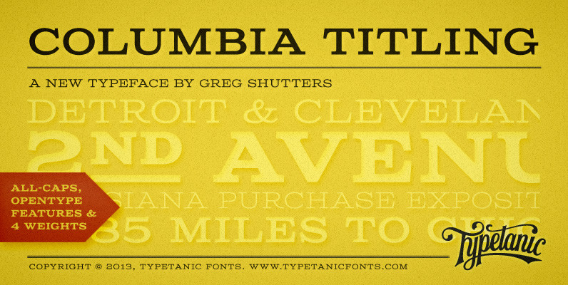
Columbia Titling Font
Columbia Titling is an titling-caps display family based on wide Clarendon-style wood type and industrial signage design from the late-19th and early-20th Century. Columbia Titling includes a small set of OpenType features, including both tabular and proportional figures, special superscript

December 1, 2014
Uncategorized
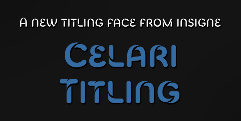
Celari Titling Font
The speed and agility of Celari is built for nothing less than a headline. Use the larger-than-life power of this face for any number of oversized applications–mastheads, posters, web headlines, flyers. It provides excellent performance for service-oriented ads where efficiency