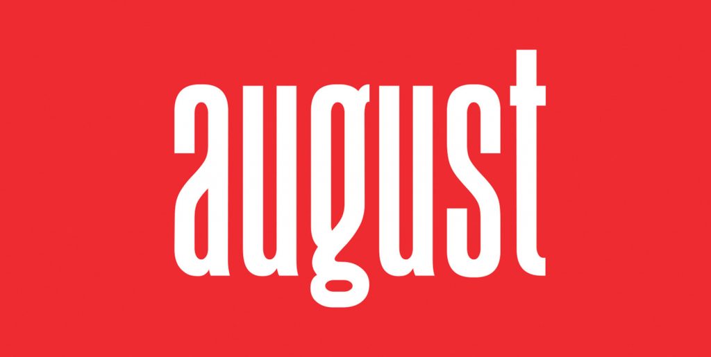
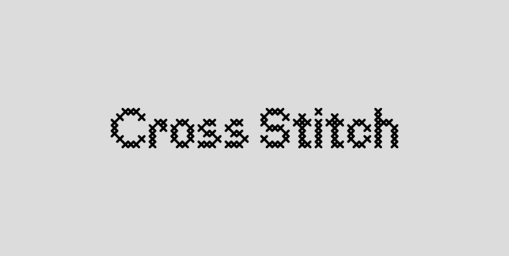
Inspired by the medieval print design, the look of the sans serif typeface is strong and beautiful. It brings charming curves and satisfying patterns to traditional thick fonts. I like to use this font for printed material and titles – the height attracts attention and creates a visually attractive modern medieval feel. Graphemic fonts include two fonts – Regular & Light.
All offer broad language support, upper and lower case letters, extended numbers and punctuation.
Specifically suitable for: Posters, Blockbusters, films, trailers, headlines, titles, logos, branding, scripts, display & bold 'goods'.


