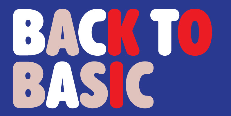
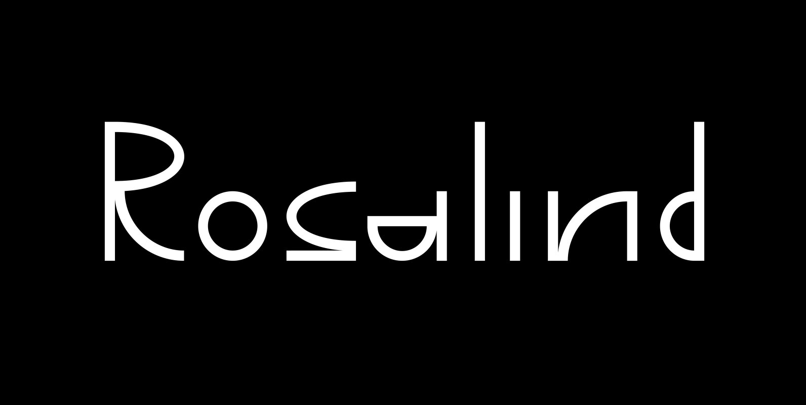
Guinevere Pro is a typeface designed by Icelandic art director Sigurdur Armannsson. It started in 2001 as simple hand-drawn sketches of a few letters built from modules, then became an experiment with four goals:
– Construct an original alphabet from a specific set of predetermined modules.
– See how certain letter forms built without said modules would behave within the totality of the module-constructed alphabet.
– See if certain letters would actually enforce their own shapes to be drawn a certain way within the totality of the typeface. Likewise, see if the totality of the alphabet demands that individual letters be drawn in a specific way, and if so, how much room for variation would there be?
– See how all of the above reacts/changes to implementing the alphabet across different weights.
The experiment was finessed and re-worked over many years of technology changes, and Guinevere Pro is the final outcome, ten years later.
The Guinevere Pro set is four cross-platform Open Type fonts, with built-in small caps, alternates, ligatures, and support for a wide range of Latin-based languages. Published by Canada Type.


