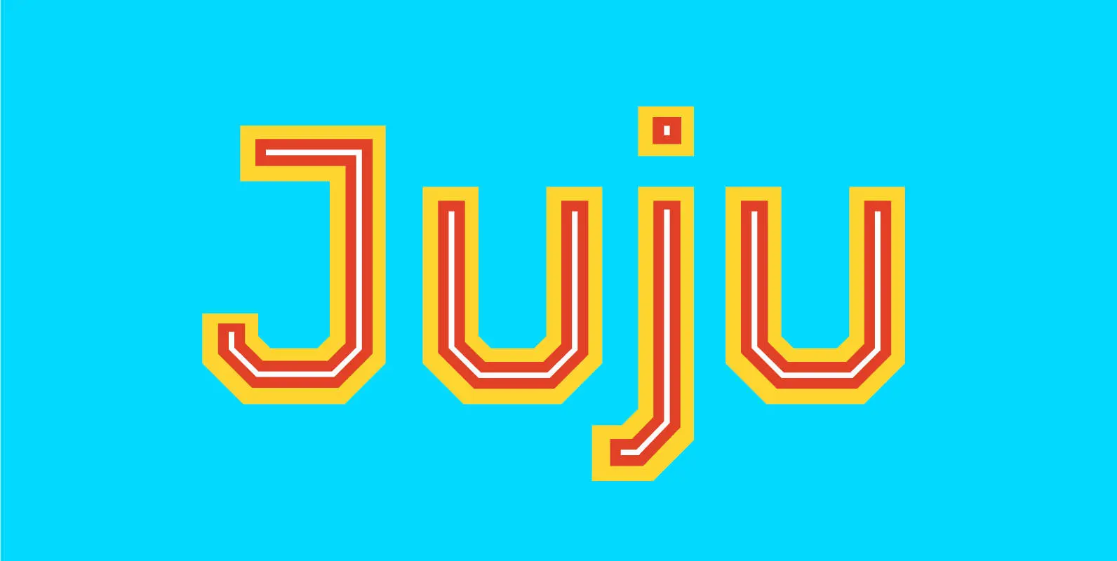
Juju was created for a wide variety of usages. There isn't a single curve in any of the 253 glyphs in each five styles. It works for your sports team, your space rocket, your CNC router, anything. Stack all five layers for a truly deep look, or combine two or three (heck, four even) for simplified clarity.
Style 01-Superbase This is the only style that might look a little wacky on its own, but it is an important member of the family, giving extra weight for added impact. Suggested use with: 03-Center and/or 05-Inline
Style 02-Base This is the backbone of Juju. The workhorse. It goes well with any style included, and on its own is a very nice, straightforward semi-bold style. It is also the style that defines the caps height, ascender, x-height, baseline, and descender (all other styles extend beyond or within those boundaries).
Style 03-Center The thinnest of the bunch, in the middle of Juju, is Center. It's power cannot be underestimated, since (when activated) it can the bright or dark center of each letter. It plays well with all styles.
Style 04-Outline Outline is the quiet, shy one in the group here. It provides a subtle enclosure to Base, a nice accent to Superbase, or as a wonderful boundary to Center or Inline. And on its own it works in mysterious ways.
Style 05-Inline Another standalone style that could also have huge impact when combined with Superbase, Base, or Outline, this last layer of Juju brings out the best in everything it touches (or doesn't touch).
Numerals are fixed width (they all take up the same amount of horizontal space).


