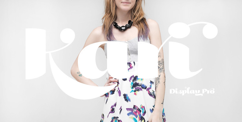
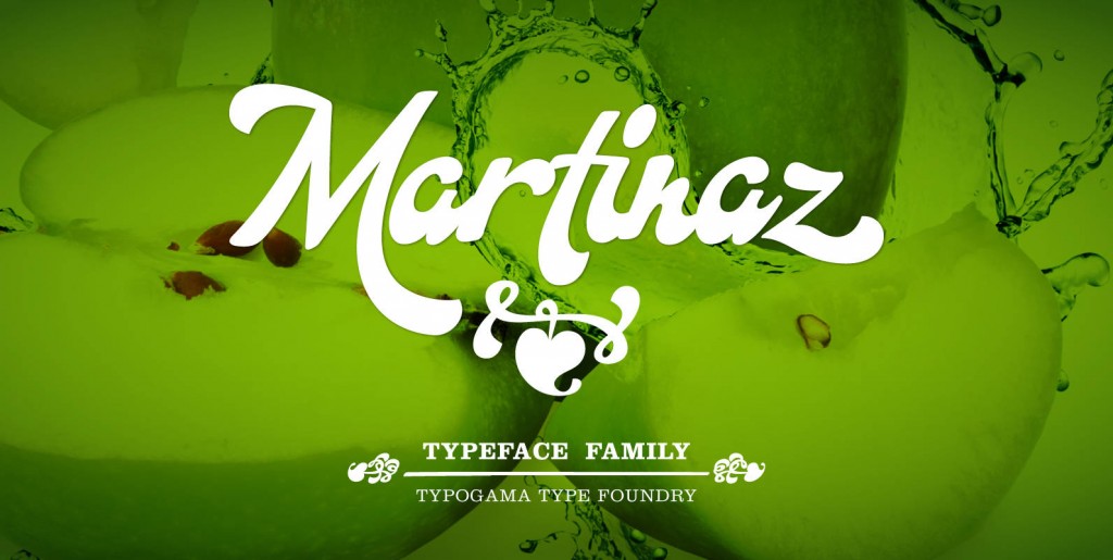
Kari evolved from an earlier design called Juicy. In Kari’s case, the design ended up far curvier and loopier than its sister. The typeface went through an enhancement period where several OpenType features were incorporated into the character set – allowing for far greater flexibility and expression with distinctive swashes, ligatures and alternates. In 2005 it received a Commendation in the Display Family category for the Creative Review Type Design Awards.
Save 10% off YouWorkForThem fonts with the code: MRSAVE10
Related posts:

February 17, 2015
Script
Kari Display Pro Font
Kari Display is the product of a long standing idea I had to give the well-received Positype typeface, Kari, plastic surgery. Just referring to giving a typeface plastic surgery, or letter lipo, stuck in the back of my head until

April 28, 2015
Script
Martinaz Font
While walking through Geneva, I came across an old tailor that seemed specialized in curtains or other outdated motifs, but his shop window featured quite an interesting script design. As I was in the middle of a design project that