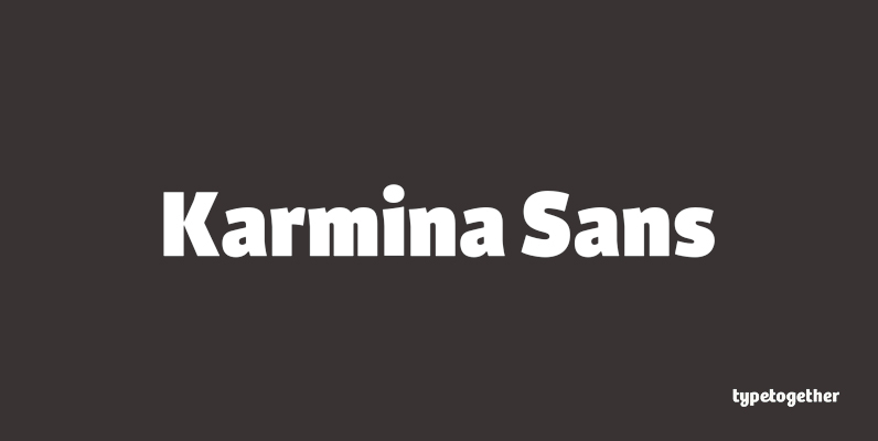
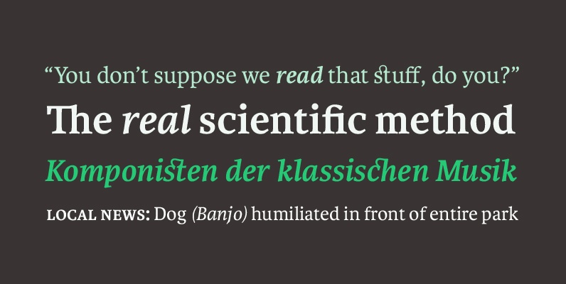
Karmina Sans was conceived as a larger type family, six weights with matching italics, that could perform alongside it's serifed cousin, but that had its own features and personality. It shares the same technical excellence and has the same basic proportions, but it proposes to be a much more versatile tool for editorial designers. While intermediate weights match the proportions and weight of Karmina Serif and are excellent for setting short texts or magazine articles, the more extreme weights are intended for all kinds of headlines above 14 points and for corporate identity programs.
Very early in the design process some of the calligraphic reminiscences were ironed out, that were present in the serif version and that simply did not work here. For example, the kink on the bowl of 'a' was smoothed and the counter in 'e' made bigger, the connections in the italics were made less deep, and the curved strokes on italic 'z' were straightened.
Multiple master technology, with the light and extra bold weights as starting points, was used to create three weights by interpolation and a heavy weight by extrapolation process, which were then optimised and finalised by hand. The latter is so bold that it delivers one of the darkest and most powerful impressions out there.
The character set of each of those 12 styles supports Latin A Extended, five sets of figures, ligatures, small caps, full range of fractions, superior numbers and letters and other typographic niceties. The quality of Karmina Sans has been already recognized by receiving the Bronze award at ED-Awards 2010, in the category “Original Typeface”, the 1st prize in the Granshan competition 2009 in the “Latin text font” category, and is being featured in the ComArts Typography Annual 2011. Published by TypeTogether.


