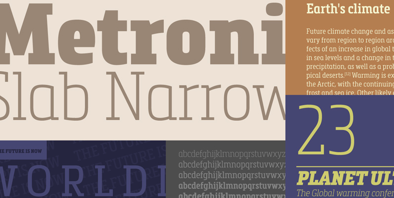
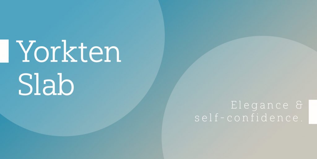
Structurally inspired by modern fonts, Klimt is distinctive for its two options: Original Slab Serif and Organic Slab Serif. The Latter is special for it illustrates the designer’s attempt to genetically modify the font. Beginning with the original structure, a humanist twist is incorporated into the serif adding the presence of curvy lines that shatter the solidity of the geometric form of the font. Another distinctive feature of Klimt is the Ball Terminal at the upper curve of the letters such as ‘a, c, r and s.’ The results of Typesketchbook’s investigation give birth to a unique pair of the fonts, Original Slab Serif and Organic Slab Serif, that while stemming from the same structure, offer a different visual vibe and feel.
Save 10% off YouWorkForThem fonts with the code: MRSAVE10

