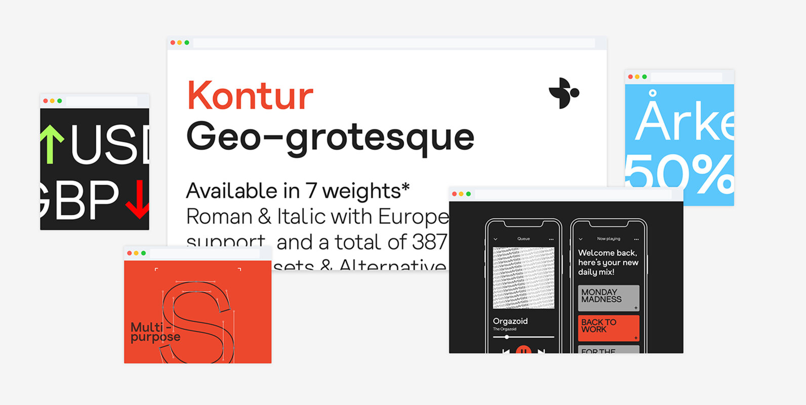
Kontur is a Geo-grotesque typeface which is inspired by the flowing contours of shapes and geometry. Kontur was designed to evoke a playful and approachable personality with an honest tone. It is a multi-purpose typeface which is suitable for both print and digital use. Kontur can be used across multiple disciplines/applications, and has a total of 387 glyphs. Kontur works well on web, user interfaces and print due to its extensive language support, italics and glyph set.
Kontur type family:
– Contains 14 individual OTF font files
– 7 weights include Thin, Book, Light, Regular, Medium, Semi-Bold, Bold
– All weights in both Italic and upright (Roman)
– Supports Western, Central, and South-Eastern European languages
– Stylistic Alternatives & OpenType SS01/SS02 features (easily toggle between different character style sets — See 'alternates' on common characters image)
– Arrows & symbols
– Case sensitive brackets, bars, hyphens/dash and @ symbol
– Affordable Web & Desktop Bundle license available
– WebFont ready
– Alternative symbols (mix and match different styles/variations)
Kontur's design began June 2018, and the release of version 5.0 took approximately 10 months to create. An extended/Pro/Studio version of the family will be arriving late 2019 (expect Mono, extended, condensed cuts and more language support). Please contact (YWFT) if you wish to use Kontur for a commercial audience/business.
Kontur also supports bespoke versions, please get in touch with me directly if you wish to discuss a branded, bespoke cut of Kontur.


