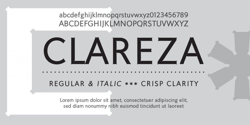
As a graphic designer, I know all too well designers are always looking out for that elusive font that is “normal” but has a slight uniqueness about it. This was my challenge in designing Leuk: to find a unique feature that will set it apart without losing the fundamentals of type design. In fact, incorporating some calligraphic elements into a basic font was the key to making Leuk unique. In the process of doing so, a virtual font smile and wink was created especially in the “o” upper and lowercase while the “a, e, k, o, z, ß, have a centered hint of a connection to create a stenciled calligraphic feature.
The Dutch word “leuk” is one that does not translate directly to English. The following words circumscribe Leuk: pleasant, jolly, funny, witty, clever, nice, sweet, kind, nice, amusing, entertaining, funny. Leuk, the font, in its totality features a little bit of fun and wit in a normally predictable font. Since the calligraphic features are not dominant, Leuk is actually very legible and robust. Leak is therefore great for advertising, brochures, promotion, book cover design, packaging, etc. Leuk family consists of Leuk Light, Leuk Light Italic, Leuk Regular, Leuk Italic, Leuk Bold, Leuk Bold Italic, Leuk Black, Leuk Black Italic in Opentype format.

