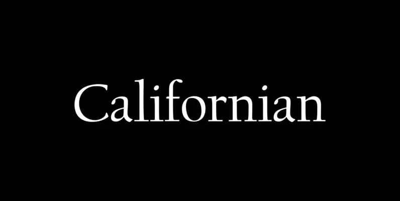
This font family is a revival of Centaur by Bruce Rogers(1870-1957) and Arrighi by Frederic Warde (1894-1939). A previous digital version was released by Giampa Textware/Lanston Type Co. in 1987.
Metropolitan Roman:
Originally designed by Bruce Rogers in 1914, Centaur was cut by Robert Wiebking (who also cut many of Goudy’s type designs) as a private typeface for the Metropolitan Museum of Art. Many years later, the idea came up to have Centaur released commercially. It was originally to have been cut for monotype by Lanston Monotype (Philadelphia), but was “for various reasons” made by Monotype Company of London. It was commercially released by English Monotype in 1929.
The roman font was marketed with the companion italic; Arrighi. Frederic Warde originally designed Arrighi in 1925 for the book “The Tapestry”. Warde used the italic types of Ludovico degli Arrighi circa 1524 as the model for his design. Rogers similarly used Jenson’s roman font circa 1470 as the model for his face. Both are highly regarded as exemplary revivals of these early classics.
Metropolitan Italic Pro (Opentype) combines two of Frederic Wardes versions of Arrighi. Accessible in the contextual alternates feature, the alternate ascenders, g, y, and ampersand were found in the original version of Arrighi from 1925. The only difference is that the upright caps that were originally paired with the type have not been included. There is also a swash ‘e’ added in the swash feature, as well as all standard ligatures.
The Metropolitan Italic font is based on the third and final (Monotype) version of Arrighi with sharp ascender serifs that extend to the left.
Metropolitan Italic Alt is based on the original Arrighi of 1925 and features pear shaped ascenders that extend to the right. The original Upright Capitals have been omitted in favor of the sloping capitals found in the Monotype release. A second version of Arrighi containing elements of the first and third and has not been digitized.

