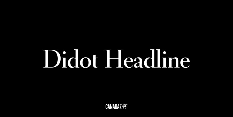
This typeface wasn’t designed for use as a body typeface. Rather, I designed it with the intention of it being used as a header at a large point size. It was originally the Firmin Didot typeface, but of course I didn’t aim to make it a perfect re-cut. I freely interpreted it by bringing out the strengths and weaknesses of Didot’s extreme strokes.
Save 10% off YouWorkForThem fonts with the code: MRSAVE10

