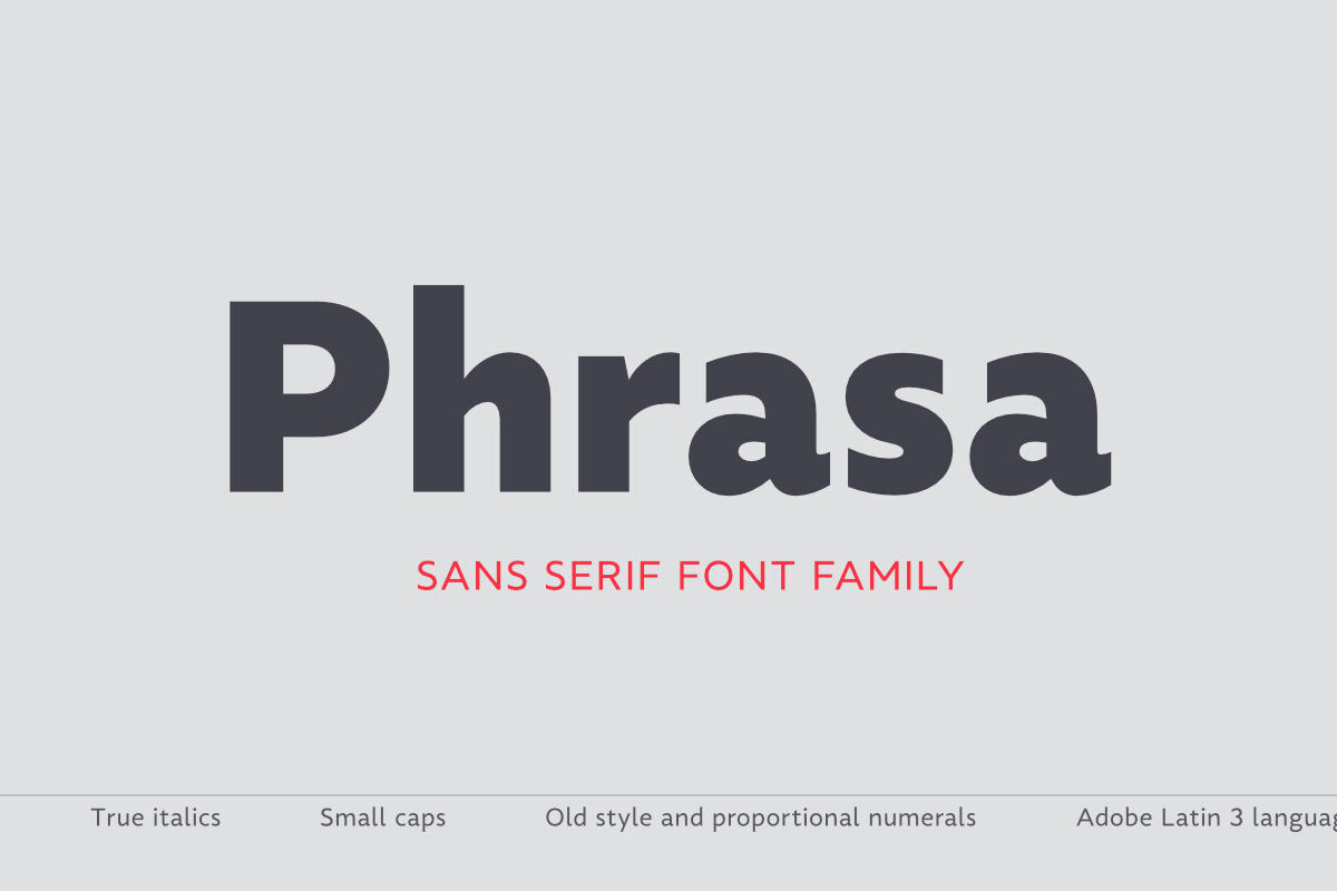
Phrasa is a robust humanist sans-serif typeface family which will carry you through most of your design needs. Designed for legibility, she truly shines in running text. However her solid yet elegant construction allows for usage in such settings as branding or signage.
Phrasa's most prominent features are:
– 13 weights, from hairline to black
– Moderate x-height
– Large apertures
– Modern capitals proportions
– Designed for readability without sacrificing good looks
– True Italics
– Small capitals
– Adobe Latin 3 language range
– Old-style and tabular figures
The idea behind Phrasa was to create a stylish typeface but with legibility in mind. First drafts were tested against Frutiger. The typeface performed well, yet she didn’t do so well in paragraph setting. New inspiration was needed. It came from history, namely from two of the most legible typefaces known: Garamond and Gill Sans. After reworking much of the design, the new typeface boasted a smooth, easy-on-the-eyes texture which allowed the reader to simply sink into the text. To compliment this development a set of true italics was added.


