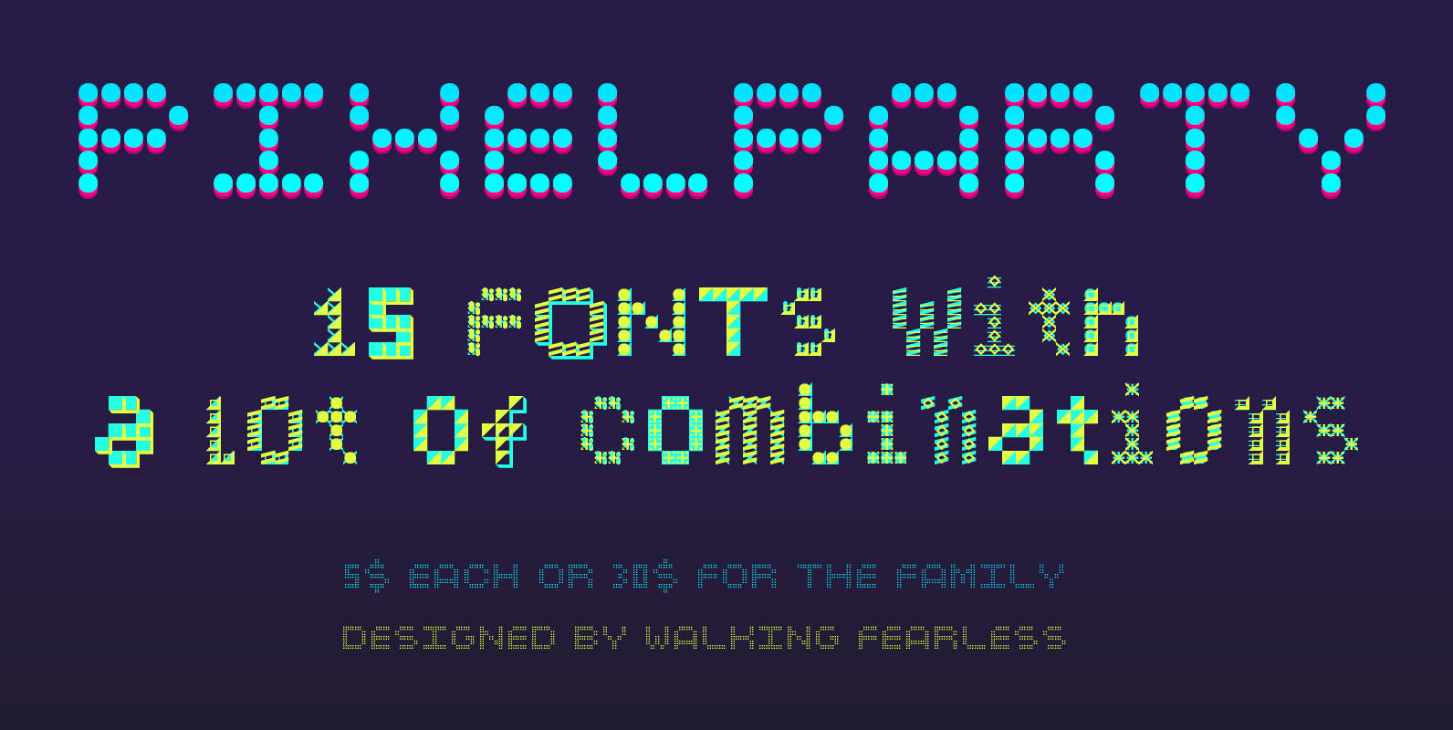
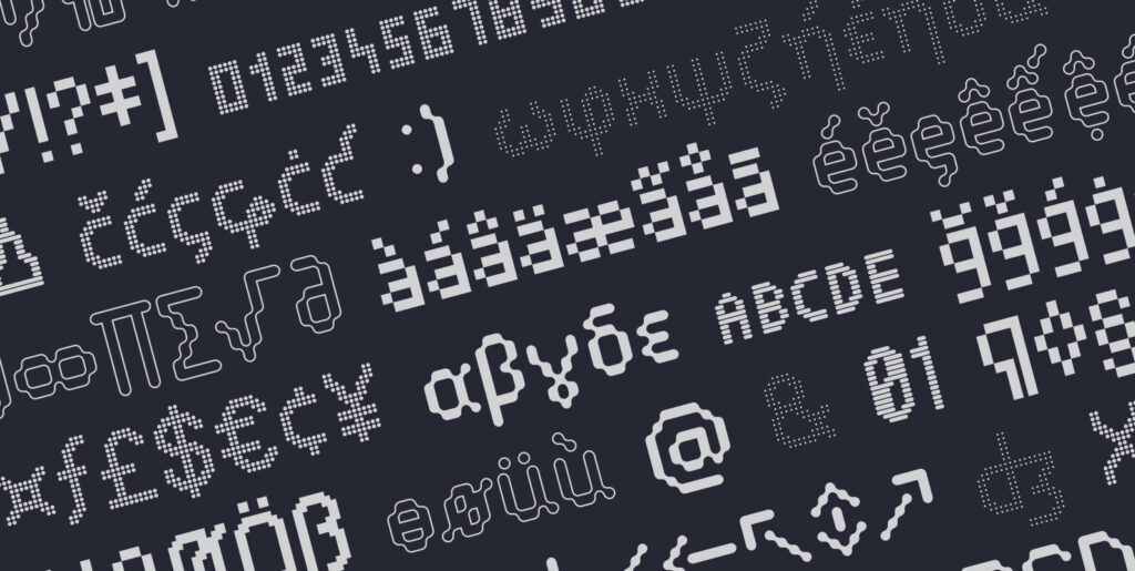
Why does a pixel font need to be boring and monochrome? We are not in the 80s anymore. Use PixelParty for your colourful headlines and find the best combination between shape and colour for your project.
With 15 weights with different styles you will manage to do unique headlines, defining a relevant visual culture for your projects, just by using type. How cool is this?


