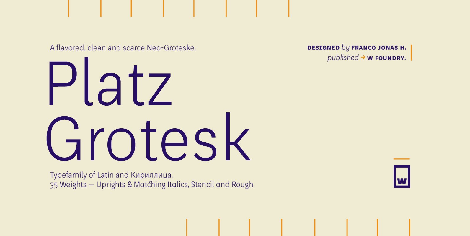
Platz Grotesk has been designed parallel within the neogrotesque universe of typefaces and is inspired by humanist proportions and humanist-grotesk features. Firstly, this hybrid has a smaller x height, thus it possesses wider typeface whites in order to be legible in small sizes, vertical strokes which are located inside the typeface bowl that are slightly straight to not affect the typeface legibility and, finally, has fresh-fun features which culminate in a totally versatile type family, ideally to be used inside any visual communication application.
Additionally, Platz typefamily possesses true italics, obliques, a stencil and stencil rough version, all completely equipped with opentype features, alternative glyphs, fractions, lining numbers, old style figures, capsular numbers, superscript and inferiors. Also, this typeface supports Latin, basic and extended Cyrillic.
Finally, I dearly appreciate the help of Bana Arasanz, Diego Aravena, Patricio González, Rodrigo Araya, Matías Cortez and W Type Foundry for this months of learning that were of shelter and encourage; towards me and this project.


