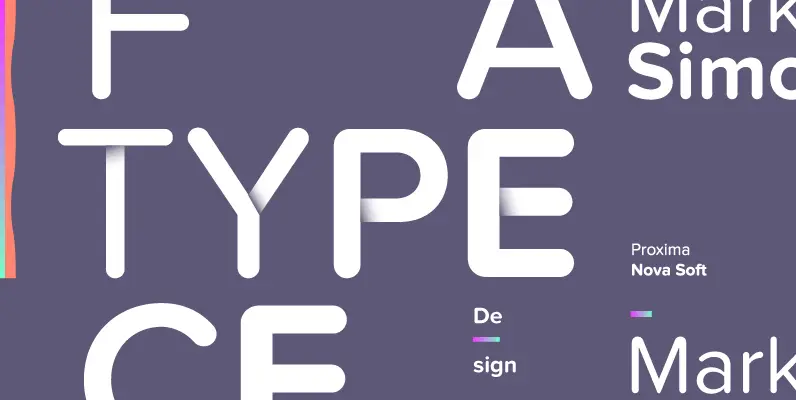
Proxima Soft (2017) is a rounded version of Proxima Nova.
With the same forty-eight styles (eight weights in three widths, plus italics), Proxima Soft fits the bill when you want something a bit warmer and more playful than its older sibling. It features the same extensive language support, including Greek and Cyrillic. It also has several alternate characters, such as a one-storey lowercase a, allowing you to customize its appearance in a variety of ways.
– Same 48 weights/styles as Proxima Nova
– Same language coverage (including Greek and Cyrillic)
– Same alternate characters (a, l, y, G, 1, 0)
– Proportional and tabular figures
– Fraction support
– Ordinal support
– Case sensitive forms
Proxima Soft is warm and welcoming, an approachable type design that offers clarity without severity. It’s naturally well suited for web content and mobile applications, yet it is also befitting of casual headlines, editorials, and contemporary advertising. The heavier weights are particularly excellent for early-reader children’s books, educational tools like flashcards, and board game cards.

