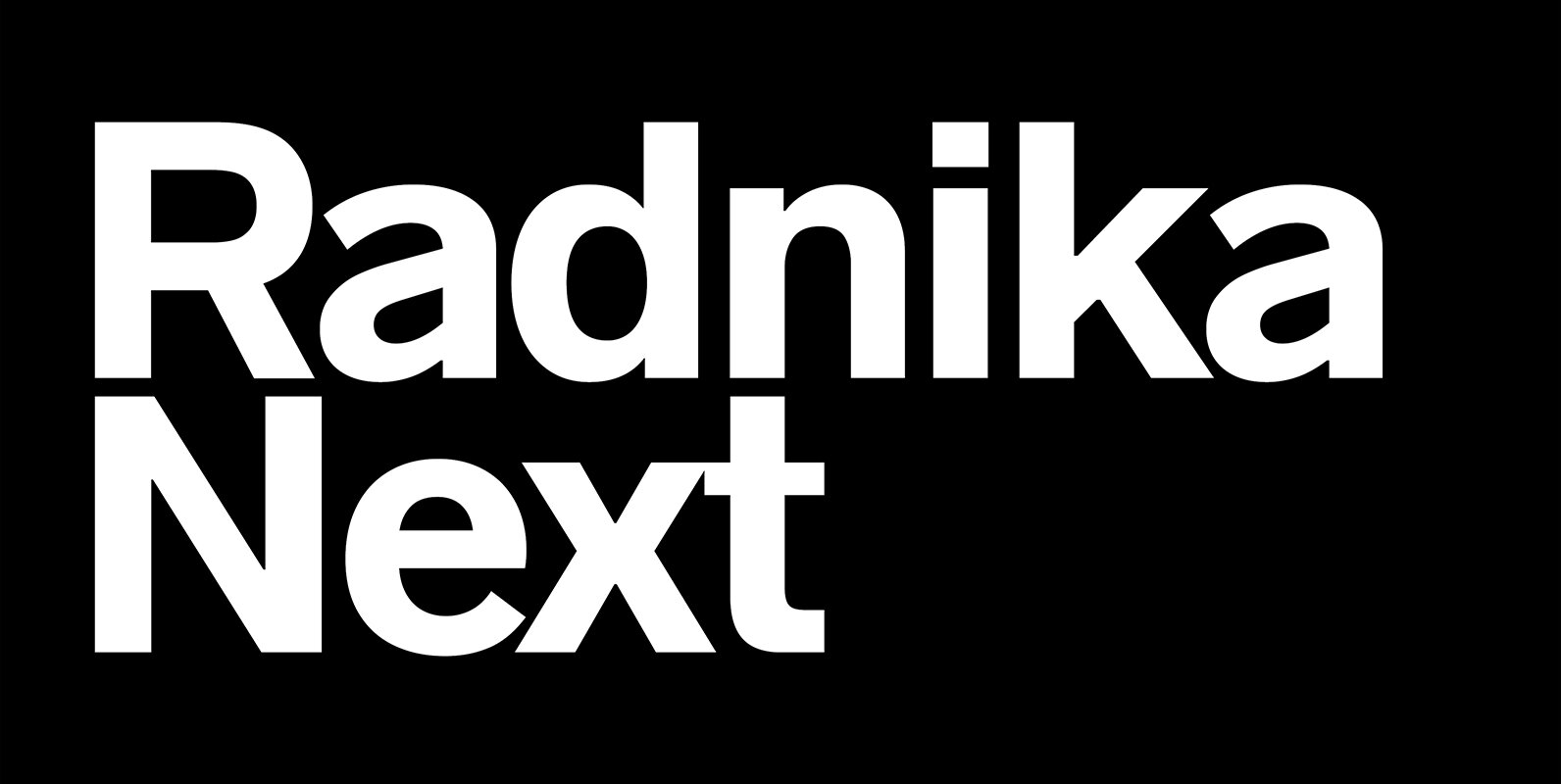
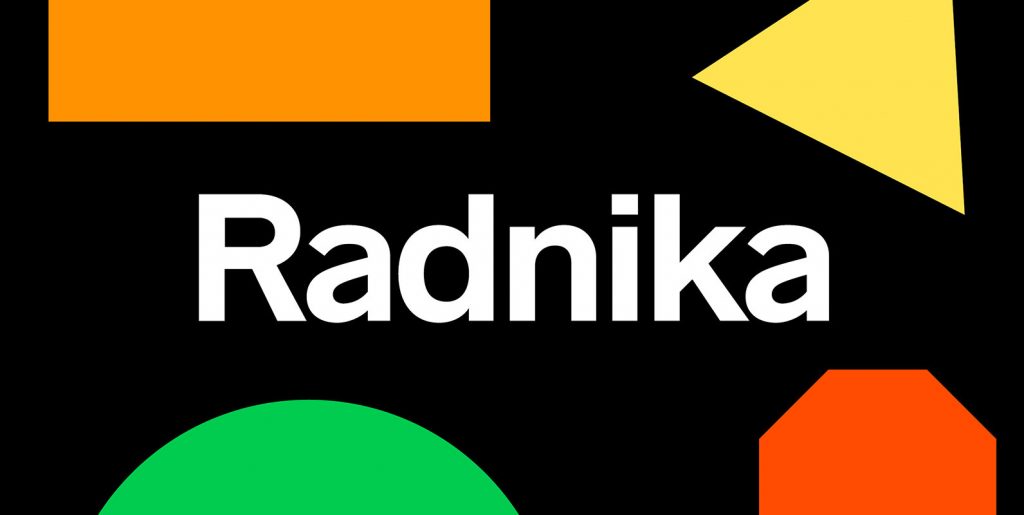
Radnika Next enhances the geometry, kerning, spacing and ligature handling of the Radnika typeface. Radnika Next is a multi-purpose sans serif typeface that bridges the gap between the strong expressive typefaces of the 19th century and the finer, rather stern, typefaces of the 20th century.
Reviewed by YouWorkForThem
Radnika Next embodies Hanken's considered approach. The updated font is beautiful yet subtle. This sans serif typeface is perfect in its space: a solid workhorse ready for application anywhere in the world. The font's nearly endless options give it astounding flexibility and appeal.
According to Hanken, Radnika was a sans serif font to be used instead of “Helvetica, Akzidenz Grotesk, Trade Gothic, or Univers.” In other words, broad use was a major consideration. The resulting Radnika font was effective and beautiful.
Now, the spectacular font Radnika Next improves on the original. Per Hanken Design, Radnika Next enhances the geometry, kerning, spacing and ligature handling of Radnika. Like its forerunner, Radnika Next suggests both expressive 19th typefaces of the 19th century and sterner 20th century typefaces. The font is perfectly balanced in this respect.
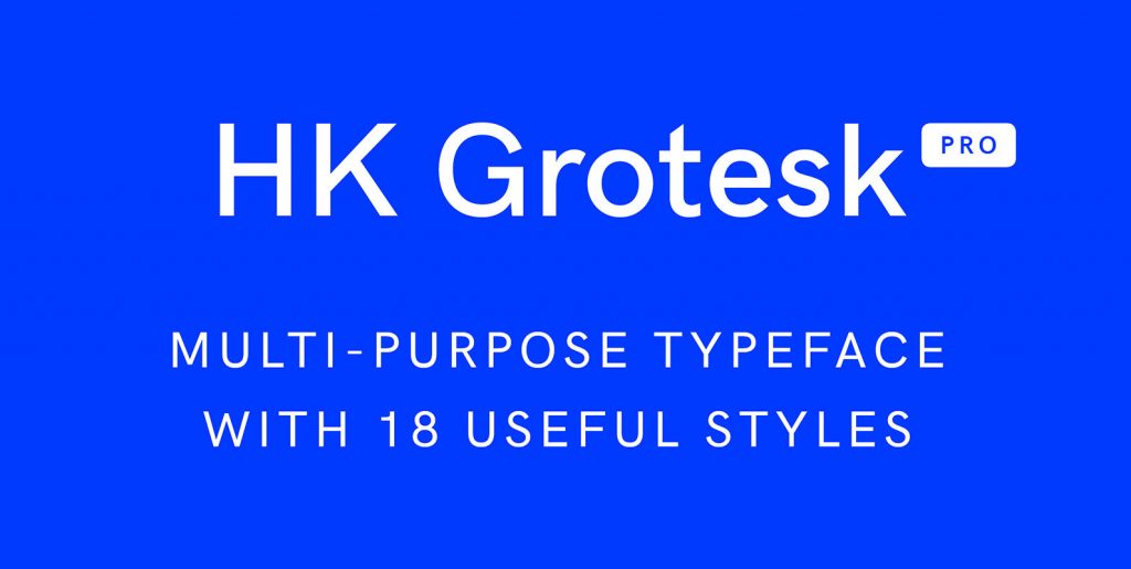
With 18 styles in six weights and extensive language support, Radnika Next has broad appeal. This is a clean, functional typeface for almost any use. It is excellent for mobile, web, branding, corporate communications, art projects, advertising, signage, body text, social media, educational materials, print media. Anywhere a rational, easy to use workhorse is needed.


