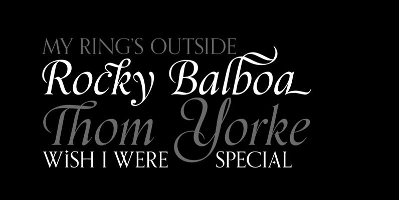
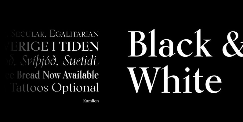
The metal Ronaldson was the magnum opus of Alexander Kay, a first generation Scottish-American expert punchcutter whose résumé included clients no less historically prominent than Henry Caslon, Vincent Figgins and the Stephenson Blake company. His expertise at cutting roman faces was world-renown. This expertise is quite evident in Ronaldson Old Style’s confident serifs, which loom from the T like an eagle’s wings, and point out of the C, E, F, G, L, S and Z like the proverbial thorns on a rose. Only a master handcutter would be able to include such ornamental traits in a typeface yet still succeed in creating such a cleanly readable face. The popularity of Ronaldson Old Style around the turn of the century can still be seen in new editions of novels from that era, like the recent Arion Press letterpress edition of Edith Wharton’s The Age of Innocence.
This digital version of Ronaldson revisits the original sizes, where some of the letter forms varied considerably from one size to another, with a more technologically current, scalable type approach. The forms that were originally cut in display sizes are included in this digital version as alternates. The metal Ronaldson was only a roman style in different sizes. There was a sloped (oblique) version that was mostly deemed unworthy of being a counterpart to the roman, so there were plenty of instances were other old style italics were used with it instead. But even in those instances, the italic always seemed loose and clunky compared to the attractive color and evenness of the roman. In this digital version, a brand new italic was made, as well as a bold weight. Roman and bold small caps were also added, along with oldstyle, tabular, superior and inferior figures, and fractions of both the vulgar and nut varieties. Then plenty of ligatures and extra alternates were added.


