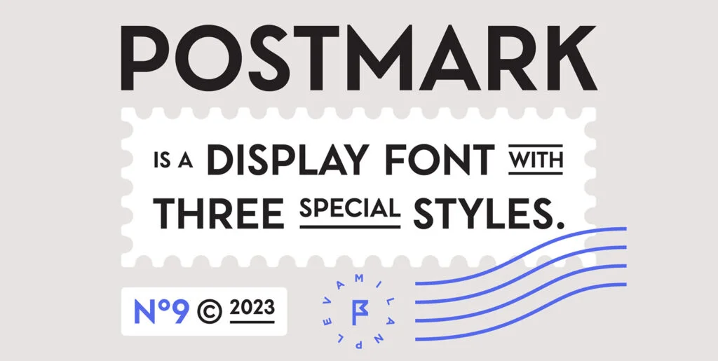
In the realm of typology, fonts play a critical role in visually crafting and curating a brand’s narrative. There is a subtle artistry in choosing the right font, that dictates the essence of your text and complements aesthetic aspirations. One such typographical treasure making headway in graphic and digital design platforms is the Segovia Font; a versatile and efficient font designed for crisply communicating your message.
This sans-serif font, designed specifically for headlines and titles, walks a fine line between readability and aesthetics, ensuring your text is always in focus. Segovia ventures beyond being just a font. It possesses an array of features, such as 364 glyphs incorporating uppercase, lowercase, multilingual, numbers, punctuation, superscript, subscripts, ordinals, and fractions. Stylistic alternates, arrows, and currencies yield an even broader range in functionality, leaving room for customization that a design desires.
Variations and Adaptability
In the true spirit of adaptability, Segovia is furnished with nine diverse weights, and their equivalent italics, making it a highly versatile 18 style typeface. The spectrum runs from the elegant ‘thin’ and ‘extralight’ that grace a page, right up to the commanding ‘black’ that demands attention. With a spread like this, it is an invaluable asset to the discerning graphic designer making quick iterations with varying intents.
Moreover, it doesn’t shy away from embracing diversity. The Segovia Font accommodates a mammoth twenty-five languages. This variety includes- but not limited to- the likes of Afrikaans, Dutch, Finnish, Italian, and Zulu. Thus, it acts as a universal tool that caters to varying cultural contours and regional nuances.
Influence on Creative Projects
The crisp and clean lines of Segovia presents a modern and stylish approach to typography. As typography rules the landscape of graphic design, this font stands at the crossroads of innovation and tradition, creating a strong visual impact. The versatile characteristics of Segovia make it an incredible choice for creative projects, including branding, advertising, digital design, and more.
The alternative glyphs offered by Segovia can prove to be an attractive choice that adds a unique spin to your design. Whether it’s logos, headlines, or short blocks of text, the readability and aesthetic appeal of Segovia are undeniable. It’s not merely a font; it’s a powerful tool to elevate and refine your designs.
In this digital age, a font like Segovia is widely recognized as significant in creating visual identities that resonate with the target audience. For graphic and digital designers looking to leave an indelible mark on their work’s landscape, the Segovia font comes highly recommended. Handpicked for its diversity, functionality, and sheer elegance, it serves as the backbone to amplify your message. The Segovia Font, in essence, is an instrumental asset in the modern world of graphic and digital design.

