Tag: 1800s
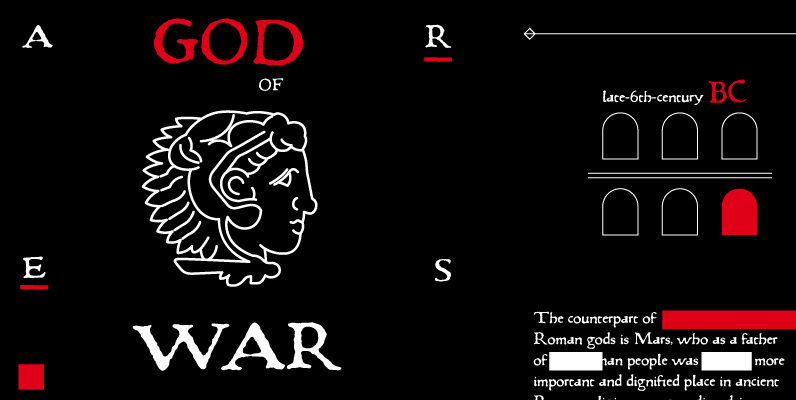
Pannartz Font
I happened to come across a facsimile of a sample of text with typeface made by Sweynheim & Pannartz in 1476. I scanned the sample, and redraw all the available glyphs from the sample in RobFog. After that I added
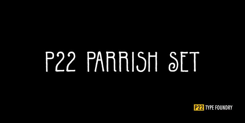
P22 Parrish Set Font
Maxfield Parrish (1870-1966), whose career spanned nearly ninety years, holds a unique place in American art and culture. He was enormously accomplished and successful in both fine art and commercial endeavors. Parrish’s hand-drawn letters were a significant part of his
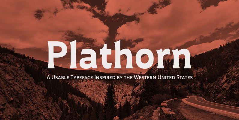
Plathorn Font
That’s right, folks. When the West called, Jeremy Dooley reached up like Pecos Bill, grabbed it by the reins and pulled it in, then using its wide, roaming elements to design this functional font that still has an unbroken spirit
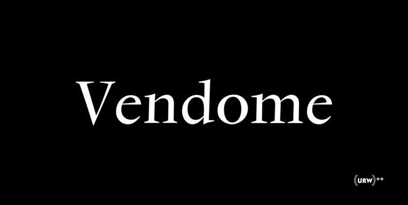
Vendome Font
Designd by Francois Ganeau, Vendome is an intense and sharp serif design. It works great in header uses, and even holds an interesting sense of fashion and style when set in large sizes. Published by URW Type Foundry GmbHDownload Vendome

Bootstrap Font
Broken in but none the worse for wear, Bootstrap and less distressed companion Bootstrap Alternate each have OpenType features that automatically substitute a unique pair of characters when any upper or lower case letter is keyed twice in a row,
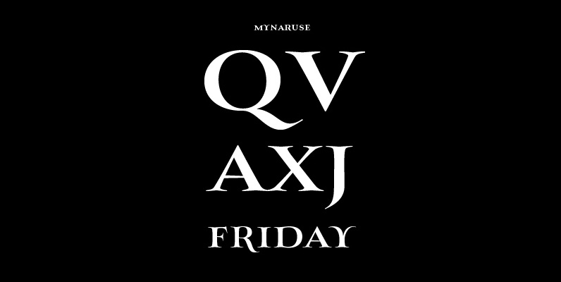
Mynaruse Font
Mynaruse is an elegant and regal roman inscriptional titling family. It has sharp and elongated serifs that give the face extra punch. The face shines in settings that call for elegance and splendor. Mynaruse’s six weights range from a fine,
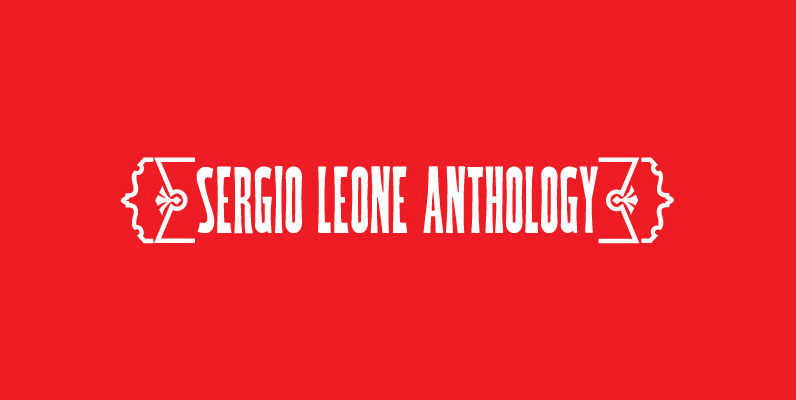
P22 Woodtype Set Font
Based on a rare specimen of an American Wood Types from the late 1800s, this condensed font conjures up 19th Century Americana but offers many potential design possibilities. The small caps font is based on a variation of the same
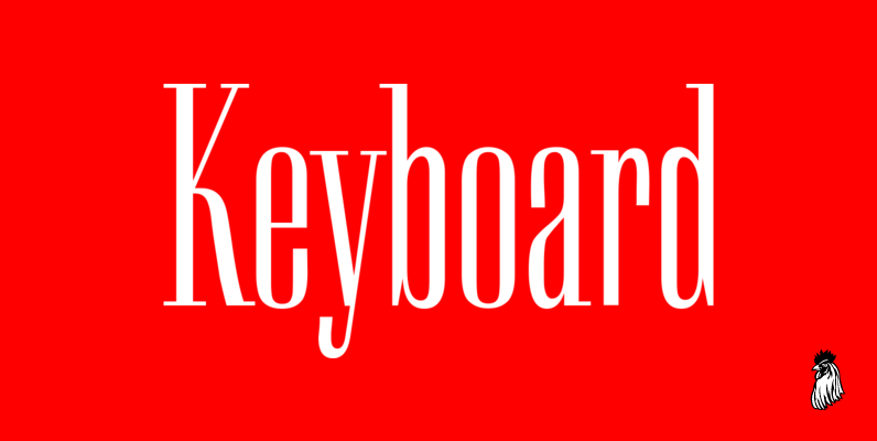
Keyboard Font
Keyboard was designed by Paul Hickson. This elegant serif release is based on the original design, circa 1951. Copyright International TypeFounders, Inc. Published by Red RoosterDownload Keyboard
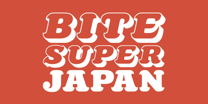
Killernuts Font
Killernuts is a woodtype design with a unique twist on its serifs. The small brush-like serifs were intended to resemble aspects of Japanese calligraphy, a sort of east meets west combination. Published by Dharma TypeDownload Killernuts
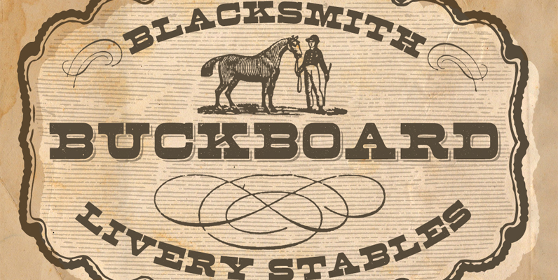
Buckboard Font
Nothing says Wild West like a good ole authentic wood type font with its original patina. The Buckboard fonts have OpenType ligature features that substitute a unique pairing of characters when any letter is keyed twice in a row, as
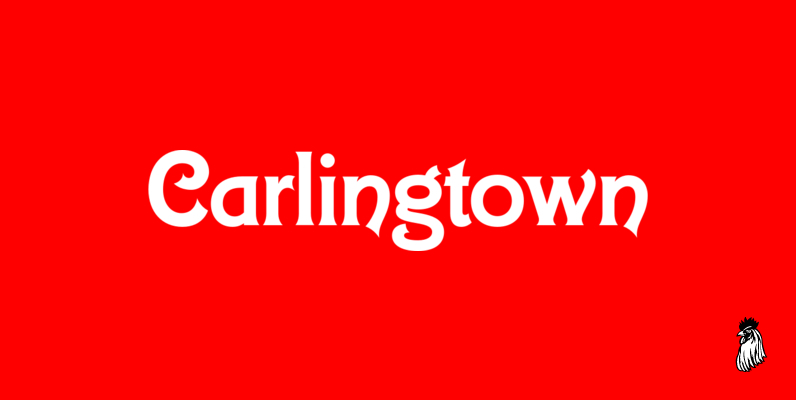
Carlingtown Font
This old victorian typeface was originally called Constantia. Since that name was already in use, we decided on a the new name of Carlingtown. Digitally engineered by Steve Jackaman and Ashley Muir. Published by Red RoosterDownload Carlingtown
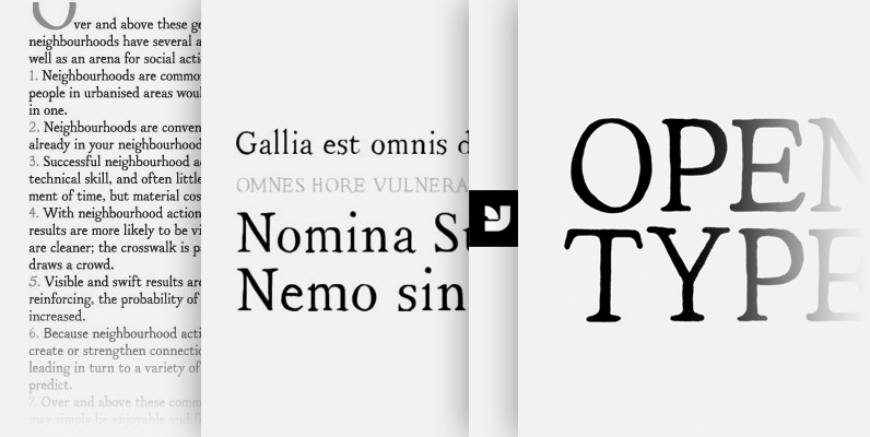
YWFT Neighborhood Font
YWFT Neighborhood is an typeface created by the integration and reinterpretation of 4 families of serifs into one community, one neighborhood, one font. It was originally hand drawn in 2008 by YouWorkForThem, then digitized into opentype format. YWFT Neighborhood contains
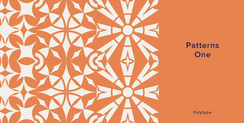
Polytype Patterns One Font
Designed by Karl Nayeri, Polytype Patterns One is a font released for the Prime Graphics Type Collection. Copyright Prime Graphics. Published by Prime GraphicsDownload Polytype Patterns One
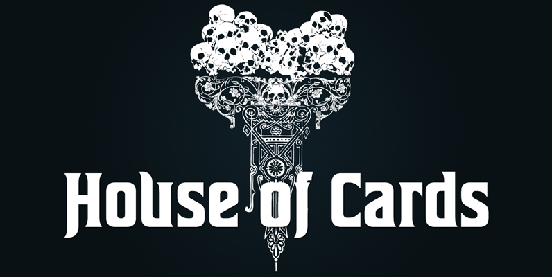
House of Cards Font
House of cards is inspired by and based on retro Hamilton s Teniers typeface which is popular wooden type fonts of the 19th century. To make natural and contemporary impressions the original lowercase design was slightly changed from the original
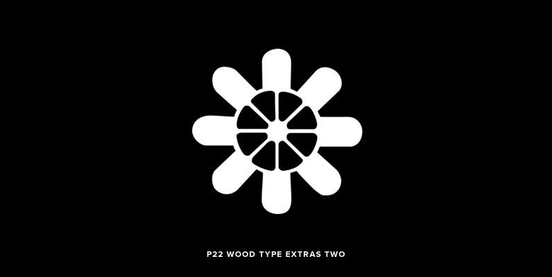
P22 Wood Type Extras Two Font
A dingbat design based on 19th Century American wooden printing types. Published by P22 Type FoundryDownload P22 Wood Type Extras Two
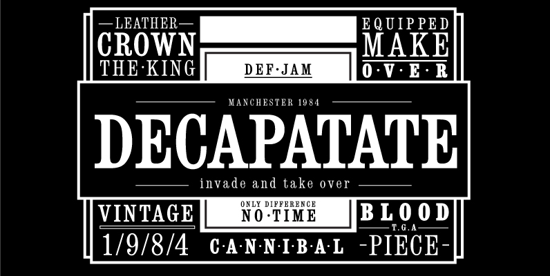
Consort Font
Designed by Steve Jackaman, Consort is a serif design based on the original Stephenson Blake typeface design. Published by Red RoosterDownload Consort
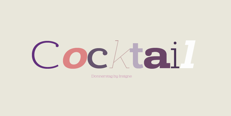
Donnerstag Font
Donnerstag is an extended slab serif and a new companion to insigne’s Montag, Dienstag and Mittwoch typefaces. Donnerstag conveys power and personality with its strong slab letterforms and ball terminals. Donnerstag’s seven different weights give it a great deal of
