Tag: 1920s
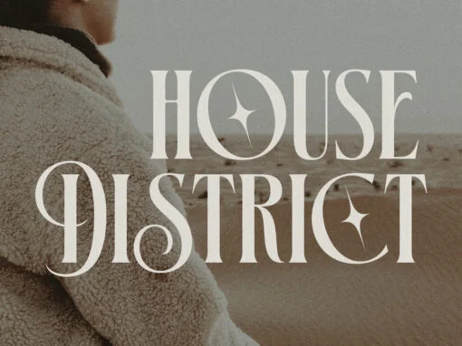
House District Font
As digital designers on the cutting edge of what’s new and novel in the world of graphic design, new tools and assets are needed to inspire and facilitate your innovation. In this fast-paced, ever-evolving industry, standout design resources can play
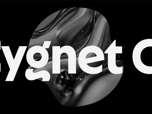
Cygnet CF Font
Cygnet CF charms with classic warmth and curious verve. An absurdly generous x-height makes this surprisingly readable and versatile display typeface perfect for headlines, captions, logos, and more. Nine weights plus italics grant a wide range of applications and moods,
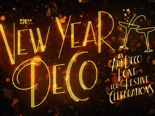
New Year Deco Font
Raise a glass to the New Year with this elegant, vintage inspired Art Deco header font. This first edition of New Year Deco is the introduction to an experimental design that I hope will evolve into the ultimate in Art
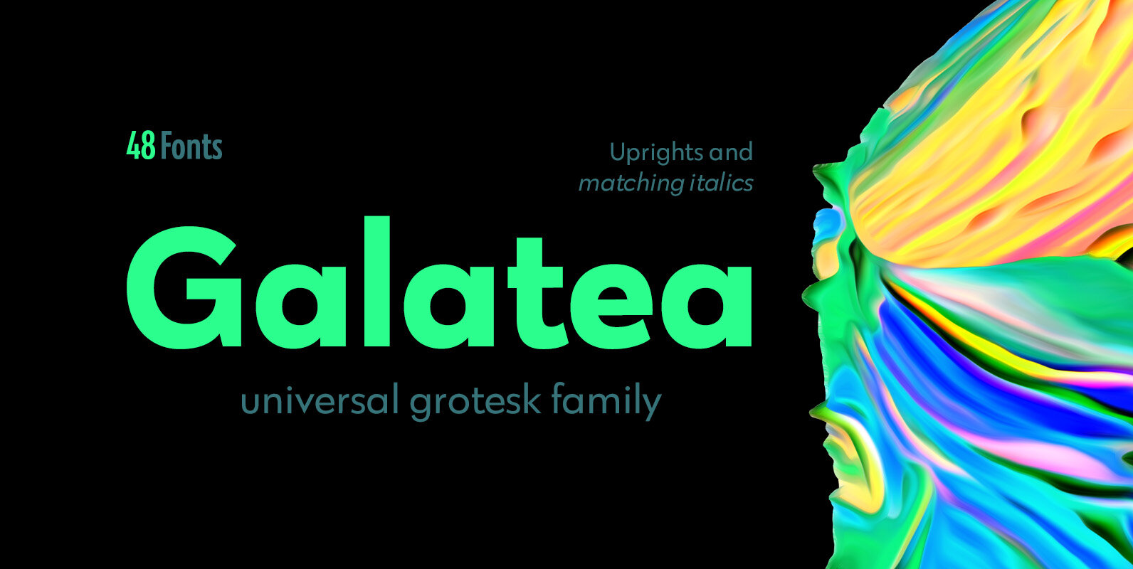
Galatea Font
Galatea is a universal sans serif family – clean and timeless. Both iconic and legible, Galatea is suited to cover many needs from brand identities to editorial design, advertising, logos and beyond. Cyrillic characters are featured and a wide range
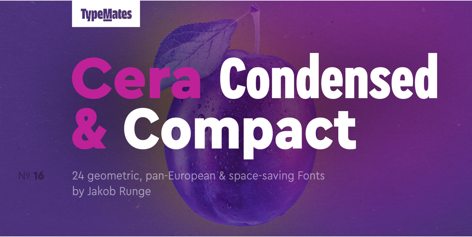
Cera Condensed Pro Font
The pan-European Cera Collection is driven by pure geometry and contains the bestselling Cera, its stenciled counterpart Cera Stencil, Cera Condensed, the hand-crafted display Cera Brush and the soft Cera Round. Developed for the narrow reading environments of mobile devices,
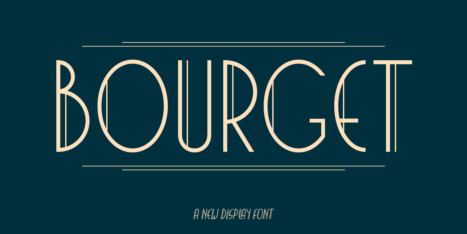
Bourget Font
Bourget is a Display-Sans, which is inspired by the Art Déco Typography of the 1920´s, 1930´s years. It has a very characteristic and unique style by its thin line through every letter. The upright and italic versions have each 750+
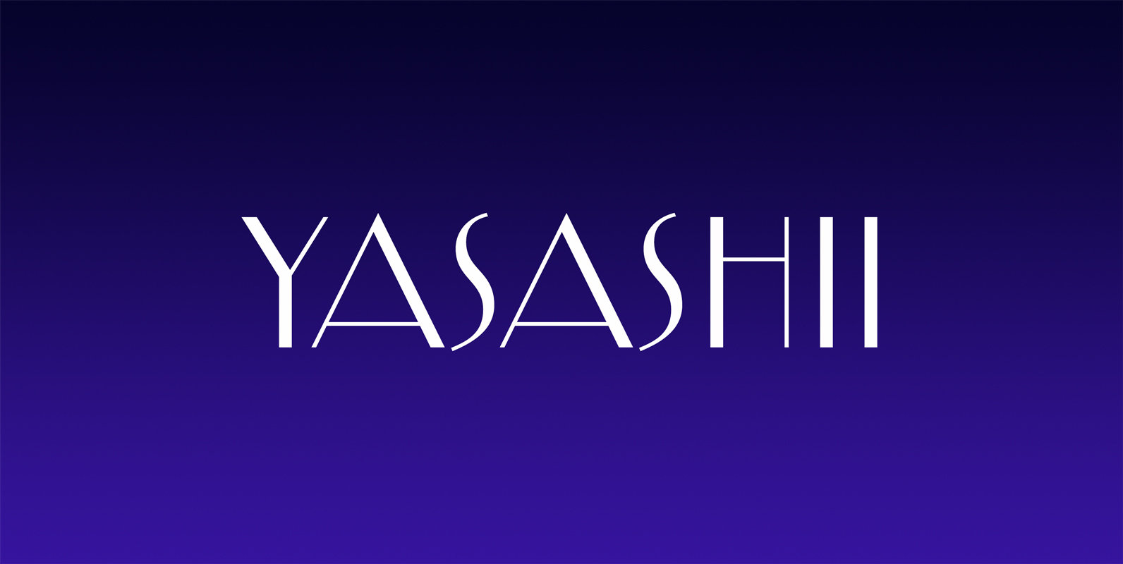
Yasashii Font
Inspired by Japanese cosmetic packaging from the early 1900’s, Yasashii makes for a beautiful Art Deco themed typeface. It’s thin lines and elegant curves even make it a perfect type choice for fashion projects of today. Published by Dharma TypeDownload
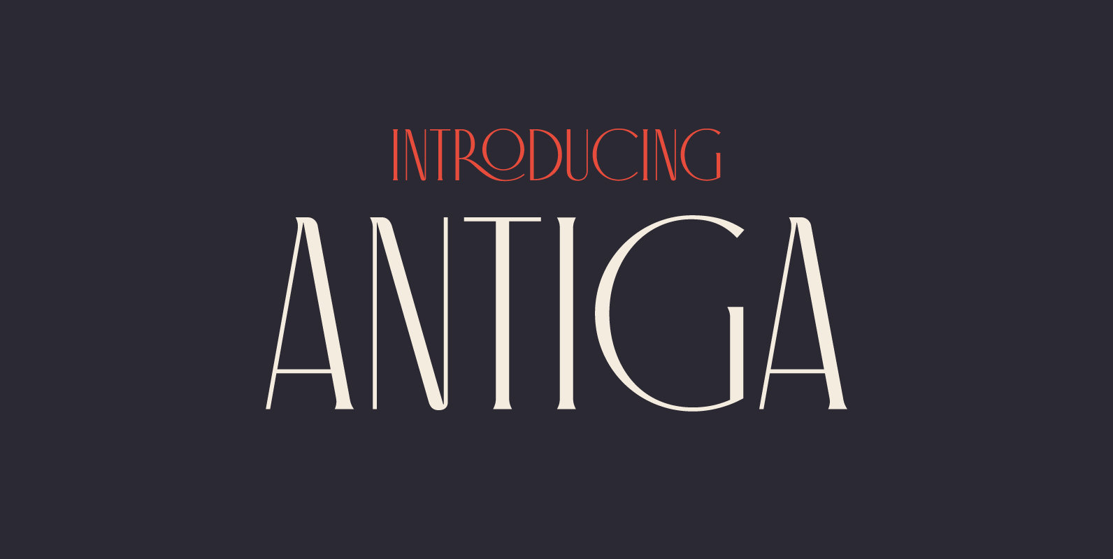
Antiga Font
What happens when Roman and Art Nouveau heritage get together? Antiga happens. Combining an old style typeface with an elegant and modern touch, Antiga is ideal for magazines and newspaper headlines, or even book covers! With a delightful and versatile
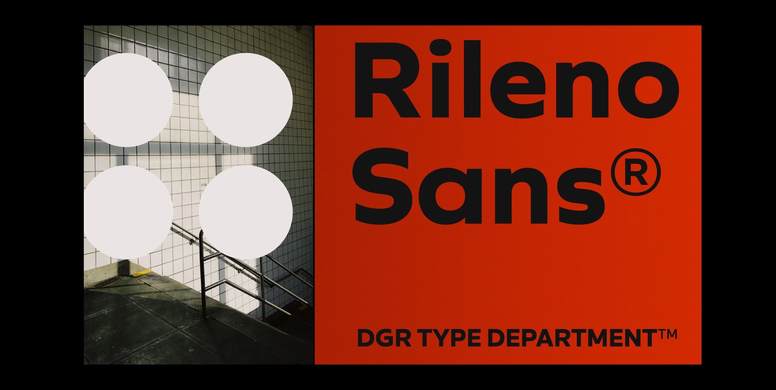
Rileno Sans Font
Rileno Sans is contemporary typeface with geometric forms and strong personality. It is constructed in a geometric manner and inspired by the constructivist typefaces of the 1920’s with a humanistic quality. It comes in 6 weights, 6 uprights and its
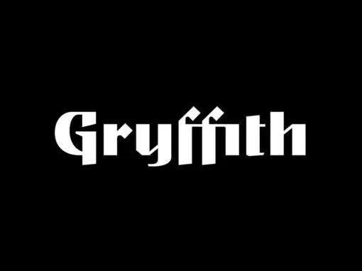
Gryffith CF Font
Gryffith is a display typeface blending a wide range of influences from medieval calligraphy to art deco lettering to high technology. Strange, captivating, and elegant, Gryffith is especially useful for logos, headlines, posters, and artwork. The typeface is based on

JT Marnie Font
The design is influenced by the geometric style sans serif faces which were popular during the 1920s and 30s. The JT Marnie font family is well suited for headlines and small blocks of text, particularly in advertising and packaging. Published
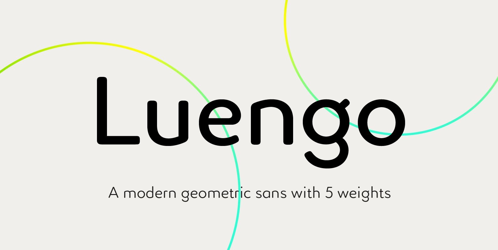
Luengo Font
Luengo is a modern geometric sans serif font family. Rounded corners give a natural and overall home-felt feel with an accessible air and an elegant touch. Luengo is for display purpose, but it also looks great in longer copy, making
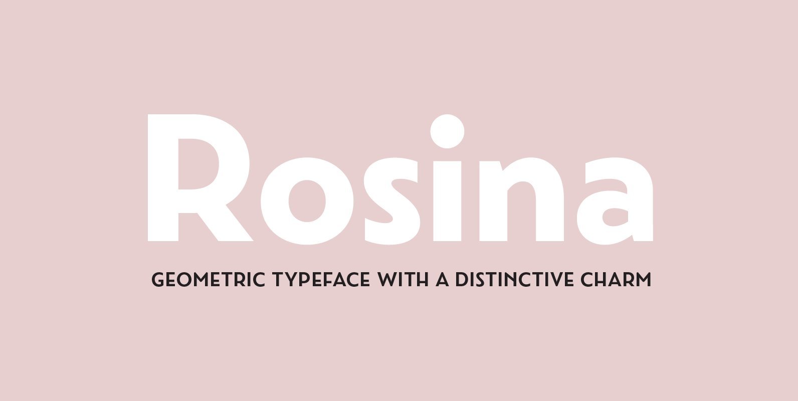
Rosina Font
Rosina is a geometric typeface with a distinctive charm. With a captivating fusion of dashing 1920s style and 21st Century sensibility, geometric forms have been taken and optically adjusted to create a sturdy typeface. Tall ascenders and descenders attempt to
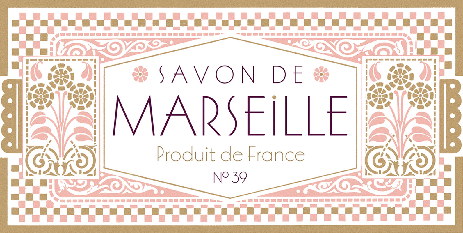
Marseille Font
Marseille is an Art Deco-inspired typeface which is based on Louise Fili’s iconic cover design for the hauntingly beautiful Marguerite Duras novel, The Lover. The font is available in six irresistible weights: thin, light, regular, medium, semibold, and bold. Each
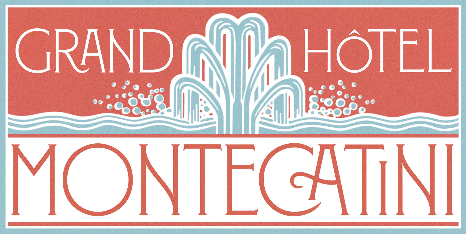
Montecatini Font
Montecatini Pro takes its cues from the elegant Stile Liberty travel posters of Italy in the early 1900s. In its successful first release by Louise Fili Ltd in 2017, the typeface introduced distinctive ligatures typical of the time when Art
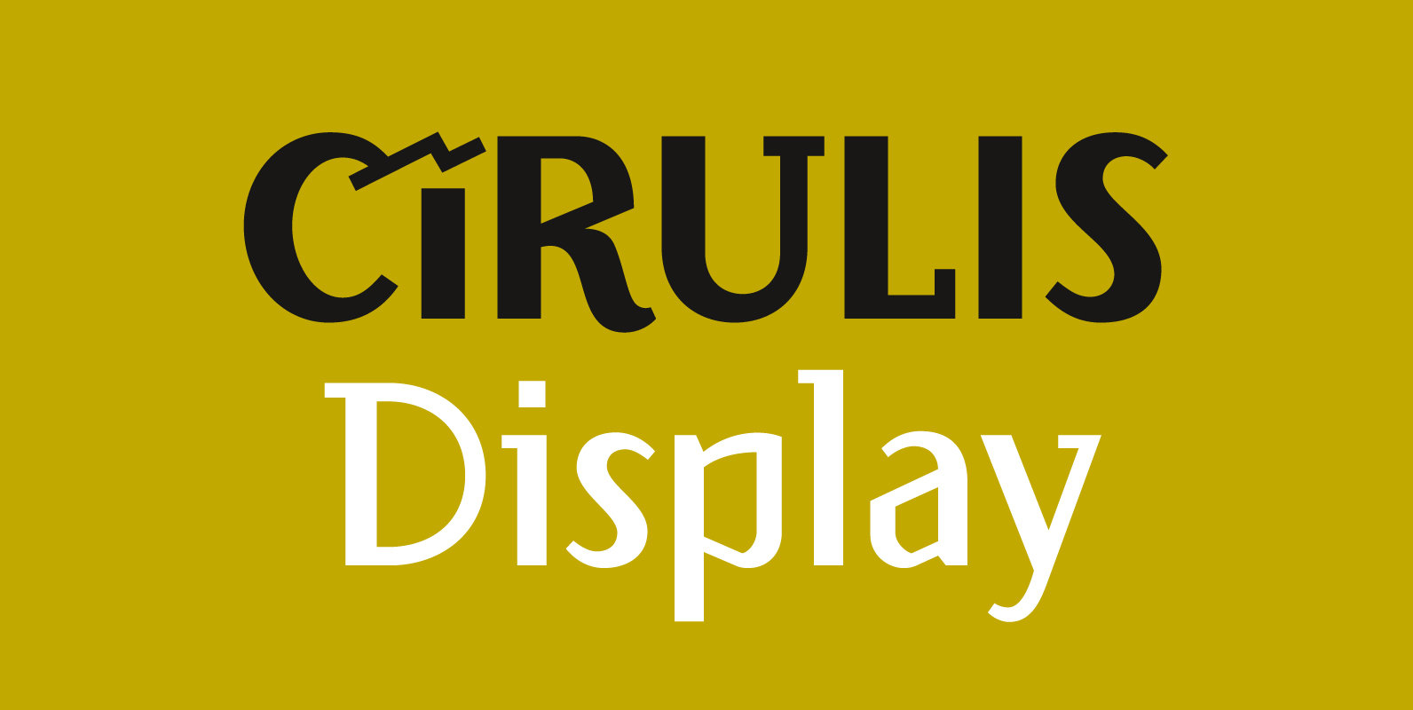
Cirulis Display Font
Designed and published by Asketic, Cirulis is a display sans family of two weights. Ansis Cīrulis (1883-1942) was one of the first Eastern European designers. The artist’s heritage is characterized by letters with asymmetric widths, sliced cuts and various intrinsic
