Tag: 1940s
Packard Font
Designed by Steve Jackaman & Ashley Muir. Packard Old Style is based on lettering drawn by Oswald Cooper for the Packard Motor Company (ATF 1913). The bold weight is credited to Morris Fuller Benton (ATF 1916), but it is highly
Byron Font
Designed by A. Pat Hickson, Byron is a script font based on a turn of the century design. Published by Red RoosterDownload Byron
URW Akropolis Font
The design of this display face is based on the hot metal typeface Acropolis, issued by the German type foundry Ludwig Wagner in Leipzig in 1940. To further increase its usefulness a Cyrillic was added to it: URW Akropolis, redrawn
Steak Font
Here I am, once again digging up 60-year sign lettering and trying to reconcile it with the typography of my own time. The truth is I’ve had this particular Alf Becker alphabet in my sights for a few years now.
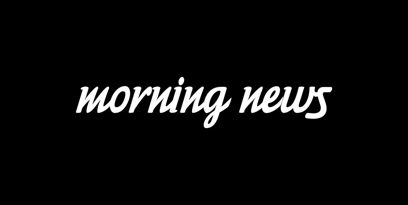
Morning News Font
“Morning News” is the sister font of “Evening News” which I designed some years ago for use with my local newspaper “Abendzeitung”. “Morning News” is an adaption, a little bit rounder, which gives the font a much softer touch. The
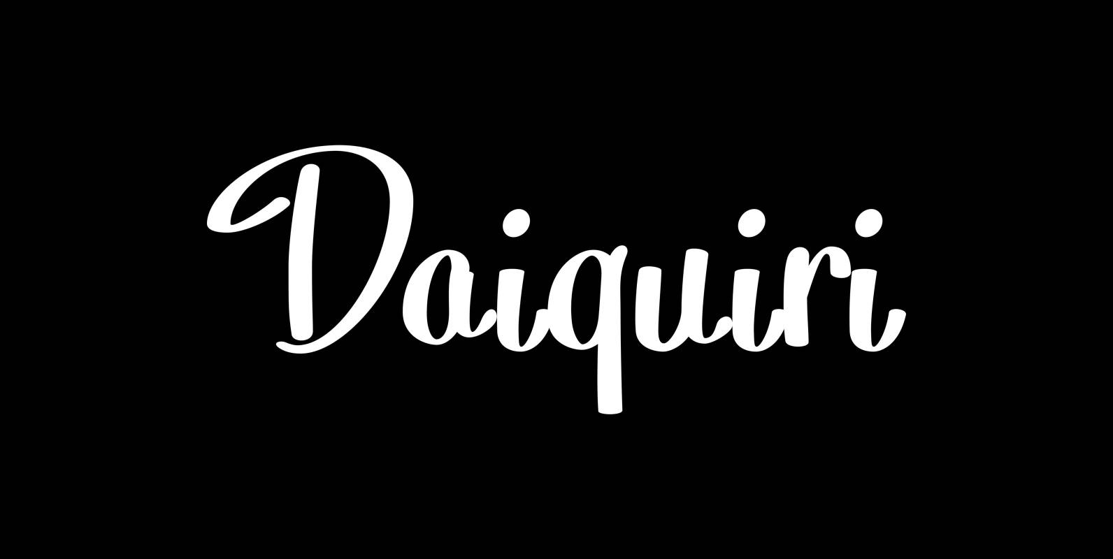
Daiquiri Font
“Daiquiri” is a revival of a handlettered font in two weights, from an ad for Puerto Rico Rum dating back to the forties or fifties. I found the ad on a French antique market on my last visit for Mardi
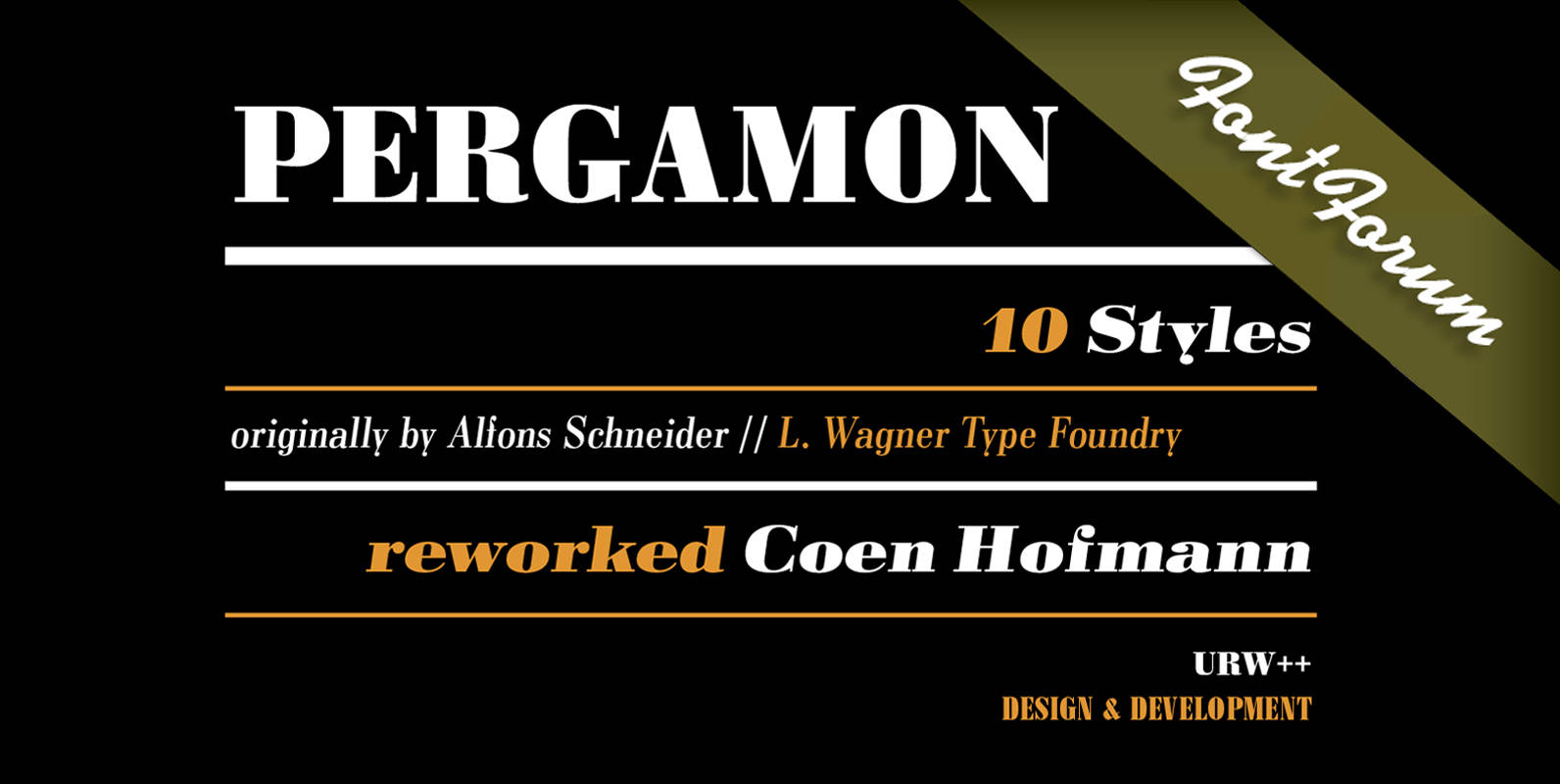
Pergamon Font
The Pergamon series is a creation of Alfons Schneider (1890–1946) and was issued by the foundry of Ludwig Wagner in Leipzig in 1937/1940, though the website of the Klingspor-Museum says that several of the faces were probably produced after the
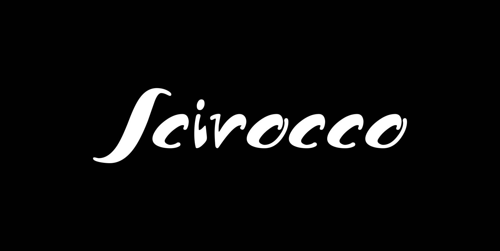
Scirocco Font
“Scirocco” is a hot and humid wind that blows from the Sahara over to France and Italy. It crosses the mediterranean sea and carries lots of fine desertdust with it. Once it hits the costs of Provençe one can feel
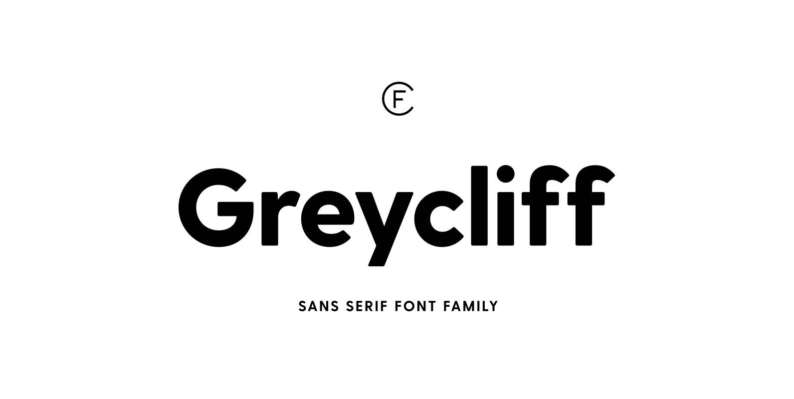
Greycliff CF Font
Rugged, hearty, and warm, Greycliff© CF is a versatile font family. Strong capitals and a smooth, open lowercase are effective in a variety of applications. The geometric, near-monoline construction lends Greycliff a classic durability, tempered by softened edges and vibrant
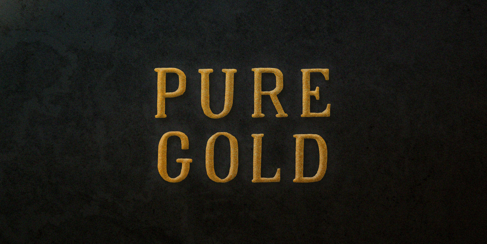
Pure Gold Font
With his henchmen pressed back by the mob into the inner sanctum of his estate, Chas Moneyton took to the roof. He was running out of options. Dropping his duffel bags with a clank from his enormous yet soft hands
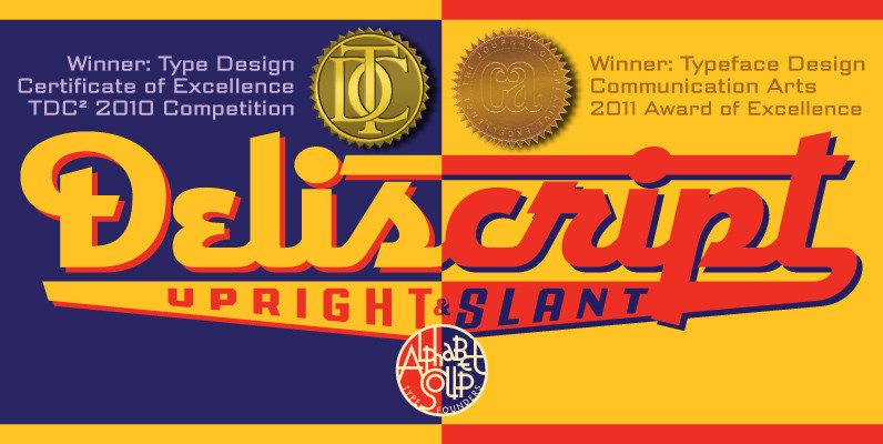
Deliscript Font
Although initially inspired by the neon sign in front of Canters Delicatessen in Los Angeles, the design of Deliscript Upright and Deliscript Slant soon took on a life of its own and its own distinctive look. Like its sibling Metroscript,
Archie Font
Archie is a wide attention-grabber based on a simple geometric alphabet drawn in the early 1930s by Dutch calligrapher and lettering artist Martin Meijer. This digital family expands considerably on the original letters, adding biform shapes, small caps, italics across
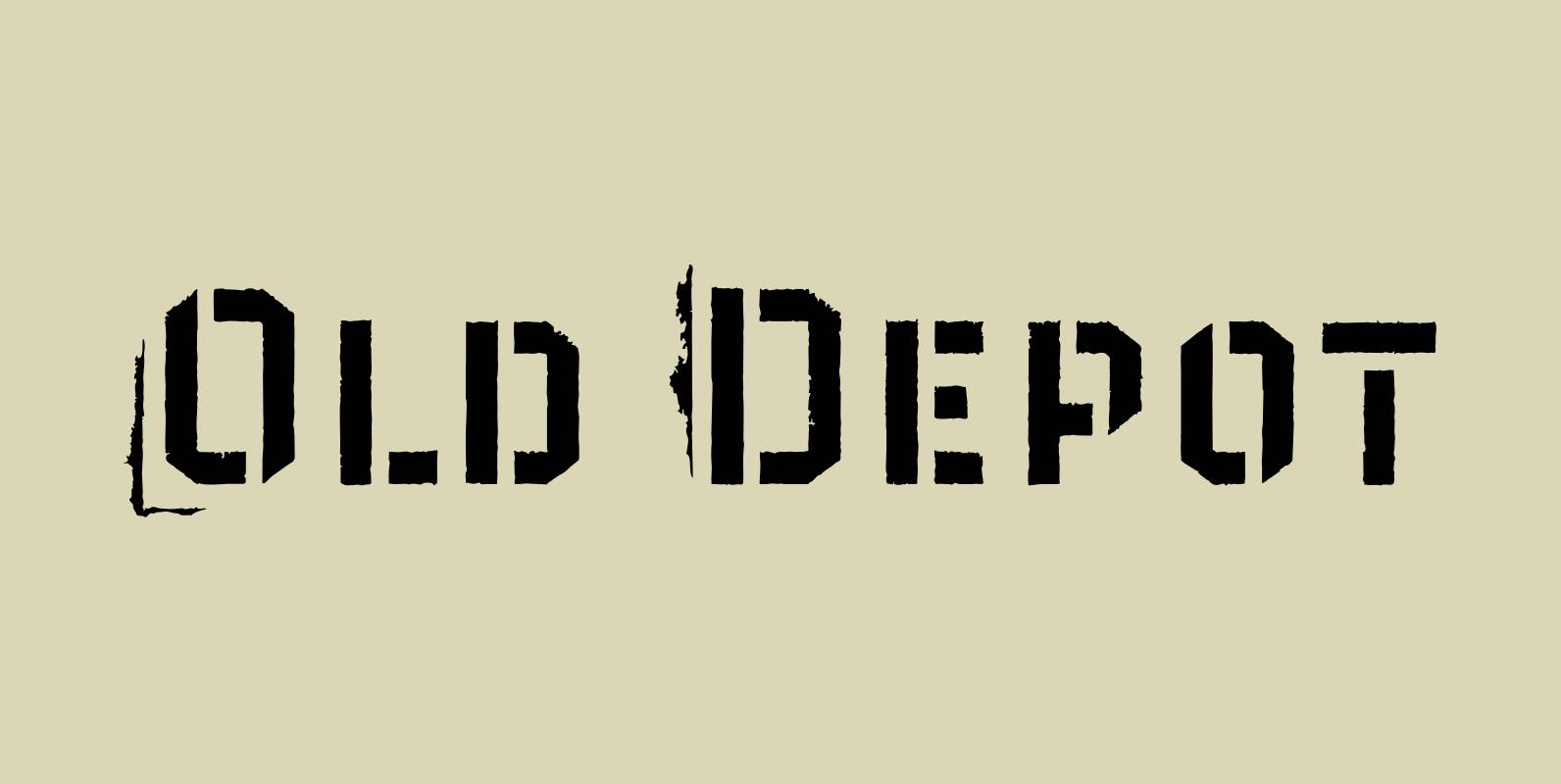
Old Depot Font
Old Depot is a newly reworked idea for the Depot Trapharet 2D font. It supports more languages and is available in more lettering. Old Depot stands out with its industrial nature of archaic spirit. It is a wonderful choice for
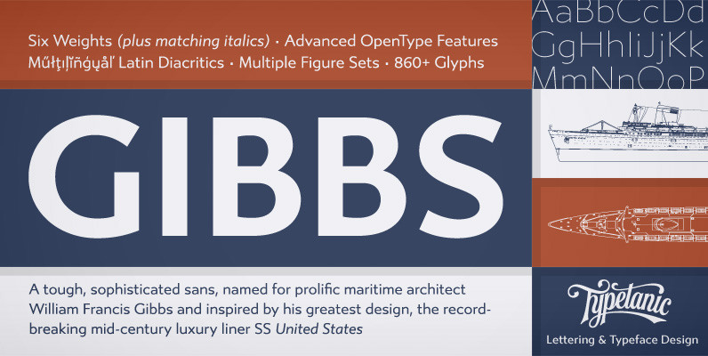
Gibbs Font
Gibbs is a tough, sophisticated sans, named for prolific maritime architect William Francis Gibbs and inspired by his greatest design, the record-breaking mid-century luxury liner SS United States. Taking various cues from the unique cast aluminum signs found on board,
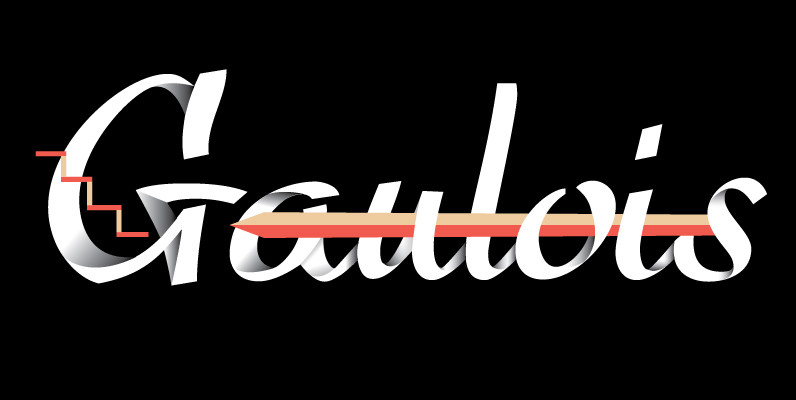
Gaulois Font
A couple of years before the second World War, Marcel Jacno, the popular French graphic designer who in the 1930s designed iconic posters for Gaumont and Paramount and famously illustrated the Gaulish helmet that first adorned the Gauloises cigarette packs
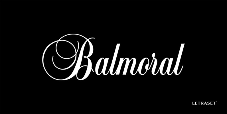
Balmoral Font
An elegant, free-flowing copperplate script style designed by renowned British designer Martin Wait. Generous initial capitals compliment the more restrained lower case letters that join for balanced letter spacing in word settings. Excellent for certificates, citations, diplomas and greeting card