Tag: 1960s
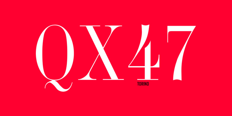
Torino Font
Designed by Edward Benguiat in 1960, Torino is a classic and thin serif release by URW. Contains language support for West, East, Turkish, Baltic, and Romanian. Published by URW Type Foundry GmbHDownload Torino
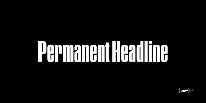
Permanent Headline Font
Designed by Ludwig + Mayer in 1968, Permanent Headline is sans-serif font release by URW. Contains language support for West, East, Turkish, Baltic, and Romanian. Published by URW Type Foundry GmbHDownload Permanent Headline
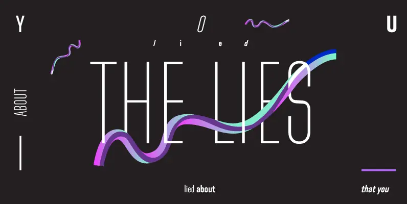
Directors Gothic 230 Font
Handcrafted by Lettering Inc as part of its core library of typefaces in the 1930s, Directors Gothic was dramatically expanded throughout the lifetime of the company and remains a timeless classic. Inspired by the Art Deco movement popular at the
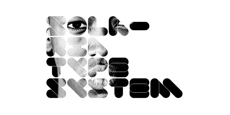
Solaria Font
Solaria is a display typeface in 3 different styles. The aim was to create a retro/futuristic ’60s sci-fi feeling. At first only some letters were made for a logo project. Later it was completed with the missing characters and numbers
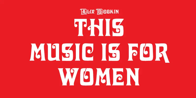
Davida Font
Designed by Louis Minott in 1965, Davida is a beautiful decorative font release by URW. Contains language support for West, East, Turkish, Baltic, and Romanian. Published by URW Type Foundry GmbHDownload Davida
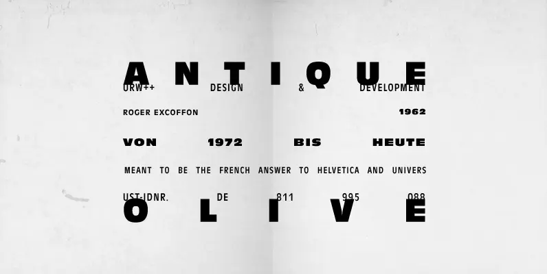
Antique Olive Font
Antique Olive, designed by Roger Excoffon in 1962 for the French Olive type foundry, was meant to be the French answer to Helvetica and Univers. However, the typeface is way too eccentric and distinctive to ever become a rival for
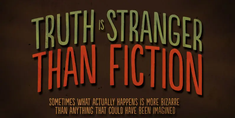
Populaire Font
Populaire is a hand-drawn font that mimics true handcrafted lettering. Counting 4 glyphs for each letter, the laborious kerning table ensures that the glyphs are really exchangeable. Yet, there’s a cool set of ornaments and a kind-of-magic OpenType feature. When
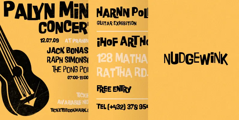
P22 Nudgewink Pro Font
Nudgewink is a funky, all caps typeface with a humorous retro 1960s attitude and a very bouncy baseline in three weights- regular, light and bold. The lower case contains a second set of differently designed caps that can be used
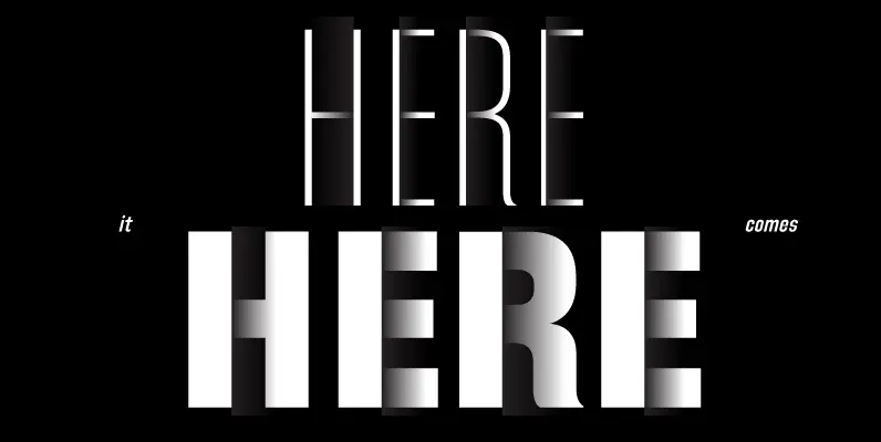
Directors Gothic 240 Font
Handcrafted by Lettering Inc as part of its core library of typefaces in the 1930s, Directors Gothic was dramatically expanded throughout the lifetime of the company and remains a timeless classic. Inspired by the Art Deco movement popular at the
Gabriel Sans Font
Gabriel Sans is a font family inspired by the original Sans Serif fonts of the Transitional age like Futura or Grotesk, but with a modern twist. It is clean, elegant and straight-to-the-point. It has features similar to the font classic
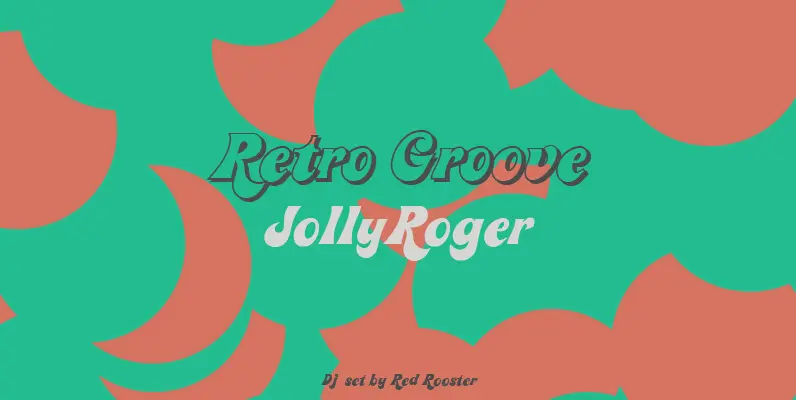
Jolly Roger Font
Steve Jackaman has refined and optimized Jolly Roger for digital release. The original design was created in 1970 by the legendary American type designer Phil Martin, founder and creator of the Alphabet Innovations and TypeSpectra type collections. Although quirky, playful
