Tag: 60s
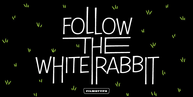
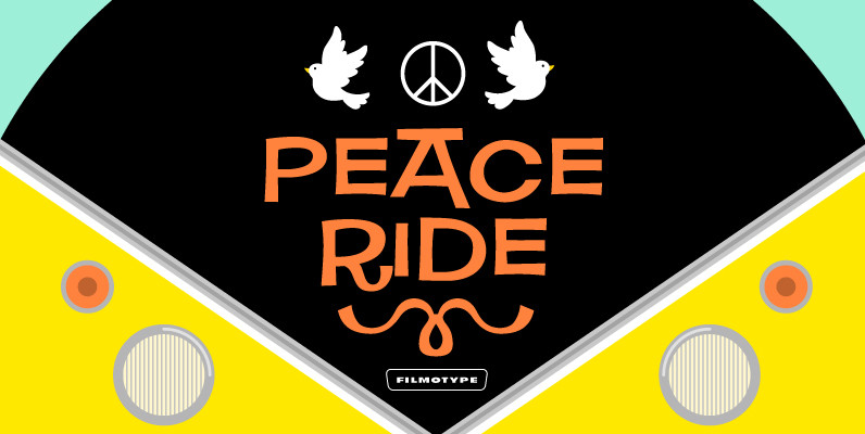
Filmotype Nemo Font
As one of earliest Free Style faces released in the early 1950s by Filmotype, Filmotype Nemo captures the more iconic playful type styles made popular in the early 1950s when a clear message needed to come across as fun to

Bassanova Font
Bassanova is a dynamic display font inspired by lettering on the “Love in the Afternoon” movie poster by Saul Bass. The font captures the minimalistic, yet very distinct look that is so typical for his designs. Bassanova offers four versions
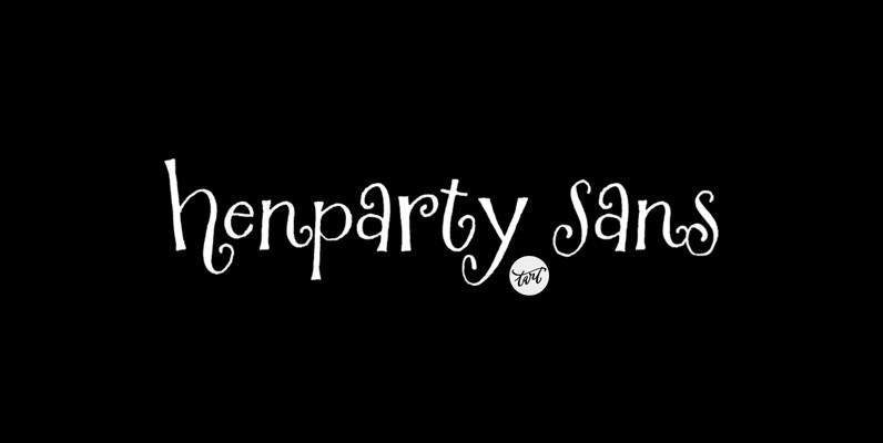
Henparty Sans Font
Originally created by the Tart Workshop’s own Crystal Kluge as a logo for an online tea store for chicks, Henparty Serif and Henparty Sans are sure to delight! These fonts are perfect for baby announcements, giftware, any creative kid projects,
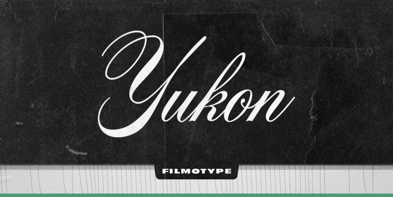
Filmotype Yukon Font
Filmotype Yukon is inspired by the classic Palmer style of penmanship made popular in the late 19th and early 20th centuries. Originally released in the late 1950s, Filmotype Yukon has been meticulously redrawn from the original font filmstrips and has
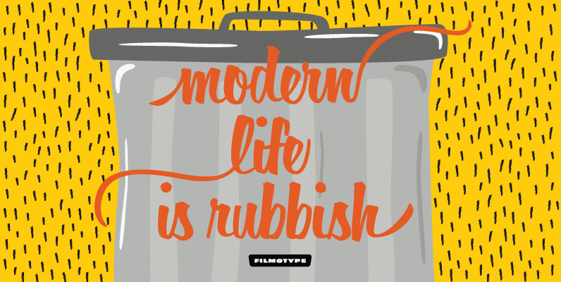
Filmotype Horizon Font
Filmotype Horizon was among the company’s earliest brush lettered casuals and was Introduced by Filmotype in the early-to-mid 1950s. This playful script was among Filmotype’s most popular brush script style typefaces.Filmotype Horizon was developed from the original font filmstrips and
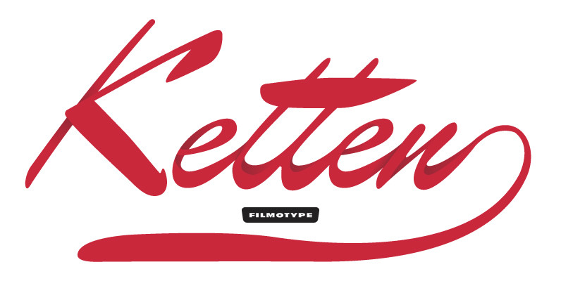
Filmotype Kitten Font
Filmotype Kitten followed in the footsteps of Filmotype Ledger as a high-style connecting script with strong contrasting thick and thin strokes to create an elegant hand-lettered look which found the height of its popularity in the mid-to-late 1950s. This style
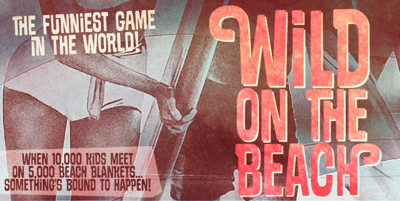
Sundowners Font
Sundowners is a smiley face. It is a versatile font, with a pocketful of cool interlocking glyphs for those days of groovier moods. It also brings a handful of amusing initial and terminal forms and a couple of ornaments. That
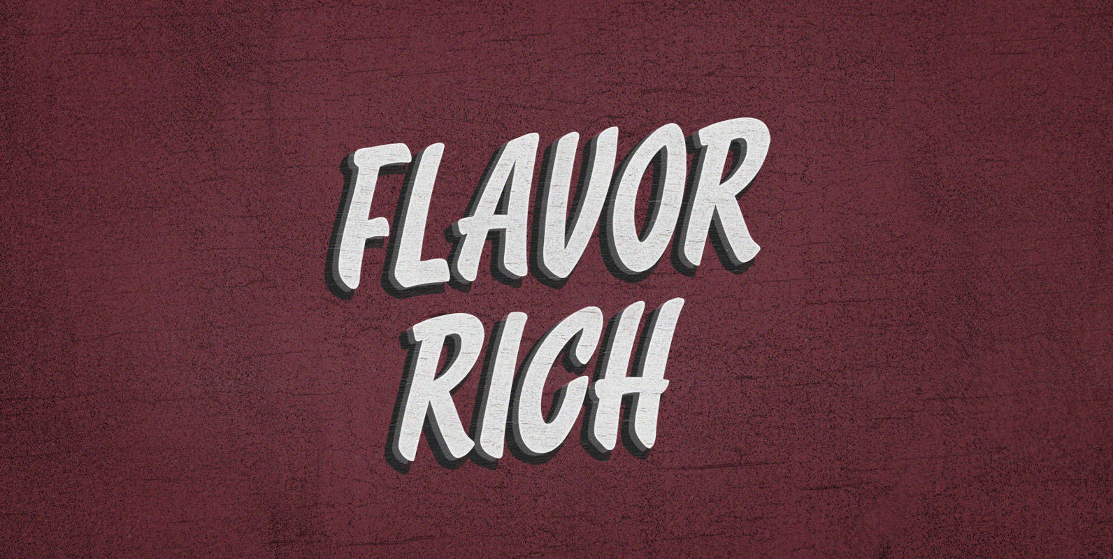
Flavor Rich Font
Juan grows coffee but he never drinks it. He never had much use for the plant, anyway: the real money–or stimulants at least–are in coca. For all the good your Flavor Rich cup does him, there’s nothing like being caught
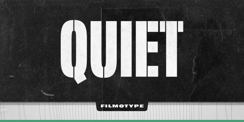
Filmotype Quiet Font
Initially designed in the early-to-mid 1950s, Filmotype Quiet was among the first of its Novelty font designs. Remastered and expanded from the original source, Filmotype Quiet includes a full international character compliment, automatic fractionals, ordinals, and a suite of period
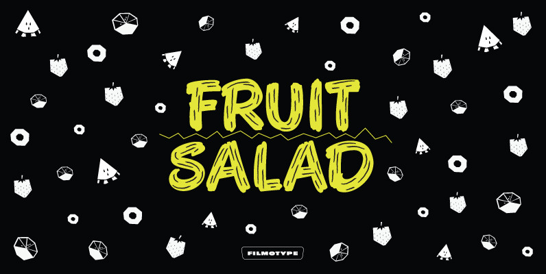
Filmotype Austin Font
Filmotype Austin was among the companies first brush lettered casuals and was Introduced by Filmotype in the early 1950s, it perfectly captures the mid-century playfulness of paint brush sho-card lettering while providing comfortable readability. Filmotype Austin was developed from the
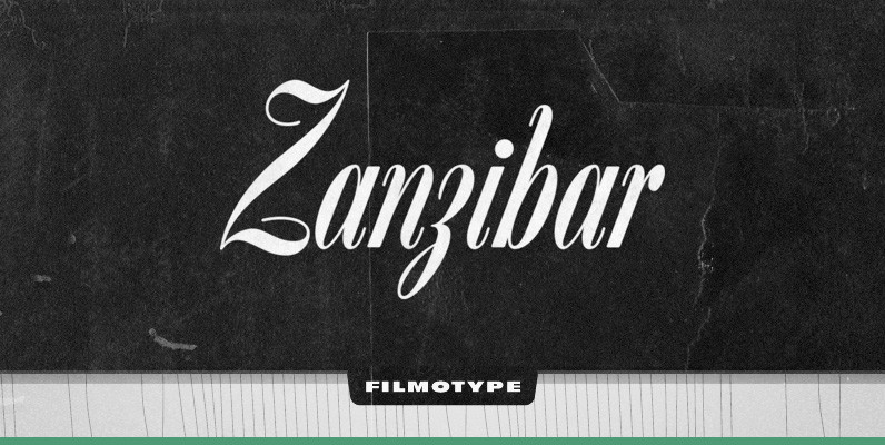
Filmotype Zanzibar Font
Strikingly poised and almost as exotic as it sounds, Filmotype Zanzibar is among Filmotype’s most amazing and beautiful formal scripts released. This hidden gem from the early 1950s has been meticulously redrawn from the original font filmstrips and has been
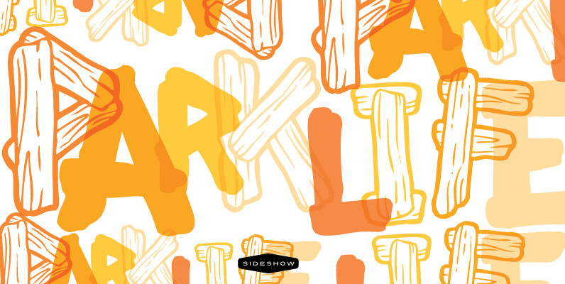
Beachcomber Font
When we last left our shipwrecked pal Squid, he was gathering driftwood planks for firewood. But fate would soon intervene. As the roar of an approaching airplane grew louder, he scrambled to arrange the planks to form a distress signal.
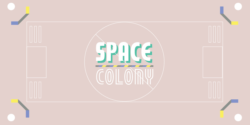
Timbre Font
Timbre is a retro and decorative sans originally designed by Phil Martin. Timbre works well in retro and or sports themed design projects. Published by URW Type Foundry GmbHDownload Timbre
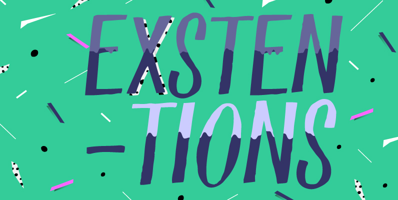
Ramparts Family Font
…o’er the ramparts we watched, were so gallantly streaming… How many times have you sung this refrain only to wonder, “What the hell are RAMPARTS?” Accessories for a ‘73 Dodge pickup? Mutton from a 4-legged critter? No sir! They’re 2
