Tag: 70s
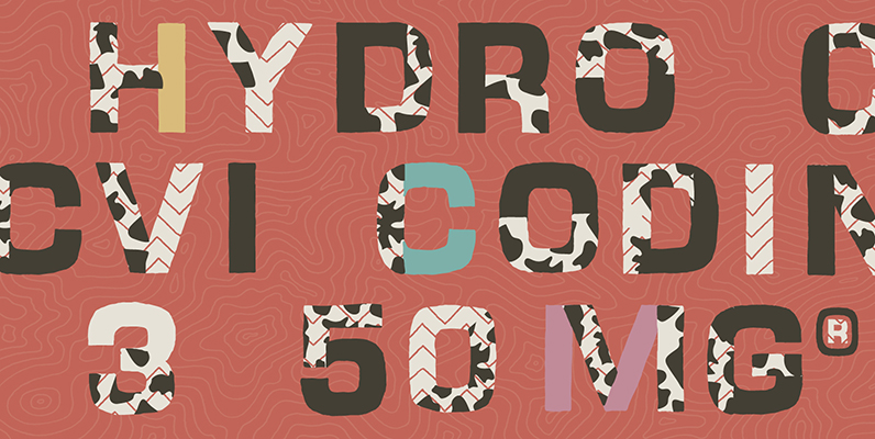
YWFT Yoke Font
A yoke is the “old-world” slang for twin, or double, or duplex, since it turned two oxen from independent operators into a powerful two-ox team. And if you ever plowed a ten-acre bean field by hand, you know how important

Serifa Font
Serifa is a slab-serif design originally designed by Adrian Frutiger in 1967. In this modern revival, URW brings the best version available by offering an extensive 16 weight family, including one amazing stencil option. Published by URW Type Foundry GmbHDownload

Tummy Font
Tummy is part of the Game font set I made few years back; this one is for game packaging and logo design. Published by Suomi Type FoundryDownload Tummy
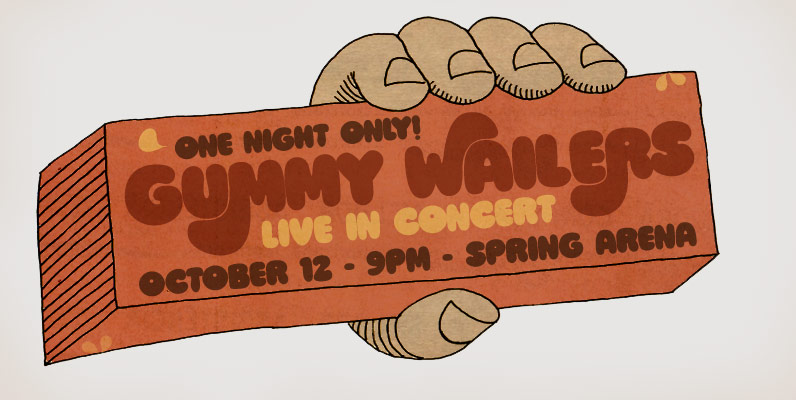
Ziclets Font
A fresh font for juicy designs and psychedelic minds, gorgeously seasoned with yummy opentype features! Published by PintassilgoPrintsDownload Ziclets
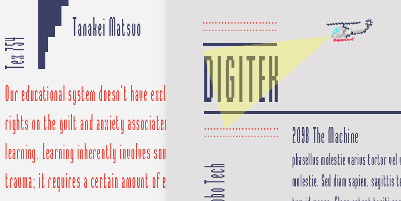
Digitek Font
This futuristic looking typeface was inspired by the appearance of coarse resolution computer bitmap output. Because it is condensed, Digitek is most effective in large headline applications with wide letter and word spacing. An excellent choice where a computer or
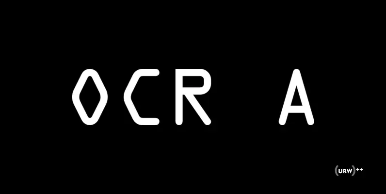
OCR A Font
In the early days of computer optical character recognition, there was a need for a font that could be recognized by the computers of that day, and by humans. The resulting compromise was the OCR-A font, which used simple, thick

Chromium One Font
This typeface creates a strong, highly polished chromium impression as its name implies and was originally inspired by airbrush technique. A highly stylized and unusual display face that can be used across a variety of commercial applications. Created by the
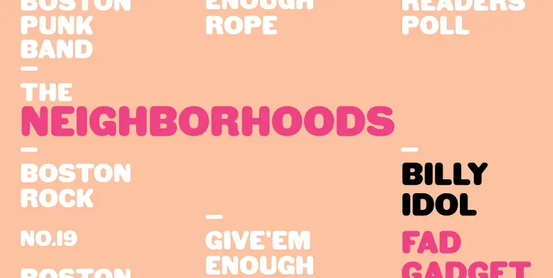
HWT Gothic Round Font
Gothic Round was first introduced as wood type by the George Nesbitt Co. in 1838. The font is a softened variation of a standard heavy Gothic typeface. The style evokes a much more recent history of the 1960s and 70s
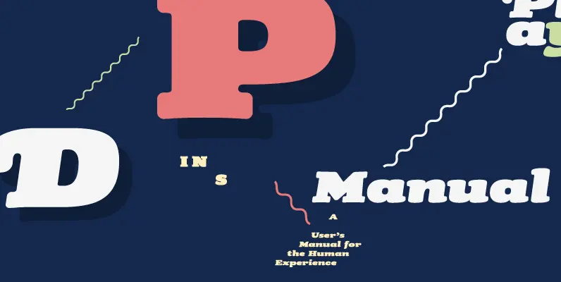
Tubby Font
Tubby came about when I made a book with Cooper Black as a headline font. I started playing with heavy forms, and as a result was Tubby. It has a fat and friendly feel, and with swash italics it is