Tag: advertising

Matcha Font
We decided to explore the concept of fitness, but from a more natural perspective. With so many people drinking detox drinks and eating raw food, we were inspired to create a font that mixes the ‘strength’ of sports and the

The Hipton Font
Introducing new layered font family it’s call the Hipton. Inspired from single stroke gothic letter of sign painting and make it layered. This is collection of type with a layered type system, many possibilities combination and options. As a display

TT Corals Font
TT Corals is a modern humanistic sans-serif which has many typical traits of the beginning of the 20th century. For an increased functionality of the font family we’ve created 6 typefaces of various weights: Thin, Light, Regular, Bold, Extrabold, Black.

Cozza Font
The inspiration for the design of the font Cozza was Unitra Letraset from the 80s. Dry transfer lettering was used by architects from Poland and Czech Republic. Font Cozza, for each character has three alternative characters with their automatic replacement.

Pret a Porter Font
Prêt-à-porter is a project developed as part of a series of type experiments appearing on the blog ‘Letritas’. Prêt-à-porter is a very expressive friendly font with a handwritten look, smooth curves and strong identity. Its counterforms make it a carefree,

SmytheSans Pro Font
SmytheSans Pro is a contemporary workhorse sans serif family that is eminently readable on-screen and in print. It is an updated version of our popular family Smythe Sans—we extended the characters sets, redrew most of the characters, rigorously spaced and

Gerlach Sans Font
As the foundry’s new flagship family, Gerlach Sans was named after the highest peak in Slovakia. Its functional design is enhanced by a few subtle ingredients, adding life and giving words a more playful voice. The family has eight weights

Scrans Font
Scrans (Script + Sans) is a modern script family that gets both, conceptual and formal elements, from classic rational and geometric styles. It’s main purpose is to make the difference in an innovative manner. In other words, you can use

Steak Font
Here I am, once again digging up 60-year sign lettering and trying to reconcile it with the typography of my own time. The truth is I’ve had this particular Alf Becker alphabet in my sights for a few years now.

Latina Font
Latina is our first humanist typeface designed for use in continuous text. This font is based on calligraphy, but calligraphic features have been changed in order to make Latina a more neutral font. This prevents readers from losing their focus

Canilari Font
Canilari is a post-modern type family inspired by contemporary serif typefaces. Its intense and consistent personality makes it a functional font for a wide range of uses: from continuous text in the most challenging environments to pithy, high-impact headlines. The

Gineso Font
Michaelangelo. da Vinci. Bellini. Rafael. Masters of Italian art whose names have dwarfed those of many other great Italian artists. Yet relics from these other artists remain, though often unnoticed because of their practical nature. These unknowns are the Italian

Dyane Font
Dyane is based on monolinear scripts from the Bauhaus time. But it is very special for its counter strokes in the lowercase letters a, h, m and n that gives the script a very distinct rhythm. Published by Wiescher DesignDownload

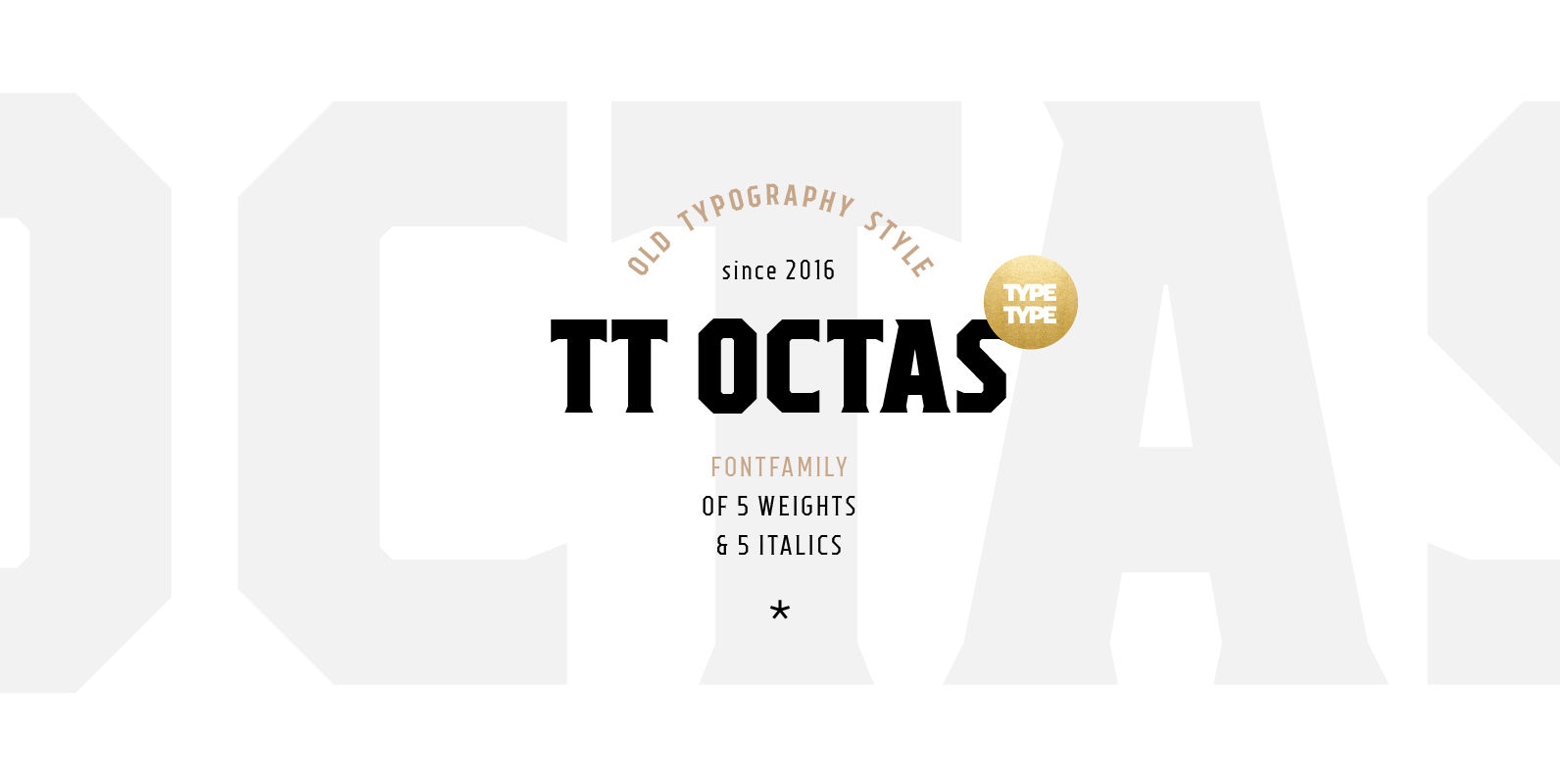
TT Octas Font
TT Octas is a narrowly proportioned font family built upon the principle of octagonal forms: all circles in this font family are actually octagons. Thanks to small serifs, TT Octas has a saturated and vintage character to it. Simple depiction


