Tag: advertising
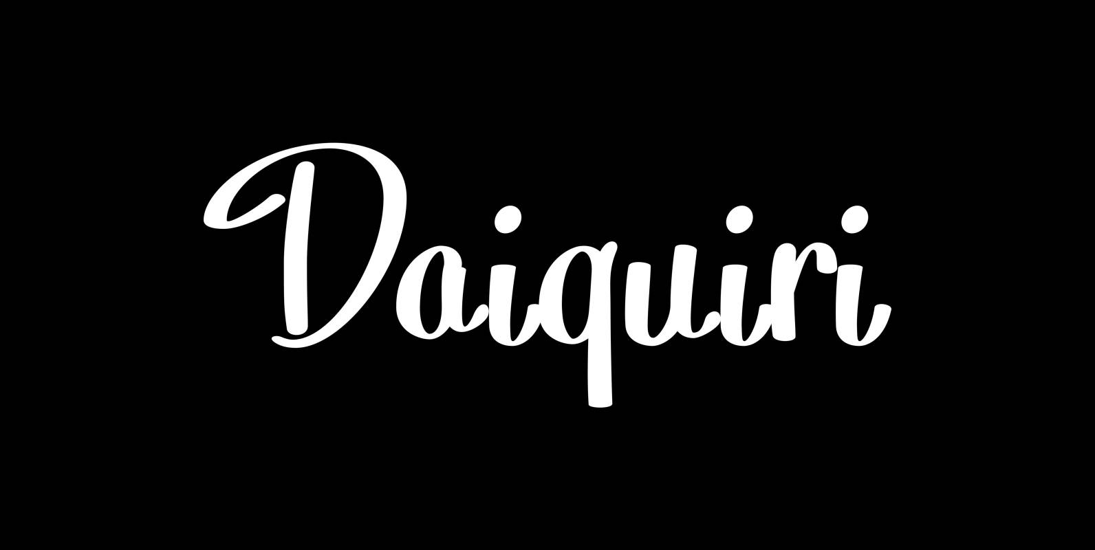
Daiquiri Font
“Daiquiri” is a revival of a handlettered font in two weights, from an ad for Puerto Rico Rum dating back to the forties or fifties. I found the ad on a French antique market on my last visit for Mardi
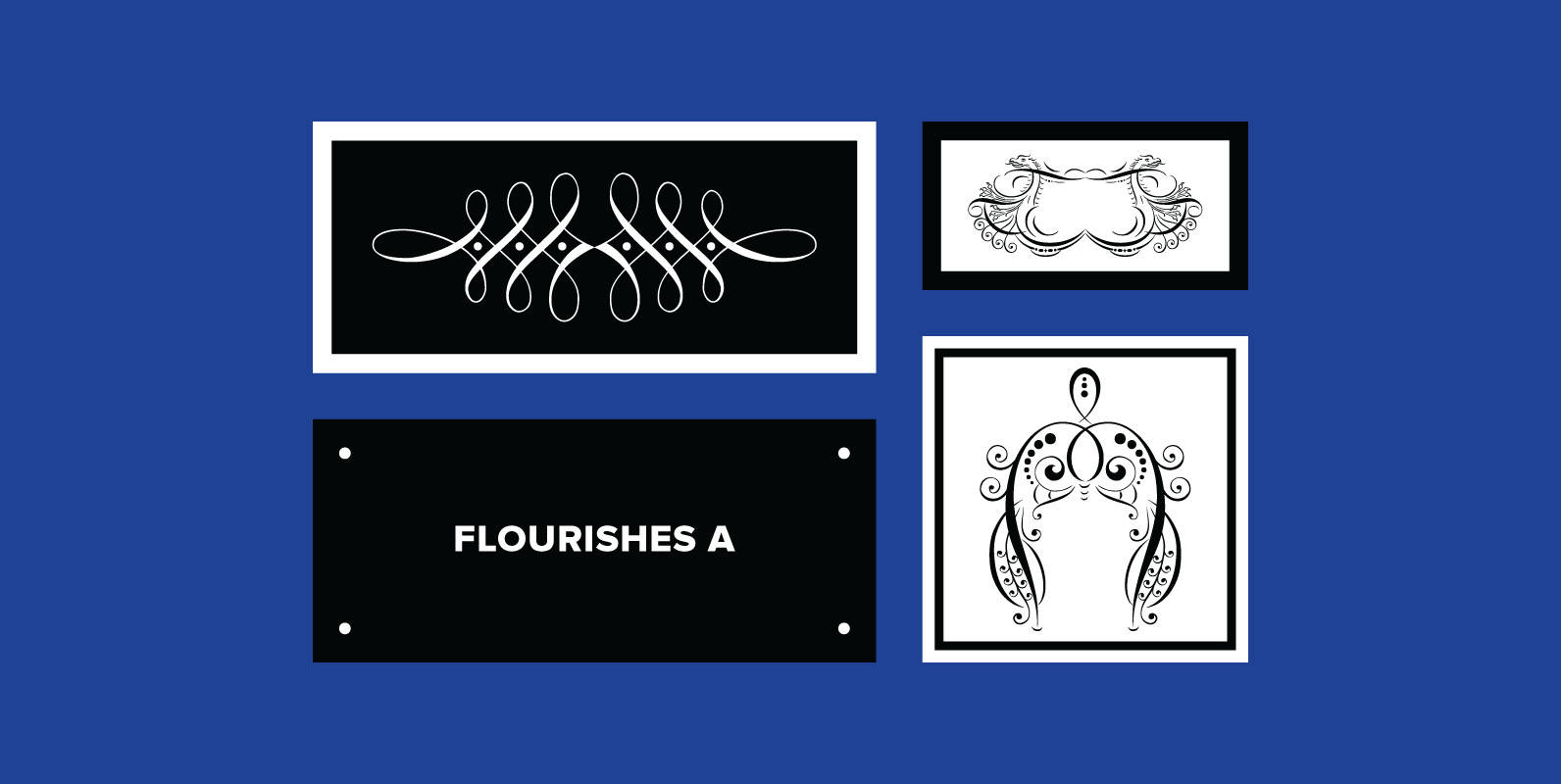
Flourishes A Font
“Florishes A” are a set of flourishes, that serves well for frames and other elegant embellishments, they are beginning of last century American. Your I-found-them-somewhere type-designer Gert Wiescher Published by Wiescher DesignDownload Flourishes A
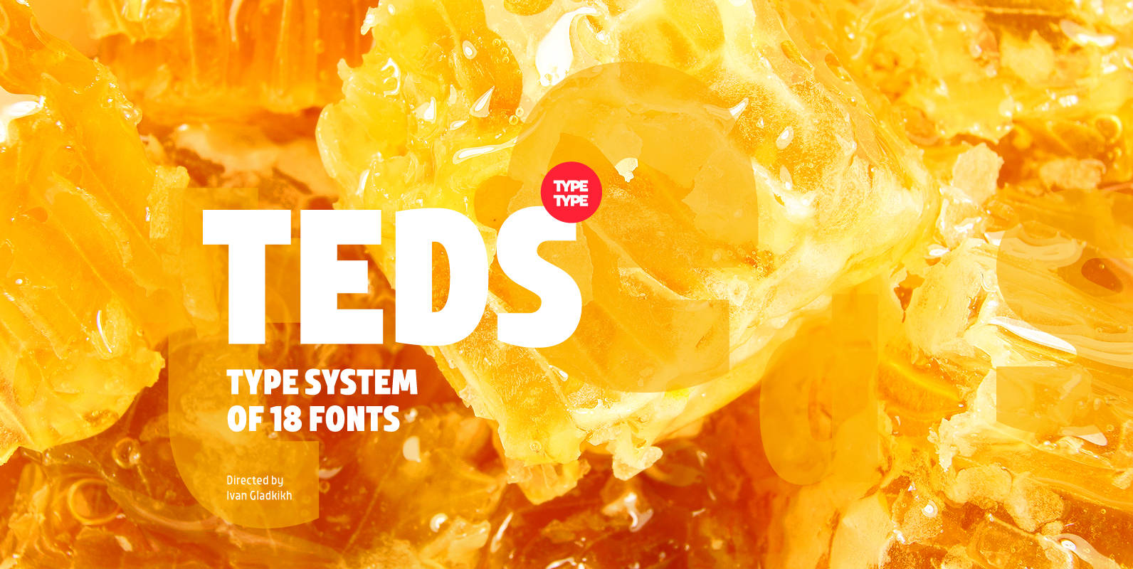
TT Teds Font
Teds is a geometric non-serif with narrow proportions created for universal application in any types of text. Relatively tall lowercase characters, open forms of semicircular characters, and low contrast between vertical and horizontal lines make this font type easy to
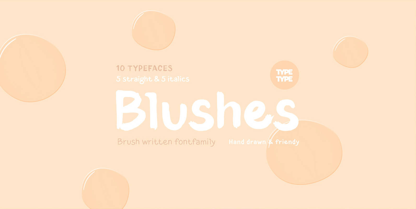
TT Blushes Font
Glitter, flashing cameras and fame – now you know how to deal with this stuff! Freshness and brightness is what defines the Blushes fontfamily, which is created for beauty and fashion industries. TT Blushes is a vibrant part of you
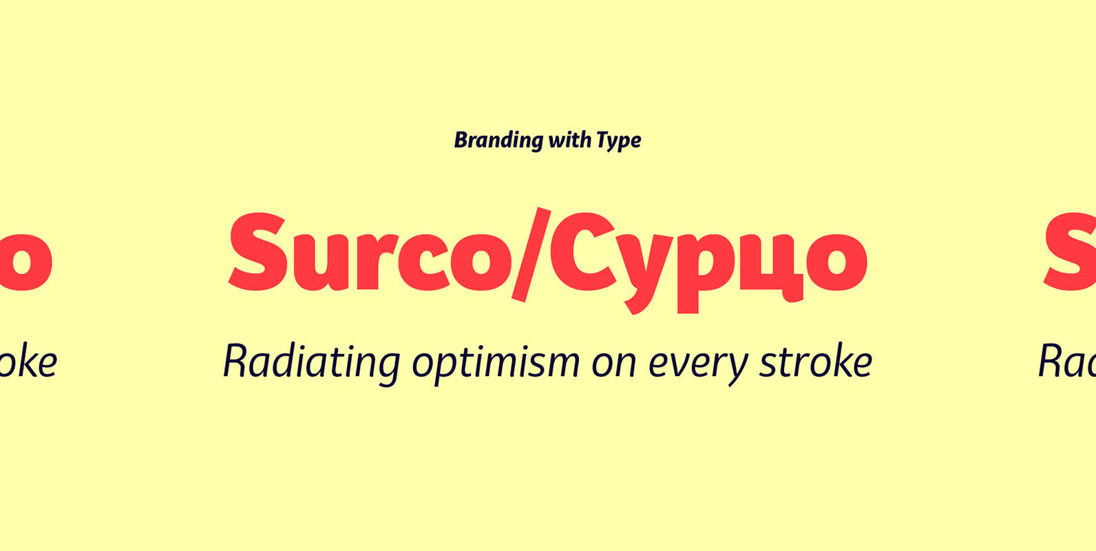
Bw Surco Font
Bw Surco is a fresh and optimistic humanist sans serif with hand-stroke cues. Its soft, rounded shapes, balanced x-height and the contrast between the romans and the true italics, all build towards a very practical font family with a friendly

Hinton Font
Hinton is a modern, clean text font, that contains 840+ characters & many Opentype features. It is calm, orderly and a bit perky. Hinton has a lightweight and pleasant design, so it fits well and easy to read. Its characters
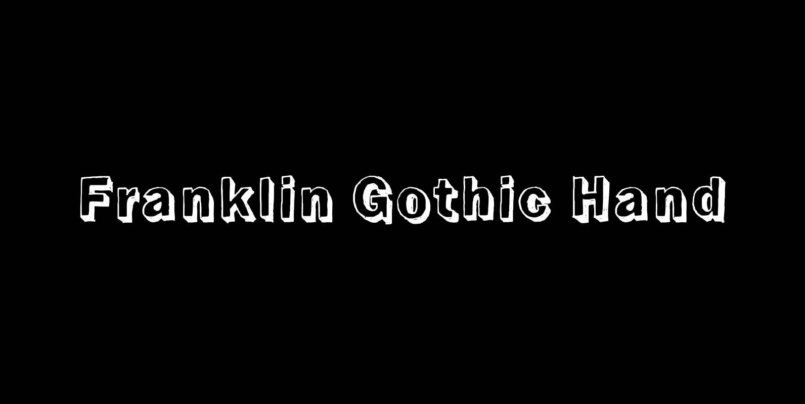
Franklin Gothic Hand Font
Franklin Gothic Hand Demi Shadow is another one in my series of hand-drawn fonts from way back in time – before computers changed the way we worked in advertising. This one was especially used for what we called “pork-belly-ads”: ads

Zega Grot Font
Celebrate good times with Zega Grot family! This font is the companion of Zega Text but less “serious” than its predecessor. The Grot version has old vertical proportions, with higher capitals and asc-descenders, height difference between capitals and ascenders, beyond
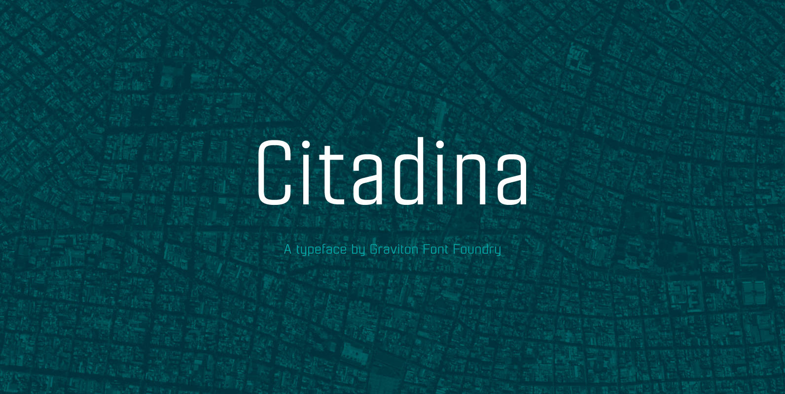
Citadina Font
Citadina font family has been designed for Graviton Font Foundry by Pablo Balcells in 2016. It is a sans serif typeface with a geometrical, mechanic, neutral appearance and a slightly condensed design which makes it particularly effective for space economizing.

Grenale Slab Font
Grenale Slab adds to the new standard of elegance within the Grenale family. Not your typical slab, Grenale has some unique forms that give it a look all its own. This glamourous slab still draws much inspiration from Grenale’s Didone
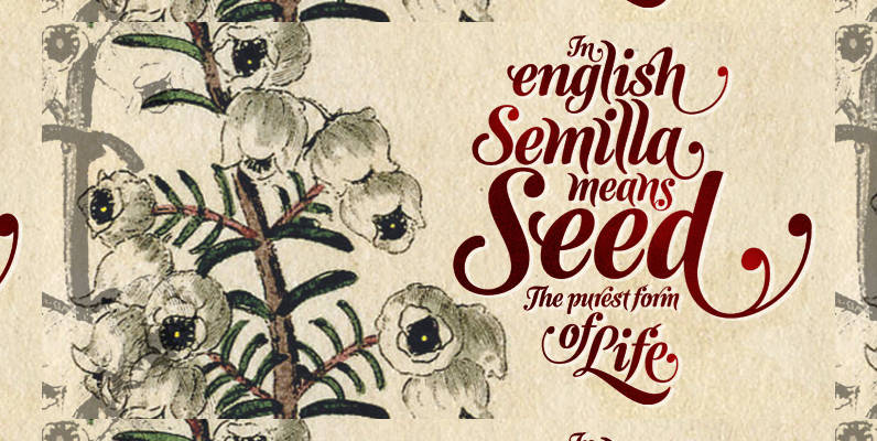
Semilla Font
I spend a lot of time following two obsessions: packaging and hand lettering. Alongside a few other minor obsessions, those two have been my major ones for so many years now, I’ve finally reached the point where I can actually
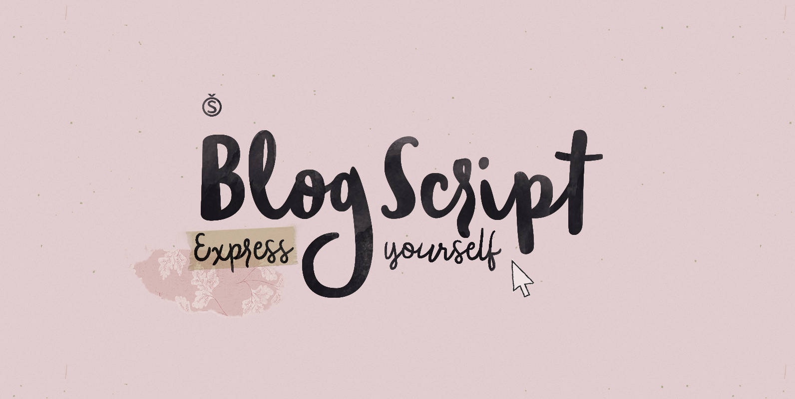
Blog Script Font
Technology is making it so that we’re all connected without the need for the physical-presence kind of being connected. That is strange, fascinating, and has a certain magnetism that is very difficult to resist. What’s at stake is no less

Filson Soft Font
Filson Soft is the rounded version of the popular Filson Pro. At first sight, the main feature of Filson Soft are the distinctive letters ‘K’, ‘Q’ and especially ‘R’ that make the font family very elegant. With its rounded terminaisons,

Quesha Font
Born from a modular font project, Quesha mixes a geometric construction with pure organic exceptions. Contrasted, readable, elegant and friendly, Quesha is a modern classic. It features a complete character set, including standard and discretionary ligatures. Published by NimavisualDownload Quesha
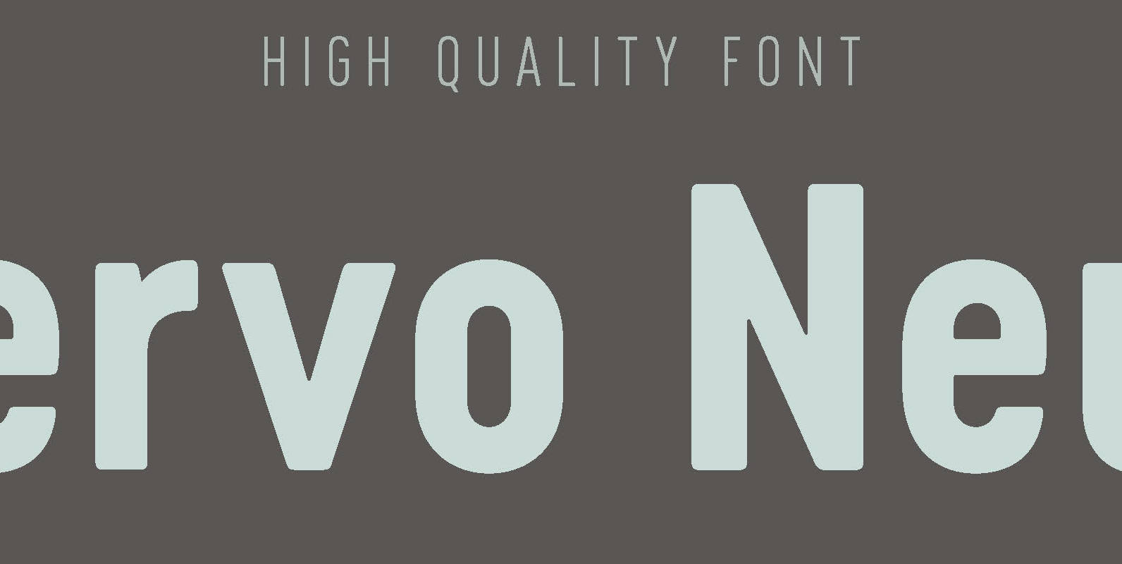
Cervo Neue Font
Font Cervo Neue is the new perfected and extended version of Cervo containing 18 varieties. It differs from its previous version with the higher accents over glyphs, enlarged punctuation, nautical numerals and newly added varieties Semi Bold, Bold, Extra Bold


