Tag: advertising
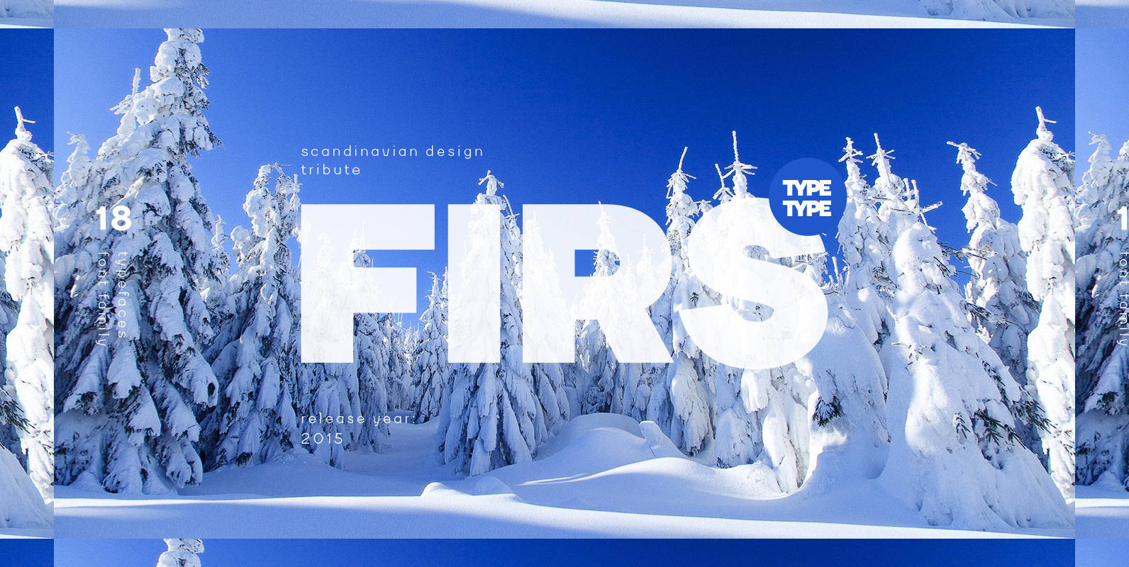
TT Firs Font
Firs – universal sans-serif font family, designed in a modern Scandinavian style. Firs has a Nordic character and is a versatile tool in design. This font family has a extension of weights coverage: Hairline, Thin, ExtraLight, Light, Regular, Medium, Bold,
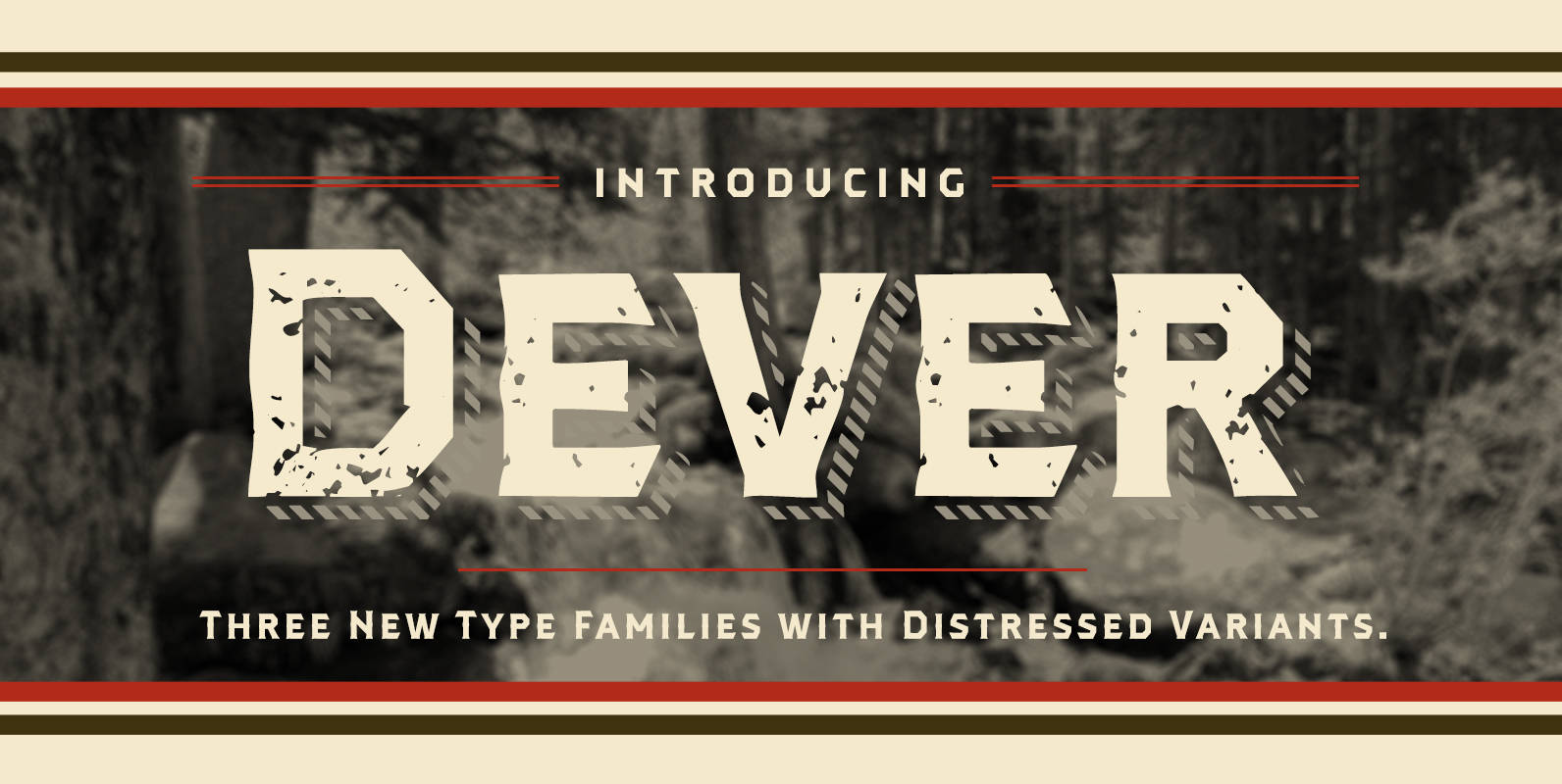
Dever Font
Dever’s brute, industrial lines are rounded up in this new typeface from Jeremy Dooley. Dever combines plenty of inspirations. It’s the flair of the Wild West melded with a shout out to the sign painters and package lettering artists of
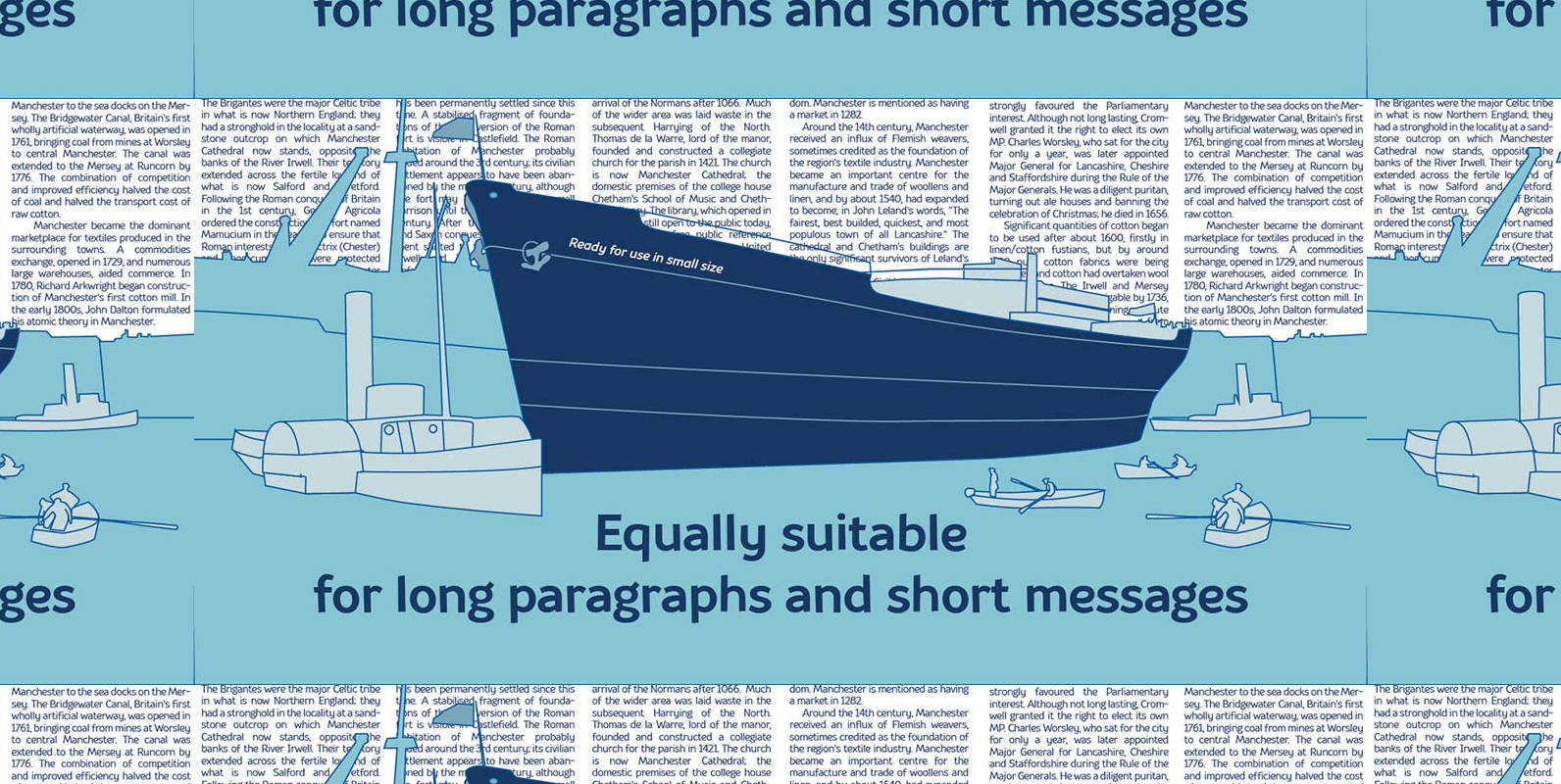
TT Souses Font
Souses — original fontfamily, which are made by hand. Universal typefaces formula of 10 fonts: Thin, Light, Regular, Bold, Black and Italics. Souses ideal for use in themes: ecology, village, natural, handmade & toys. Handmade style of the fonts —
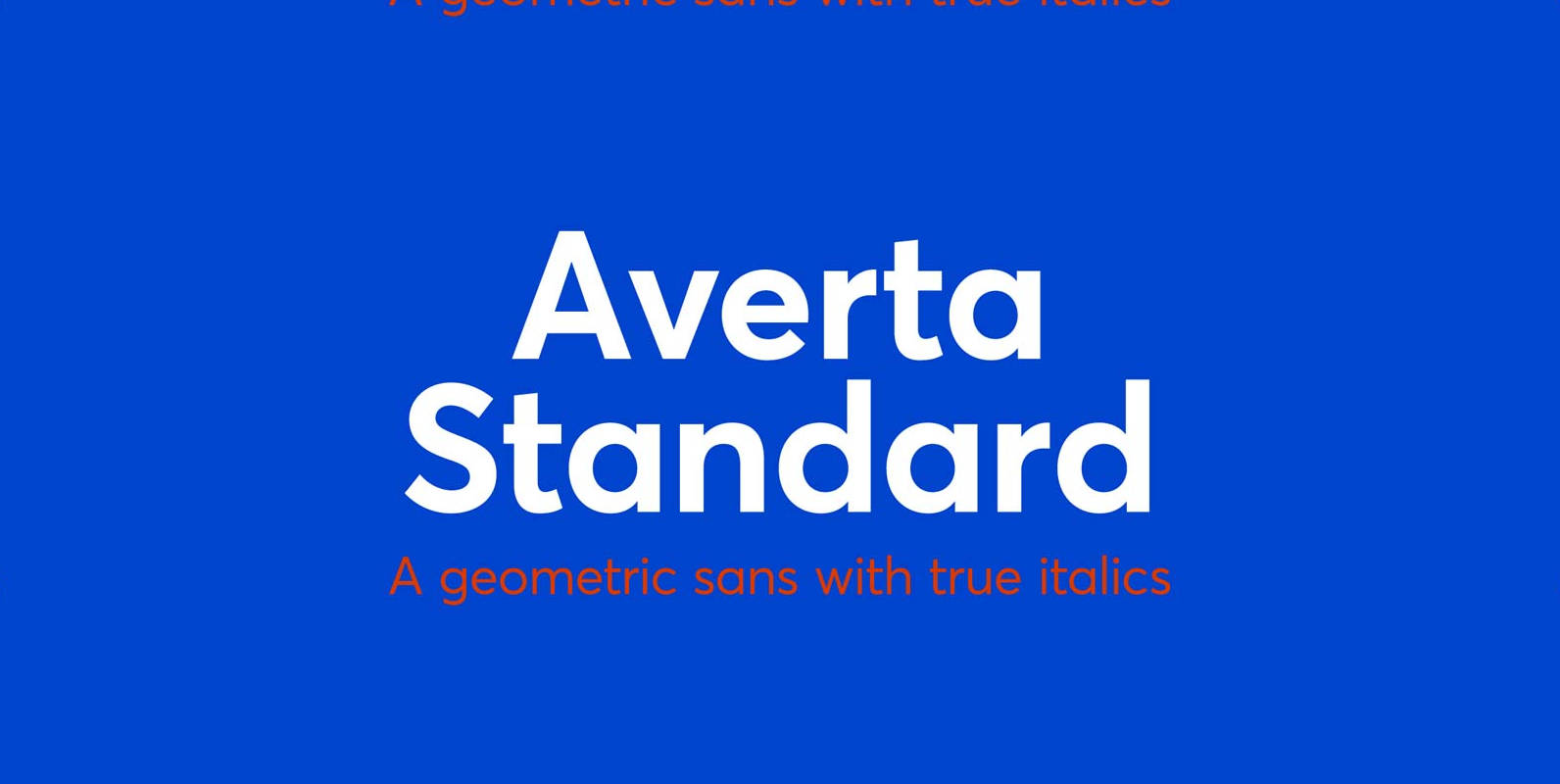
Averta Standard Font
Averta Standard is the basic version of Averta. Bringing together features from early European grotesques and American gothics, Kostas Bartokas’ (Greek: ‘αβέρτα’ – to act or speak openly, bluntly or without moderation, without hiding) Averta is a geometric sans serif
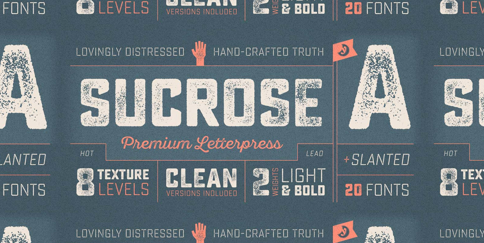
Sucrose Font
Sucrose is a registered copyright © 2015 Yellow Design Studio. All Rights Reserved. Sucrose from Yellow Design Studio is a premium high-resolution letterpress family with rectangular letterforms and authentic, hand-crafted texture. It features 8 distress levels for all letters (4

Blanc Font
Blanc is a functional humanist sans typeface with a marked personality and great style that make it ideal for use in headlines. Blanc is an ode to neutrality: a geometric face characterised by low contrast between thick and thin strokes
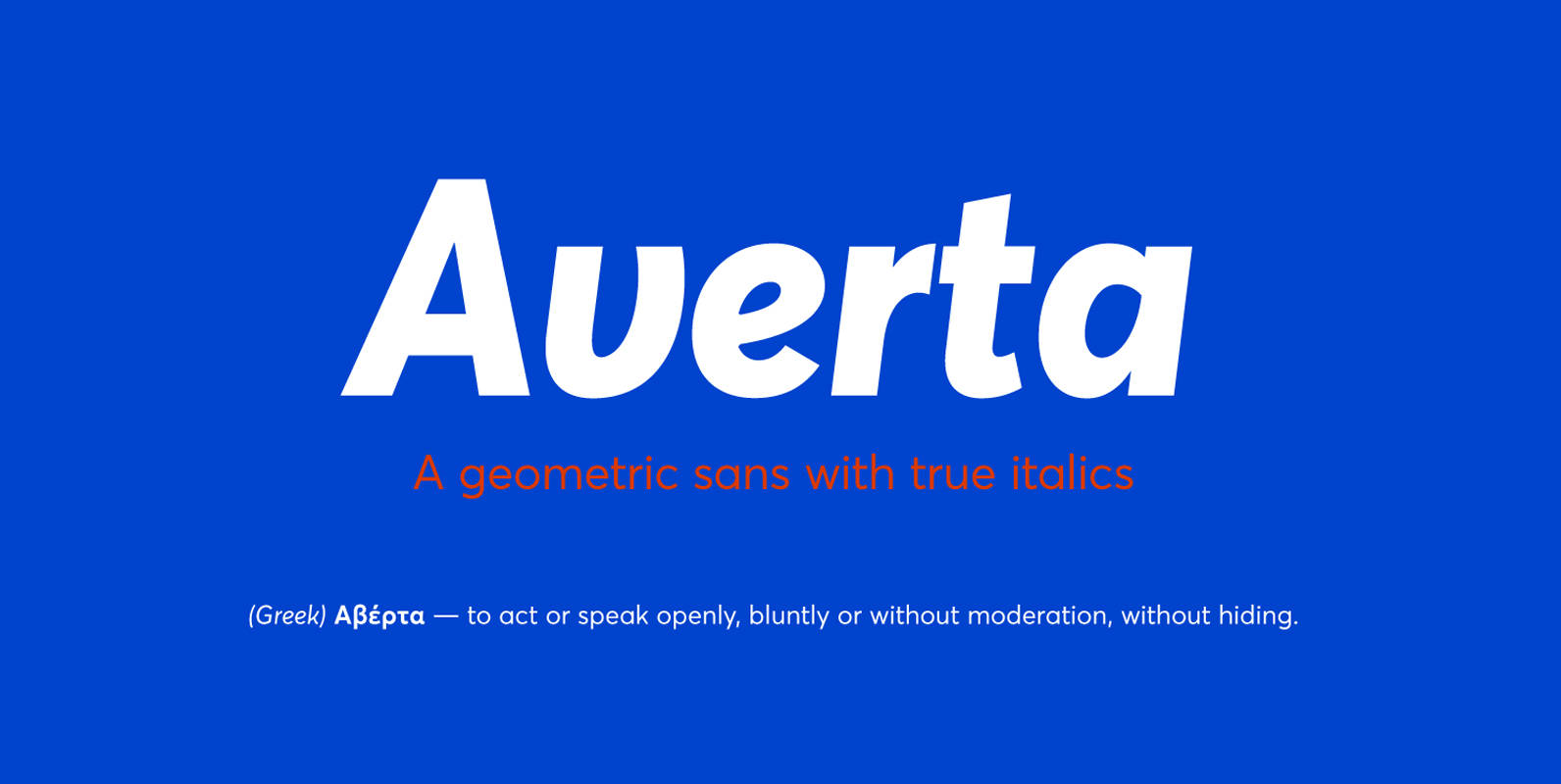
Averta Font
Bringing together features from early European grotesques and American gothics, Kostas Bartokas’ Averta (Greek: ‘αβέρτα’ – to act or speak openly, bluntly or without moderation, without hiding) is a new geometric sans serif family with a simplistic, yet appealing, personality.
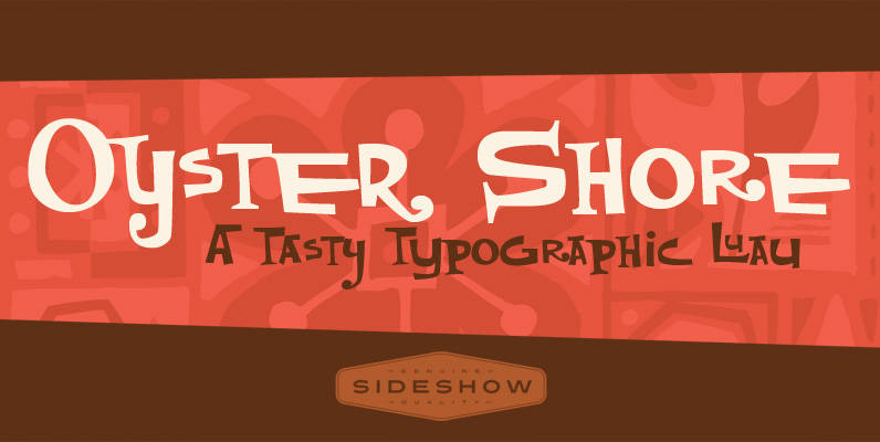
Oyster Shore Font
Aloha! It’s time once again for the Sideshow company luau and this year we want you to join us for all the tropical tiki fun. And where do we go for our annual south seas shindig? Why, sunny OYSTER SHORE
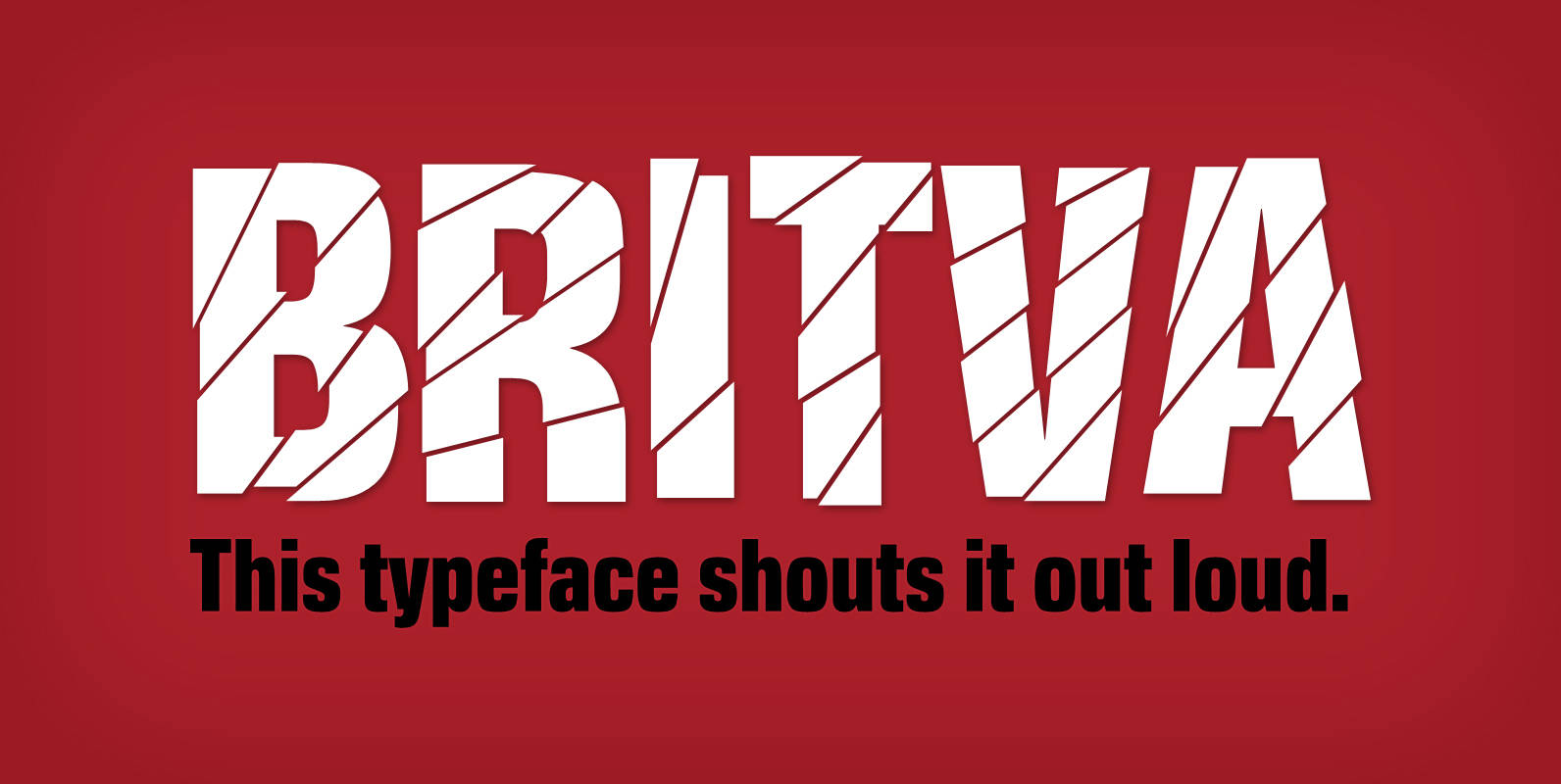
Britva Font
Derived from Valibuk, Britva is designed like from broken glass for eye-catching headlines. It’s a heavy, condensed face with a high x-height and tight spacing. While Valibuk can write it loud, Britva literally shouts it out even louder. The unbroken
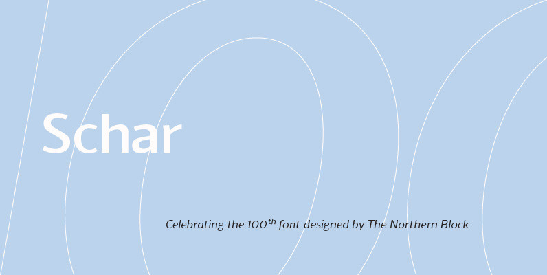
Schar Font
A humanist sans designed like a serif with high-stroke contrast, but without serifs. Calligraphic forms and consistent angle axis are combined to create a fluid and dynamic personality. Schar is a balanced sans serif with classic proportions ideally suited for
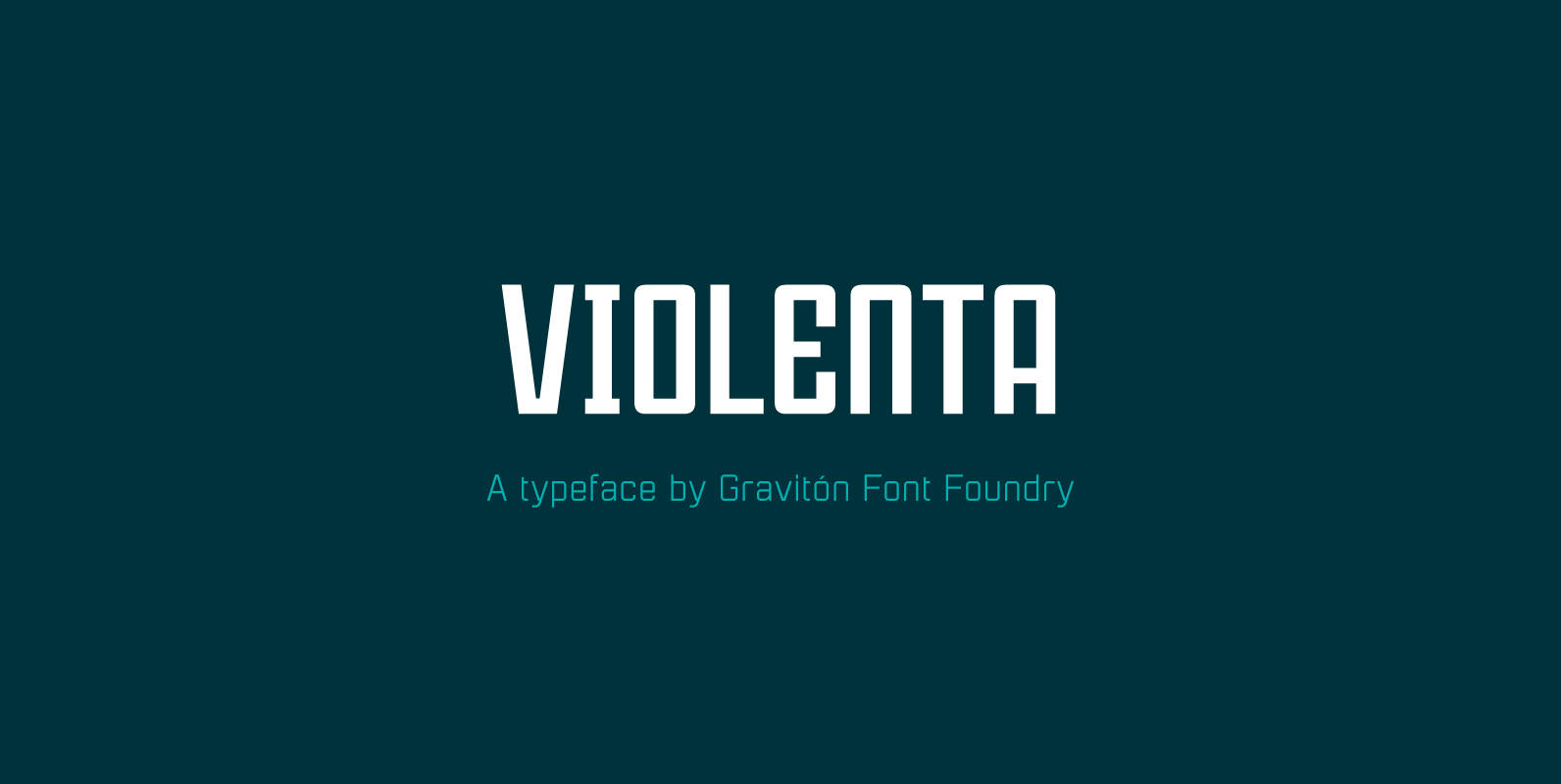
Violenta Font
Violenta font family has been designed for Graviton Font Foundry by Pablo Balcells in 2015. It is a display, geometric typeface, with a condensed design and sharp angles that provides an aggressive and strong appearance. Violenta consists of 8 styles.

Snappy Font
Snappy is a friendly and curly font. It is influenced by the typical coffee house typefaces in france. It comes along with four weights and one outline font. Published by Jorg SchmittDownload Snappy
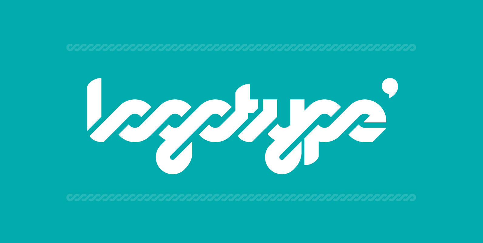
Logomotion Font
This is a typeface specially designed for logotypes, but can also be used in headlines, posters & signage. It has many OpenType programming features, that give a more playful and rhythmic spirit, creating an interesting geometric-sans and script mixture. The
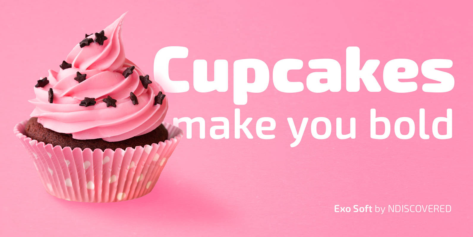
Exo Soft Font
Exo Soft. Technology meets humanity. The geometric design got organic with carefully crafted smoothed edges. Exo Soft is a contemporary sans-serif font with a warm and humane feeling. It has an extended language support (both in Latin and Cyrillic) and
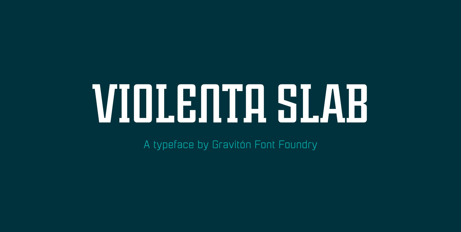
Violenta Slab Font
Violenta Slab font family has been designed for Graviton Font Foundry by Pablo Balcells in 2015. It is a display, geometric typeface, with a condensed design and sharp angles that provides an aggressive and strong appearance. Violenta Slab consists of
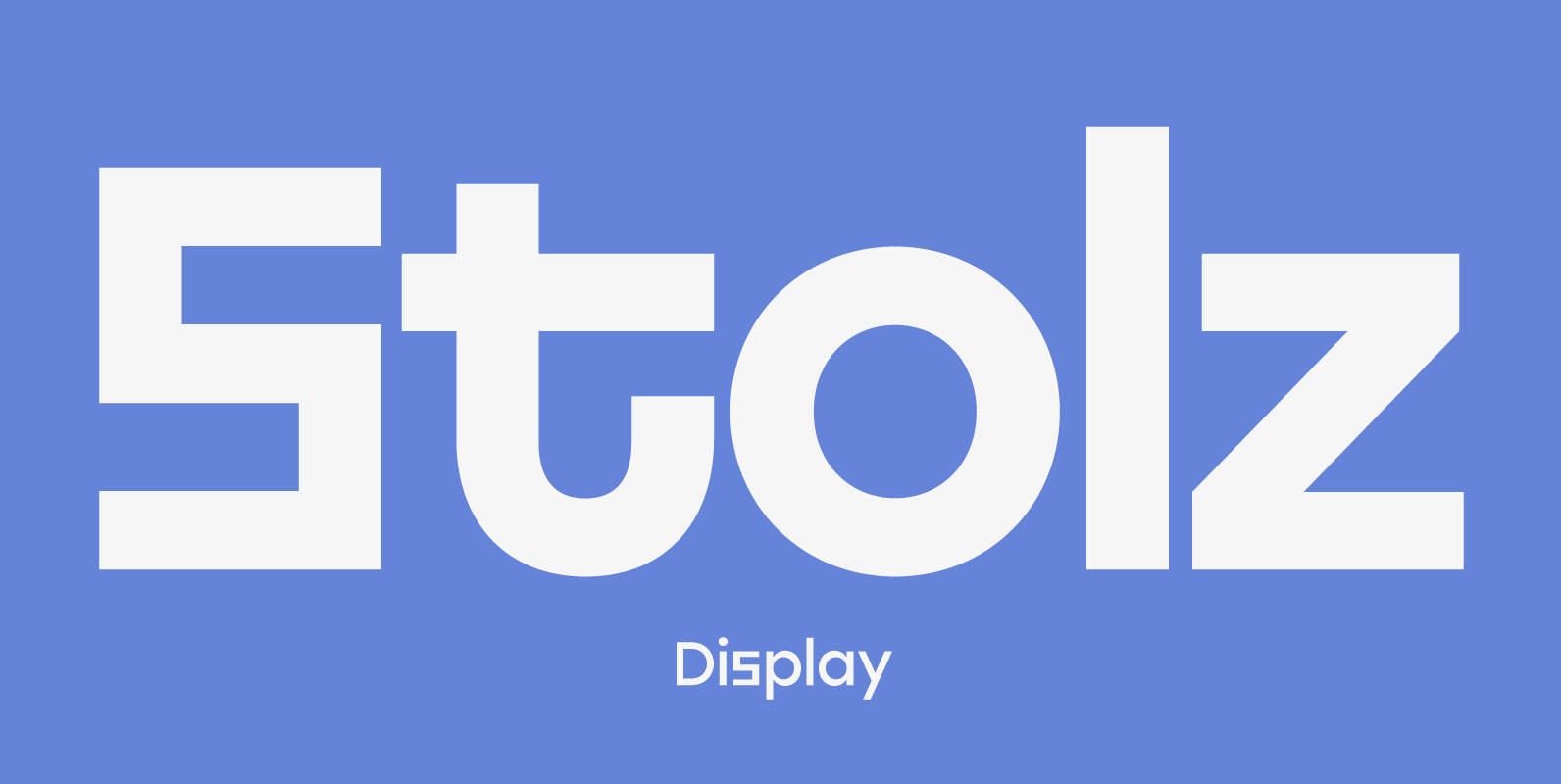
Stolzl Display Font
Stolzl Display is an original font family designed for headlines, titles and subtitles. Based on the combination of contrasting shapes, the harmony of form and rhythm is fundamental to the design. Inspired by Bauhaus, Stolzl represents, not just the significant
