Tag: angular
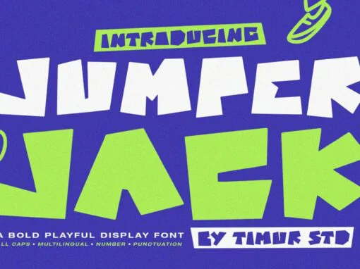
Jumper Jack Font
When it comes to creating a captivating, standout design, the chosen typography makes the world of difference. Playing an essential role in defining the overall aesthetic and messaging of a work, typographical venture leads to the discovery of the Jumper
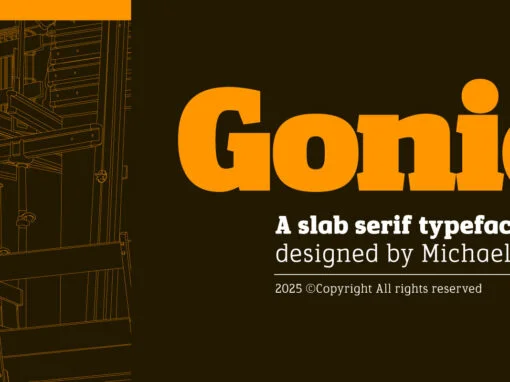
Gonia Font
Artistry in the digital realm is often defined by the tools that birth a creation. In the world of graphic and digital design, nullifying boundaries and broadening scopes stand as a pivotal requirement. One such tool that outbalances its contemporaries

Satura Font
In the radiant world of modern digital design, a bold and distinctive font can act as a catalyst, propelling your work into an exhilarating realm of creativity. Welcome to the cutting-edge future of typography: Satura, an industrial font that effortlessly
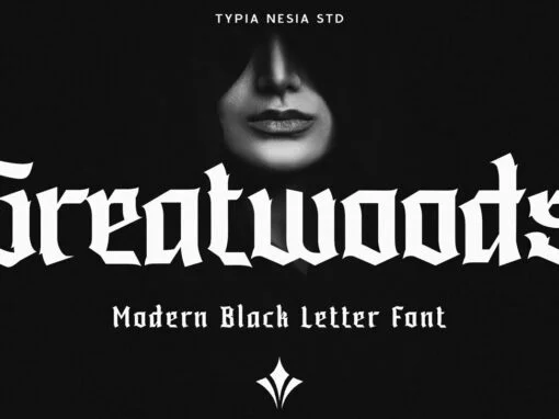
Greatwoods Font
Greatwoods Font: A Versatile Charm of Blackletter Decorative Display In the sprawling digital forest of graphic design, a gentle giant stands tall – the Greatwoods font. A modern blackletter decorative display typeface — a contemporary twist on traditional Gothic script
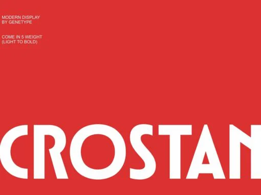
Crostan Font
In the evolving realm of graphic and digital design, the analysis of trends is rather inescapable. And indeed, as contemporary creators seek avenues to amalgamate the iconic aesthetics of bygone eras to the modern minimalist ethos, designers have chanced upon
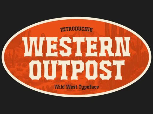
Western Outpost Font
Secure your vocation in the digital design scene with an innovative twist with Western Outpost, a bold and adventurous typeface that captures the spirit of the frontier life and brings the nineteenth-century Wild West in renderings of the 21st century.
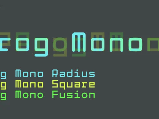
Prog Mono Font
In the realm of digital design and typography, there is no denying the intrinsic role of fonts. Their usage, characteristics and manipulation determines the visual aesthetics and communication capacity of projects. One such font that transcends mediocrity is the Prog

Teenage Delight Font
In the vast world of typefaces, it’s rare to stumble upon a gem that is as full-bodied and emblematic as the Teenage Delight Font. As both graphic and digital designers know, the power of a font extends far beyond mere
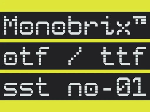
Monobrix Font
Delving into the enchanting world of digital typeface that enhances on-screen readability and supports diverse linguistic needs, the spotlight today falls on the enterprising new product – the Monobrix font. Created by Muhammad Fauzy, this riveting scribe offers an edge
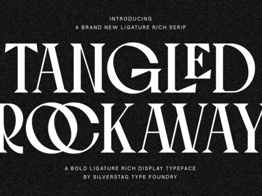
Tangled Rockaway Font
The landscape of digital design is diverse, teeming with a multitude of typefaces that blend form and function. Graphic and digital designers are always in pursuit of the next instrument to elevate their work. They seek out distinctive fonts that

Noise Storm Font
Imagine the nostalgic embrace of retro chic meets contemporary design sense, all skillfully blended to birth a revolutionary digital product- the Noise Storm Font. This rousing text style is reminiscent of classic aesthetics, yet exudes a vibrancy that effusively resonates
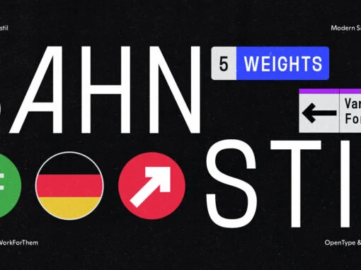
YWFT Bahnstil: The Renaissance of Traditional Design with a Modernist Twist
In the bustling realm of graphic and digital design, the harmonious fusion of traditional and modern aesthetics holds a special allure. Today, we put the spotlight on YWFT Bahnstil, a distinctive typeface that embodies this delicate balance, offering a unique
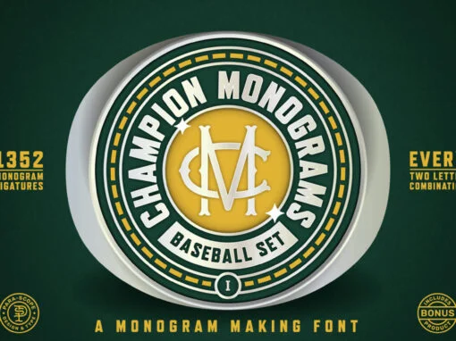
Reimagining Traditional Aesthetics: A Deep Dive into Champion Monograms Baseball 1 Font
The realm of graphic design is constantly evolving, pushing boundaries and redefining traditional aesthetics. In recent years, the vintage-style monogram, reminiscent of baseball iconography, has become an increasingly popular design element. A reflection of this trend, the Champion Monograms Baseball
