Tag: antique

Tempest Font
Tempest is a small-x-height serif font for headline use. Tempest will bring a thin, sharp and classic approach to your layout, and at the same time keep an elegant and fashionable flow to the project. Published by Suomi Type FoundryDownload
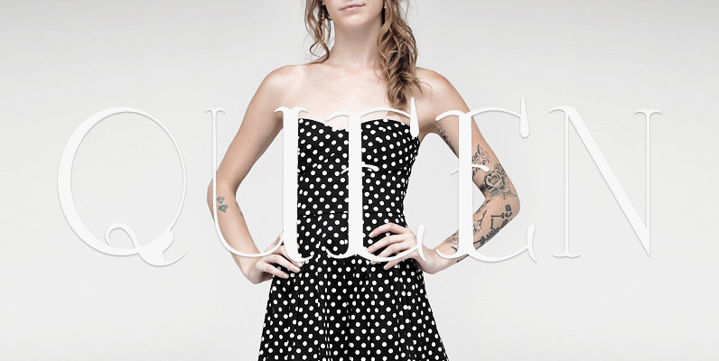
YWFT Victoria Font
YWFT Victoria has the feel of a traditional serif face, yet defies many of these implications due to its hand drawn origins and uniquely inconsistent line weights. This unicase typeface includes all of the characters you would find in a
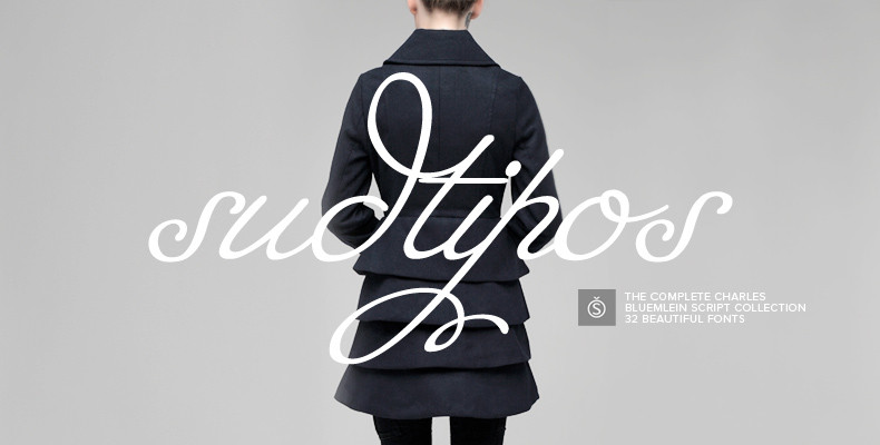
The Charles Bluemlein Script Collection Font
The Complete Charles Bluemlein Script Collection is an intriguing reminder of the heady days of hand lettering and calligraphy in the United States. From the early 1930s through World War II, there were about 200 professional hand letterers working in
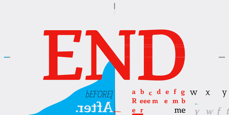
Cavole Slab Font
Cavole Slab is a new slab serif, designed in early 2011, that has a strong influence from Dutch typography. The name is an altered form of the Portuguese word for feather, emphasizing the typefaceís soft and friendly character. Slab serifs

Schillerplatz Font
Schillerplatz is a fresh, very well done retro styled font, designed by Hellmut G. Bomm in 2008. Schillerplatz is a very European styled design and works great in fashion or retro themed design projects. Published by URW Type Foundry GmbHDownload
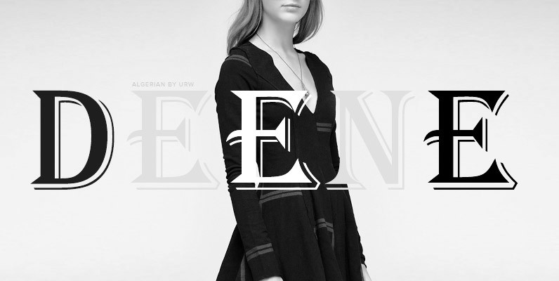
Algerian Font
Algerian is a well known decorative display font, published and released by URW Studio in 1985. Algerian is well known for being used a bit too much in previous design eras, but it still retains a certain freedom to be
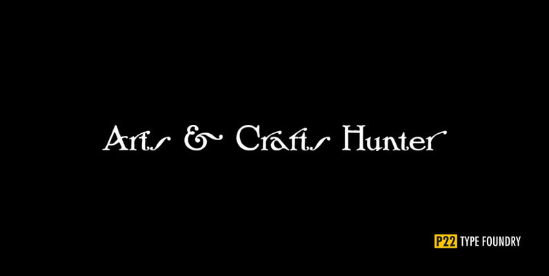
P22 Arts and Crafts Hunter Font
Produced in association with The Burchfield-Penney Art Center (Buffalo, New York), the Arts and Crafts font set derives from Roycroft books and periodicals designed by multi-faceted artist; Dard Hunter in the early 1900s. Published by P22 Type FoundryDownload P22 Arts

P22 Arts And Crafts Regular Font
In the early 20th Century, Dard Hunter designed many of the the more distinctive graphics for the Roycroft artists community of East Aurora, New York. Published by P22 Type FoundryDownload P22 Arts And Crafts Regular
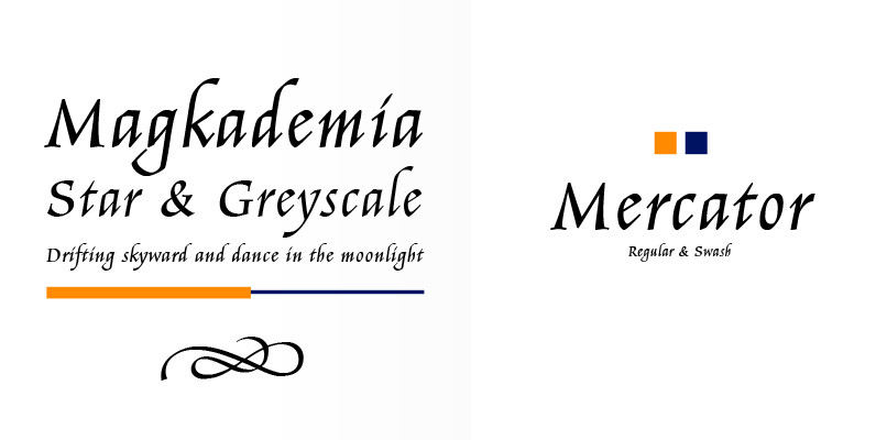
Mercator Font
Gerardus Mercator was born in the Netherlands in 1512. His name has become synonymous with the Mercator map projection scheme where our globe is represented as a flat image, creating some distortion in the Northern and Southern extremities. It ultimately
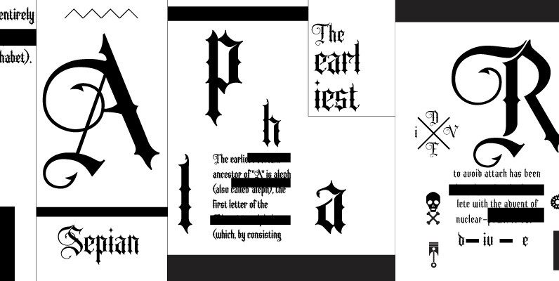
Sepian Font
Sepian is an original hand lettered font based primarily on Textualis, or Textura in the Blackletter family – the style most commonly associated with Gothic scripts. The addition of barbs to the terminals add to its modern and sharp look

Telltale Font
Telltale is classic serif design made for headline and text use mainly. Contains two styles, book and italic, that work together quite beautifully when used together at different point sizes. Published by Suomi Type FoundryDownload Telltale
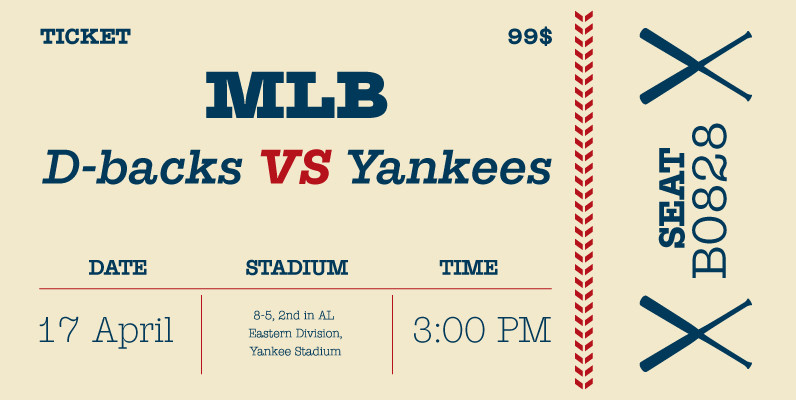
Suomi Slab Serif Font
All typewriter types are rounded and especially American Typewriter has an almost too-slick appearance. Suomi Slab Serif has the glyph shapes similar to typewriting, but the serifs, terminals and connections are crisp and sharp. Published by Suomi Type FoundryDownload Suomi

P22 Numismatic Font
Originally offered by the Devinne Press in the early 1900s, the Numismatic typeface features the letters, Arabic figures and ornaments used by designers and engravers of seal, coins, medals and inscriptions upon metal or stone during the fifteenth and sixteenth

Magesta Script Font
The Magesta Script family by Yellow Design Studio is a set of four retro script fonts that capture the warm, authentic qualities of letterpress printing. Light, Regular, and Bold weights were created using different levels of ink coverage, while Mix
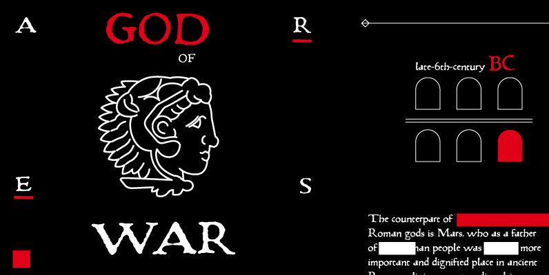
Pannartz Font
I happened to come across a facsimile of a sample of text with typeface made by Sweynheim & Pannartz in 1476. I scanned the sample, and redraw all the available glyphs from the sample in RobFog. After that I added
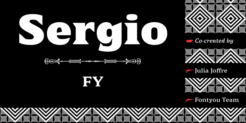
Sergio FY Font
Sergio FY is an antique latin font family inspired by a 19th century wooden type font, found in an italian print – Gazetta Musicale di Milano, 10 Guigno 1897. This typeface is characterized by its large, sharp, and triangular serifs,
