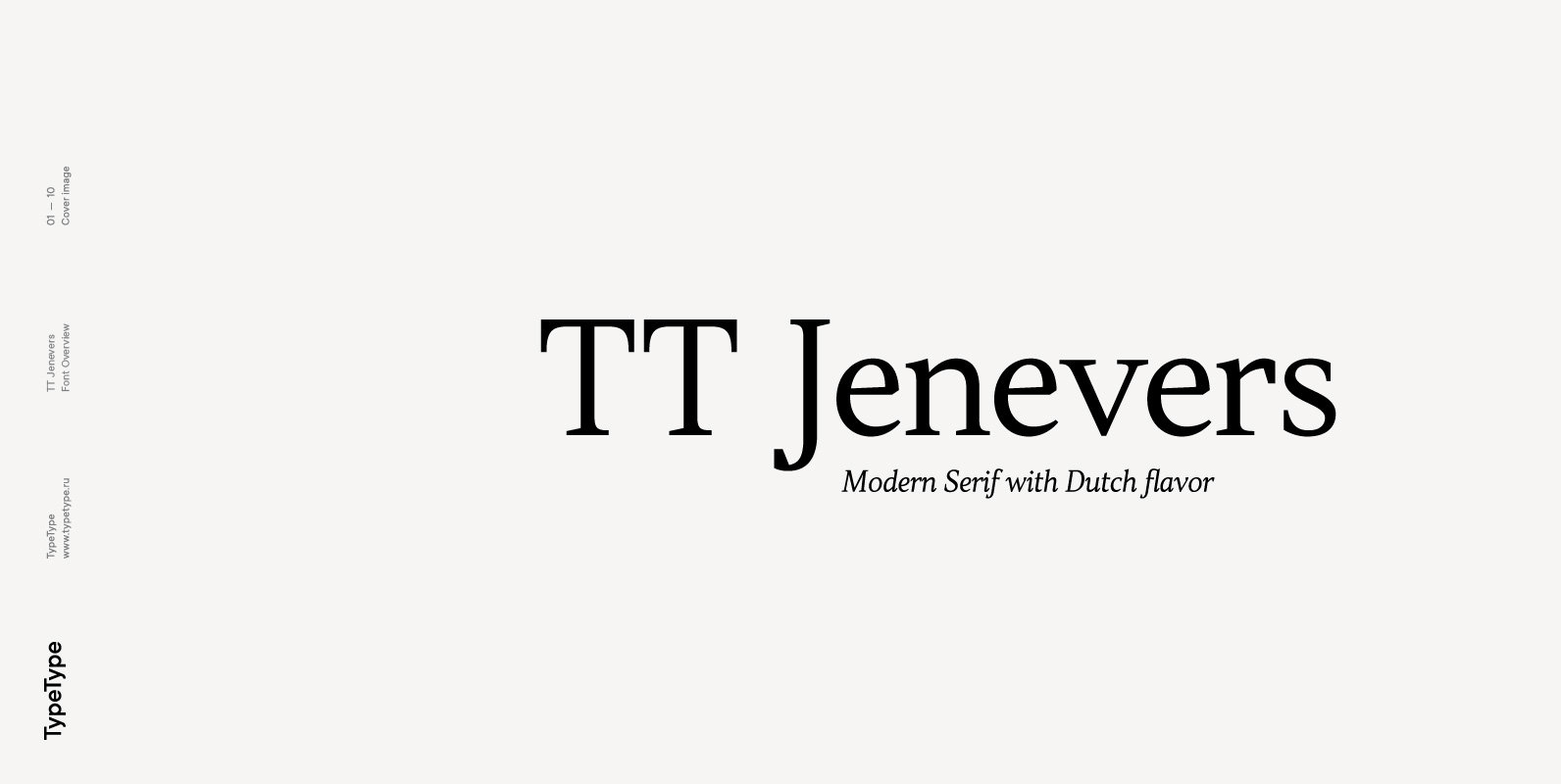
Tag: antiqua  

Mastering Aesthetics With Ltt Recoleta: The Future of Digital Typography - Image 1

Mastering Aesthetics With Ltt Recoleta: The Future of Digital Typography

For those in the world of graphic and digital design, the value of a versatile, meticulously crafted font cannot be overstated. The right font is not just a carrier of words on a surface, but an essential element of  a

Mynaruse Flare Font - Image 3

Mynaruse Flare  Font

Mynaruse Flare is a new version of the Mynaruse superfamily. This version eliminates the elongated serifs of the original, and instead stems end with a flare. You will find that the thinner weights are delicate and beautiful, while the heavier

TT Barrels Font - Image 5

TT Barrels  Font

TT Barrels is an elegant scotch style modern serif with strong industrial accents in its design. The TT Barrels project was born from a fictional technical assignment in which we tried to combine the technological effectiveness of industrial production  used

Carrig Pro Font - Image 10

Carrig Pro  Font

Carrig Pro is a refined and elegant serif. Classed as an Antiqua, Carrig Pro is borne from a hybrid of influences that range from early Roman inscriptions to type of the Pre-Modern era, giving Carrig Pro a distinctive character  all

Carrig Font - Image 16

Carrig  Font

Carrig is a Classic Antiqua typeface that was inspired by letterforms that have been carved into stone and weathered by time. Features: • Full European Character Set • 410 Glyphs • Alternate Letterforms for capitals O, Q, R and  U.

Glass Light Font - Image 17

Glass Light  Font

“Glass Light” was designed in 1912 by “Franz Paul Glass” for the “Genzsch & Heyse” foundry. The font is stylewise related to the “Lo types” of the same period. Glass designed a lot of decorative elements to go along  with

Sabler Titling Font - Image 18

Sabler Titling  Font

Make the right statement with the elegant Sabler Titling. This showstopping font features an inherent grace combined with the classic style of the Art Deco period. The subtle beauty of its letters is highlighted by the typeface’s stems, which  taper