Tag: art deco

Naive Inline Font
Naïve Inline is a layered serif handwritten font designed by Fanny Coulez and Julien Saurin in Paris. Our goal was to draw a font with finely irregular lines that give a human and whimsical feeling. We designed three weights to
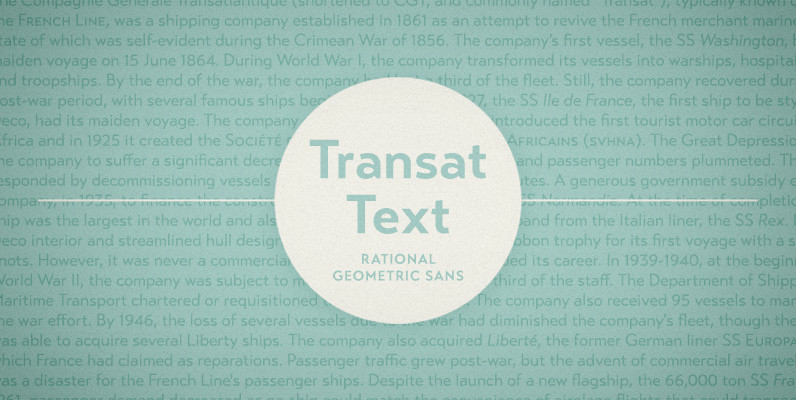
Transat Text Font
Transat Text is a geometric sans serif typeface, and is the more rational sibling to the unabashedly Art Deco “Transat”. Transat Text has a slightly taller x-height than its counterpart, making it easier to read at small sizes, but also
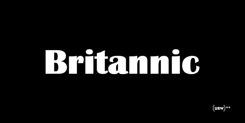
Britannic Font
Britannic is a retro and decorative sans originally designed by Stephenson Blake. The complete family contains 6 unique and very interesting type designs. Published by URW Type Foundry GmbHDownload Britannic
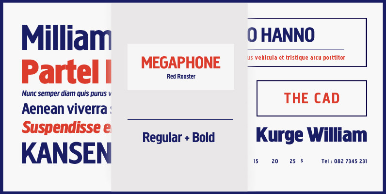
Megaphone Font
Designed by Steve Jackaman and Ashley Muir. It was our initial intention to develop a suitable lowercase for Les Usherwood’s ‘Elston’ typeface, based on a few characters from an old German typeface called Hermes Grotesque (Woellmer, Berlin). The new design

Concurso Italian Font
Concurso Italian was inspried by travel posters of the 1920s – Use it for travel posters, passports, luggage stickers or an elegant vintage look. Published by Breaking The NormDownload Concurso Italian
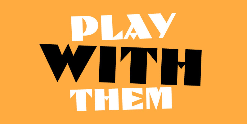
Dolmen Font
This clever revival of a 1920’s jobbing printer’s style exudes all the fashion and culture of the jazz age. Dolmen offers an interesting alternative to other fonts such as Broadway and Koloss and can be used in all capital or

Bristol Adornado Font
Bristol and Bristol Adornado (also known as Greco) was first released by Fundición Richard Gans of Madrid, Spain, in 1925. The Richard Gans Foundry is a defunct Spanish foundry which existed from 1888-1975. Throughout its existence, types were designed by
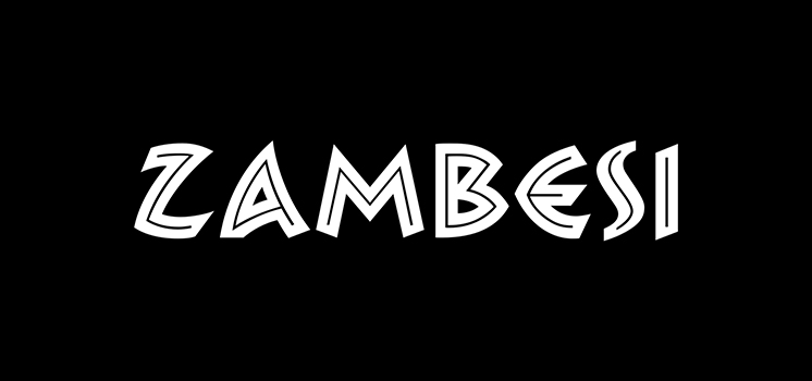
Zambesi Font
Zambesi is a font design released for the Mecanorma Type Collection. Copyright 2004 Trip Productions BV. Published by MecanormaDownload Zambesi

Naive Inline Sans Font
Naïve Inline Sans is a layered sans serif handwritten font designed by Fanny Coulez and Julien Saurin in Paris. Our goal was to draw a font with finely irregular lines that give a human and whimsical feeling. We designed three
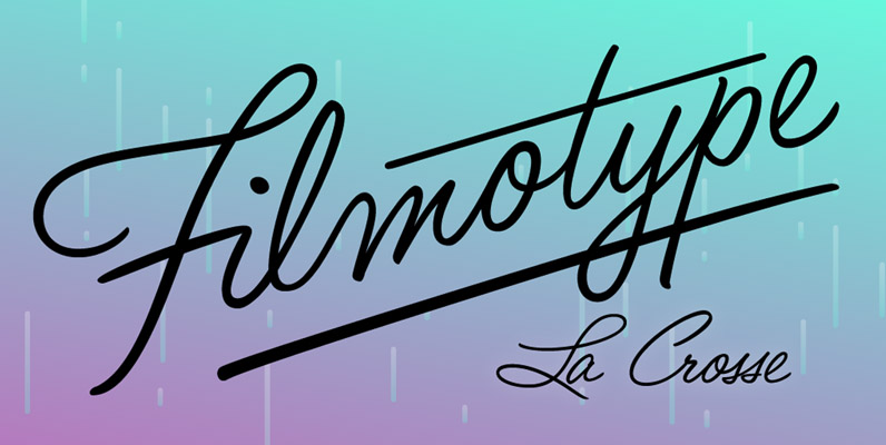
Filmotype LaCrosse Font
Filmotype LaCrosse was released by Filmotype in the late 1950s as an attractive informal casual pen-script, also known as a jewelers script based on its use in department store catalogs and luxury store signage Filmotype LaCrosse was developed from the
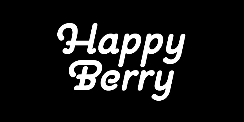
Pauline Font
Pauline is a sans serif with a strong influence from retro scripts. Pauline is a geometric face formed with slow and deliberate rounded brush strokes. The tall ascenders give it a useful touch of naïveté. It’s a face suitable for
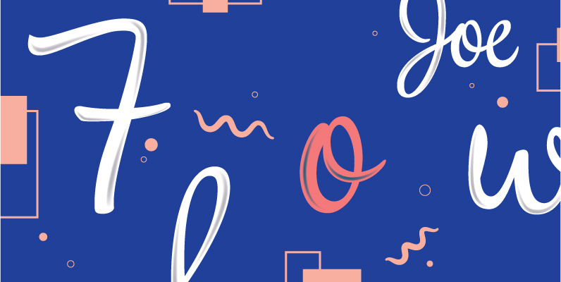
Impala Script Font
Elegant and graceful as the gazelle for which it is named, Impala Script is the perfect blend of formal and casual. It’s equally comfortable in a display or text setting for many applications. Inspired by late 1940s Hollywood with a
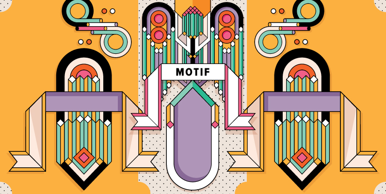
YWFT Motif Font
After starting life as as customizable set of unique vector illustrations, YWFT Motif has been reborn like Jay Gatsby into a meticulously crafted icon/symbol font, inspired by Art Deco. Containing two styles, so users can layer the solid with the
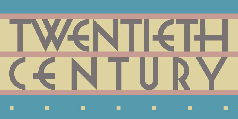
Twentieth Century Font
Twentieth Century was designed for the cover of a collection of 20th Century French Poetry and bears the precise and spare geometry of the machine age. Published by Daniel PelavinDownload Twentieth Century
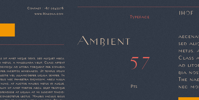
Ambient Font
When you push the stage props of life aside, there will remain the truth… Ambient is a desconstructed sans-serif font which captures the essence of basic Roman letterforms…with a few twists. Ambient was designed by Gabor Kothay, Szeged Hungary. Gabor
