Tag: art deco
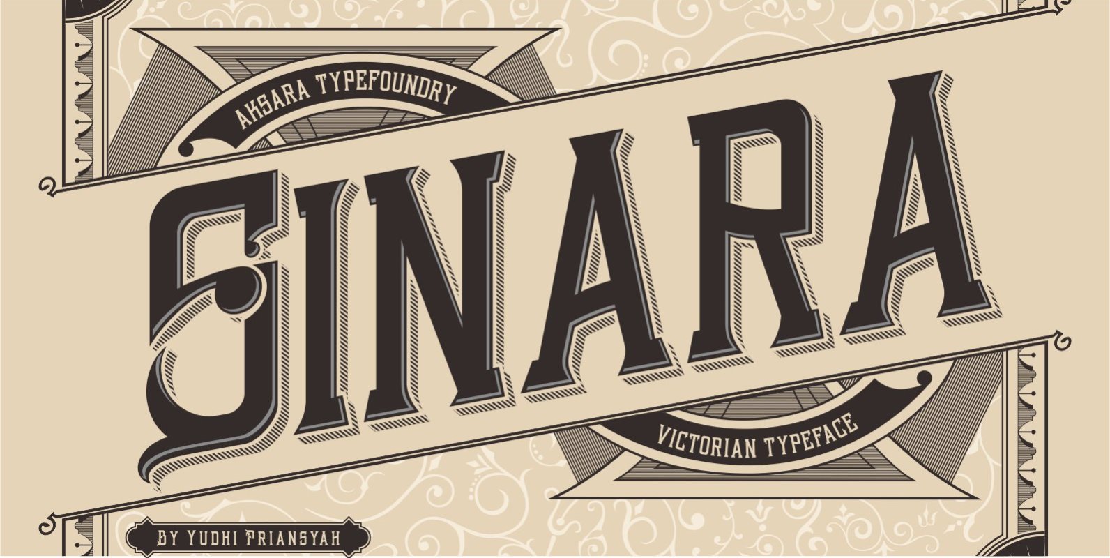
Sinara Font
Sinara is a decorative and vintage, Victorian-styled font design, published by Yudhi Priansyah. Published by Yudhi PriansyahDownload Sinara
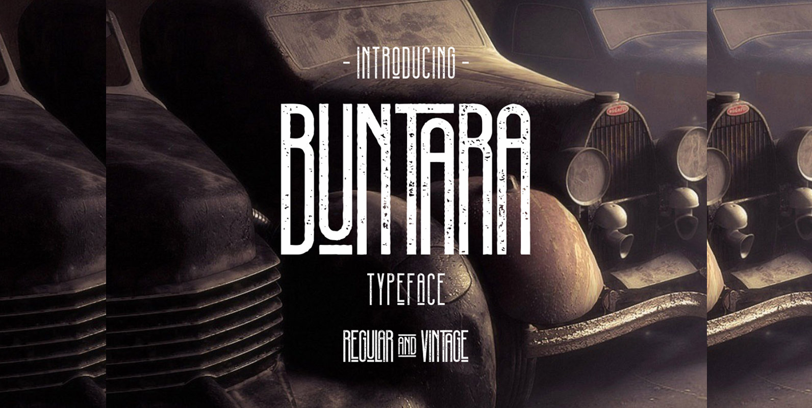
Buntara Font
Buntara is a distressed and retro styled font design published by Yudhi Priansyah. Published by Yudhi PriansyahDownload Buntara
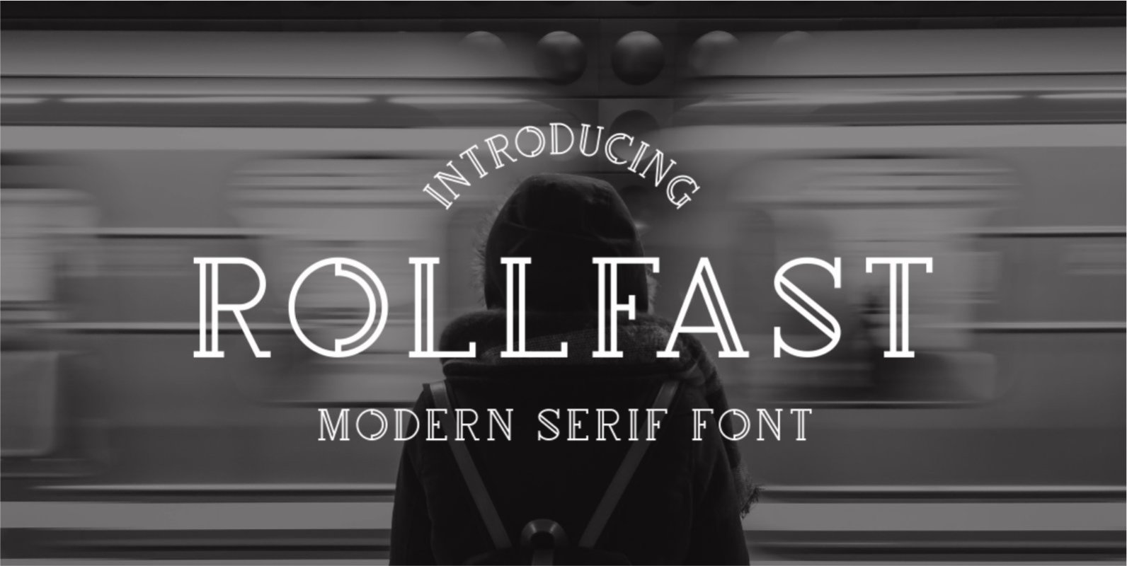
Rollfast Font
Rollfast is a retro styled typeface, published by Yudhi Priansyah. Features: – Uppercase – Numerals & Punctuations – Accents (Multilingual characters) Published by Yudhi PriansyahDownload Rollfast
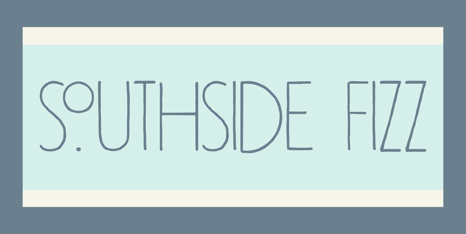
Southside Fizz Font
Southside Fizz is a cocktail (made with gin, lime, mint and soda). Southside Fizz font was based on a single word in a 1930’s advertisement and my Palembang font. I did not have that many glyphs to work with, so
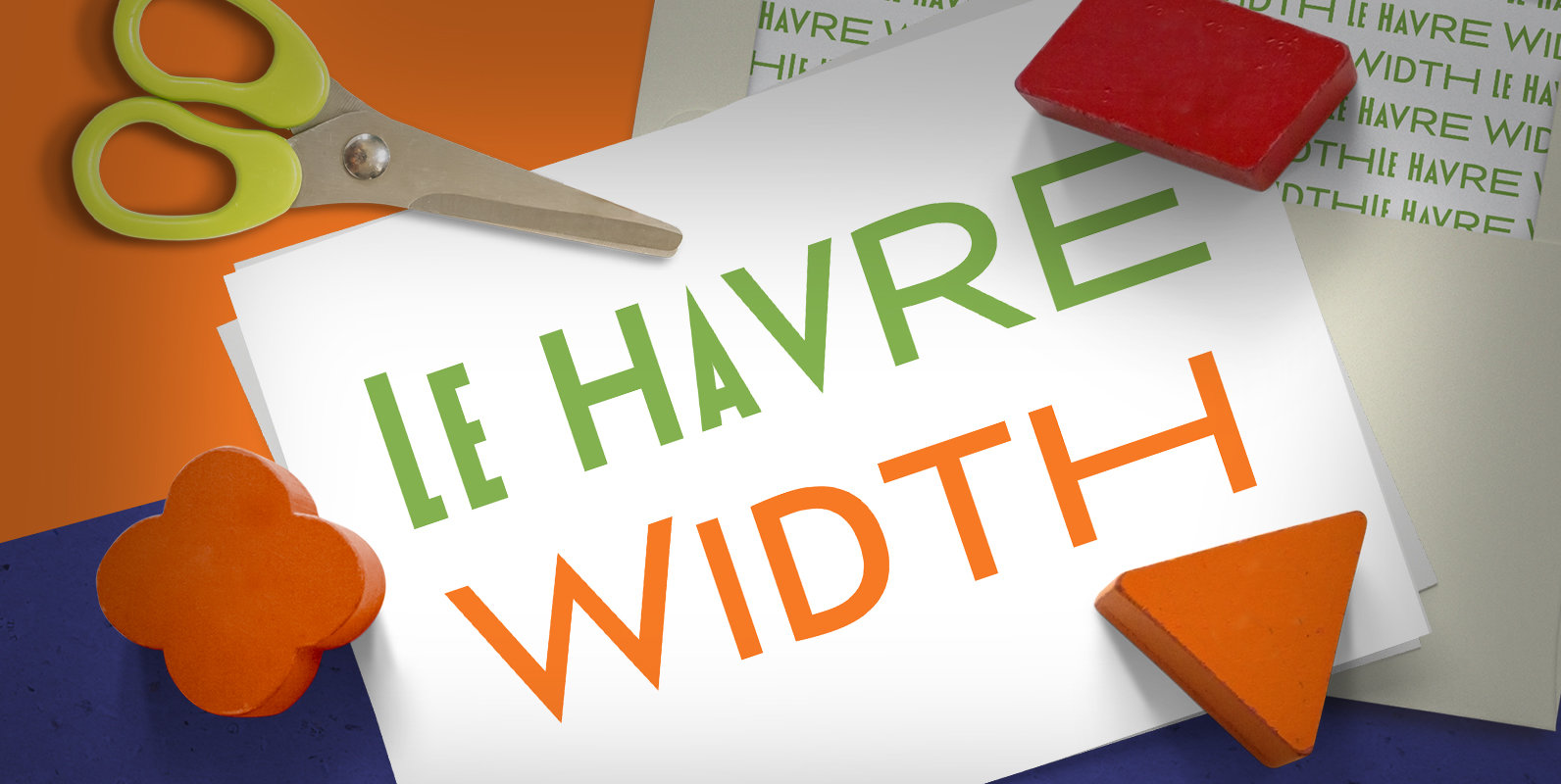
Le Havre Width Font
Le Havre Width is the loveable putty of fonts. Stretch it. Squish it. Squeeze it. Whichever way you play with it, you’re bound to find hours of fun ahead. This avant-garde typeface family has six distinct weights–each one including a
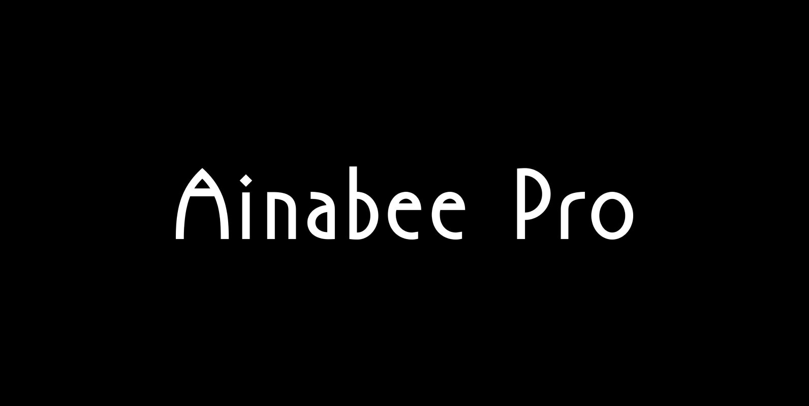
P22 Ainabee Pro Font
P22 Ainabee is an Art Deco inspired type design. The designer states: “The Art deco period has always fascinated me. The Architecture, The Furniture, The Car Industry, Letters etc, much of what I associate with 20s and 30s. This design
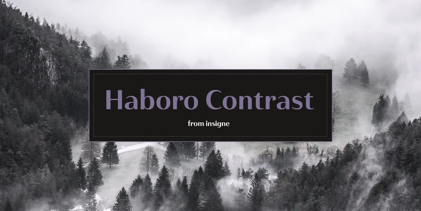
Haboro Contrast Font
Meet Haboro Contrast, the stylish little sister of the Haboro hyperfamily. While built from the same clean, geometric shapes of Haboro Sans, this new addition has been rebalanced for elegant performance with her high-contrast sans letterforms and has been adjusted
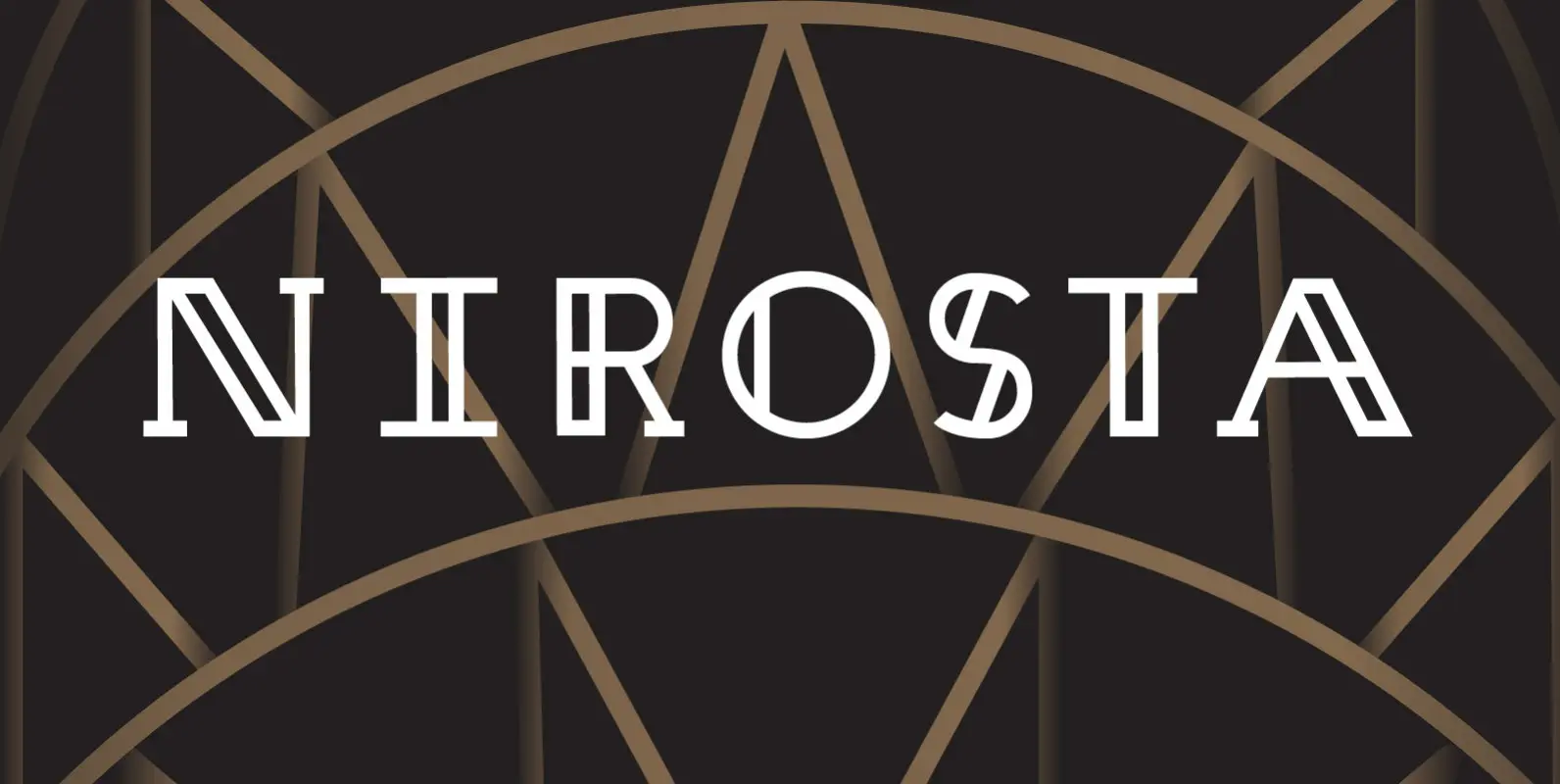
Nirosta Font
Space and light and order. Those are the things that men need just as much as they need bread or a place to sleep. —Le Corbusier Nirosta is a display face inspired by the art deco era and named for
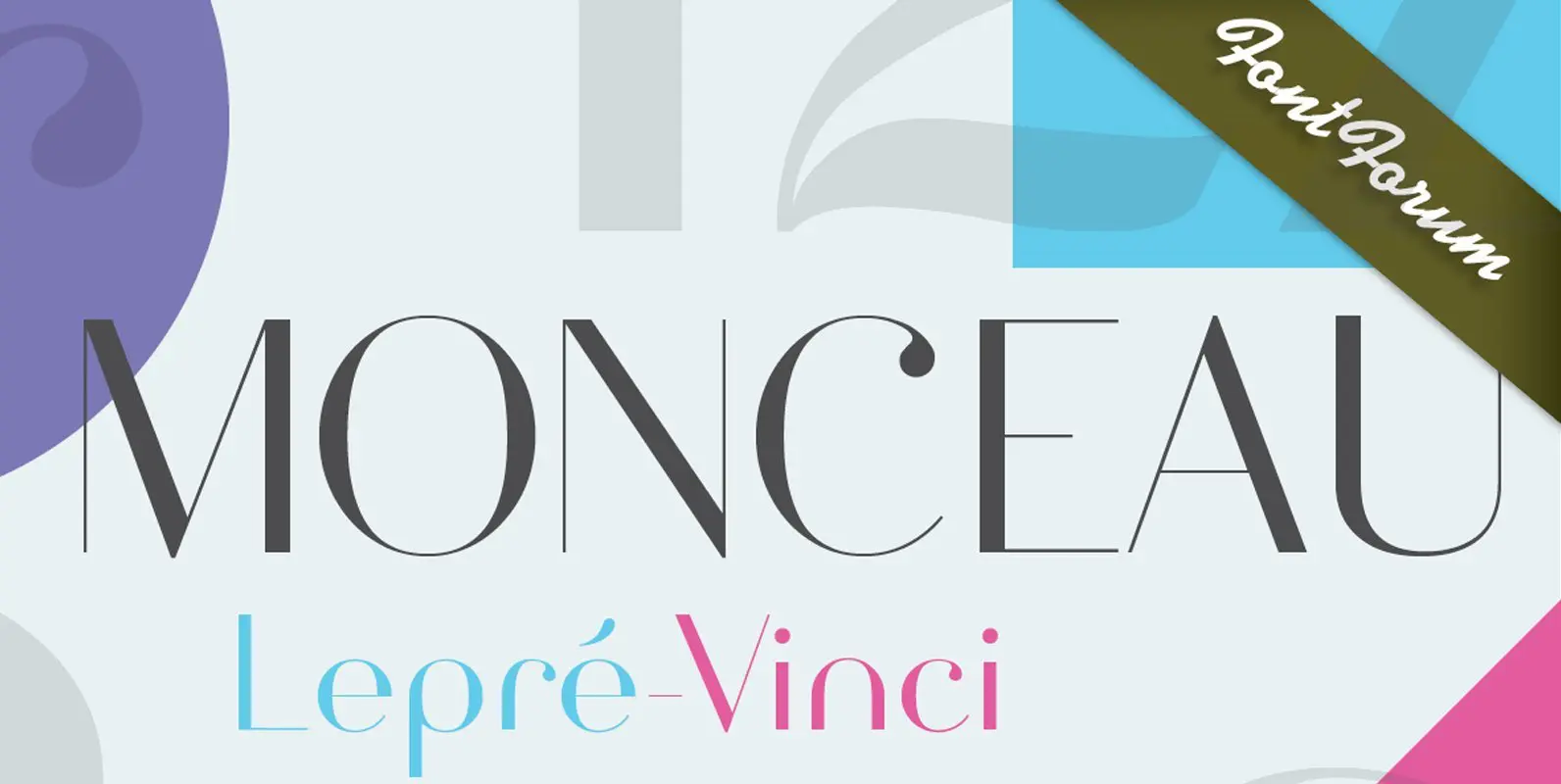
Monceau Font
As a successor of Didots famous font, which marked the beginning of modern typography, the Monceau has inherited the spirit, elegance and sophistication of french style, although in a revamped design, typical for the first years of the 21st century.
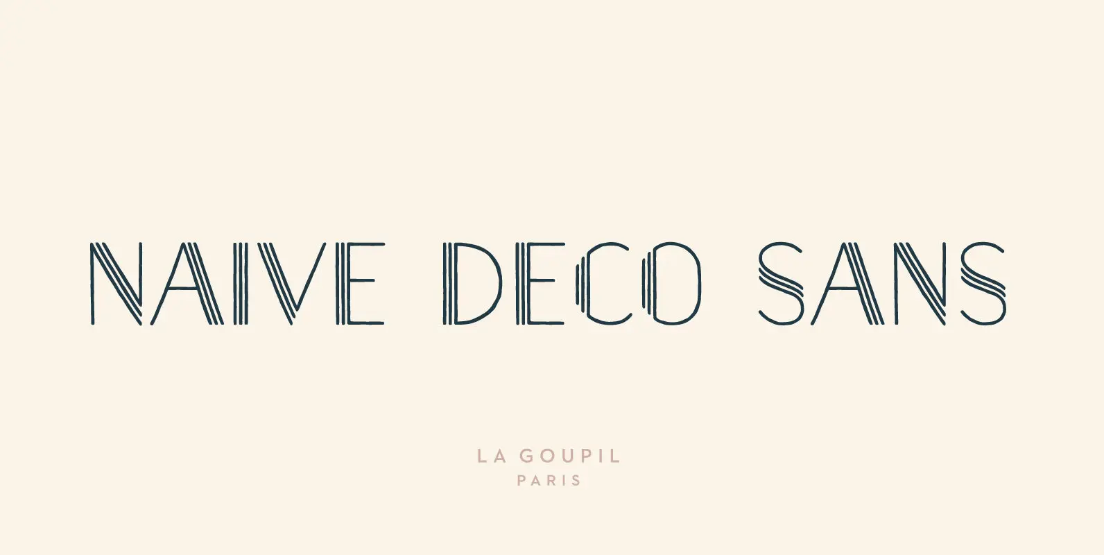
Naive Deco Sans Font
Naïve Deco Sans is a layered sans serif handwritten font designed by Fanny Coulez and Julien Saurin in Paris. Our goal was to draw a font with finely irregular lines that give a human and whimsical feeling. It is available
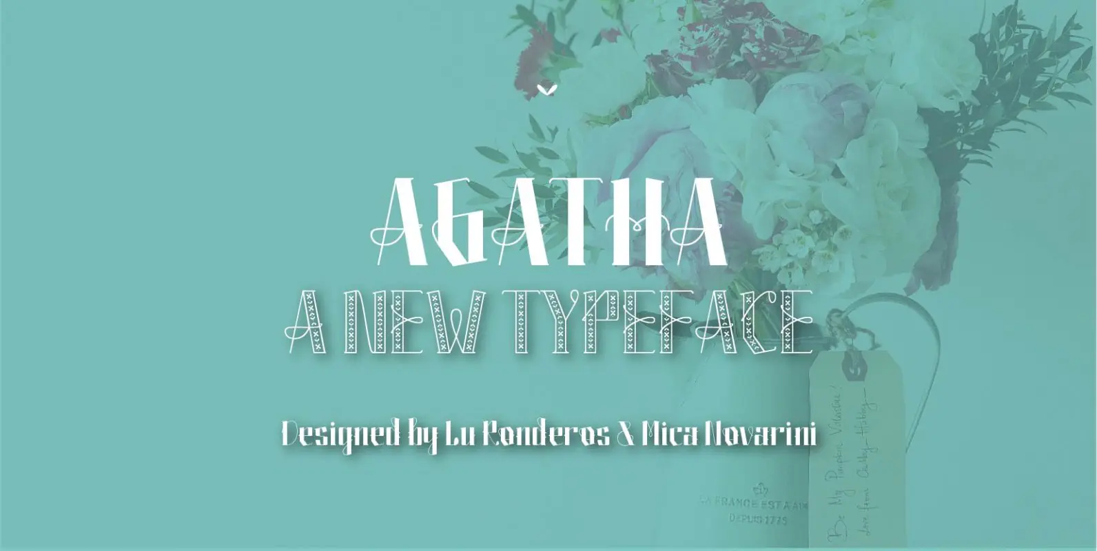
Agatha Font
Agatha is a new typeface for titles and short texts in big sizes. It can be use both in editorial publishing and brand design. From gothic geometric bases, the letters resemble the Nordic style in order to be more feminine,
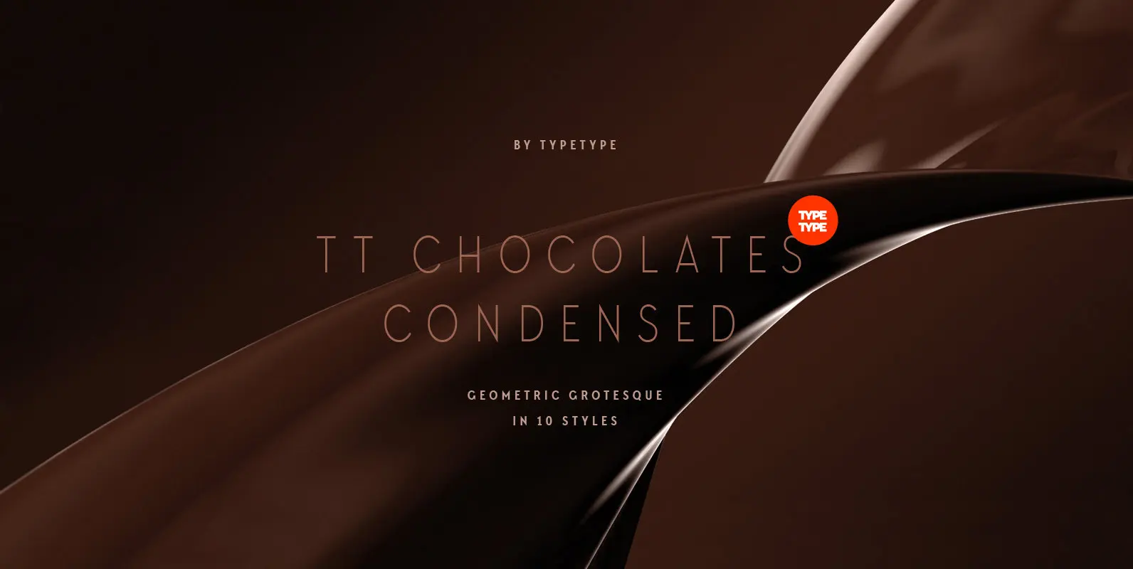
TT Chocolates Condensed Font
Have you heard the expression, 'you can never have too much chocolate'? We completely agree with this point of view and are gladly presenting you the TT Chocolates Condensed fontfamily, the narrow version of your favorite TT Chocolates. Keeping its
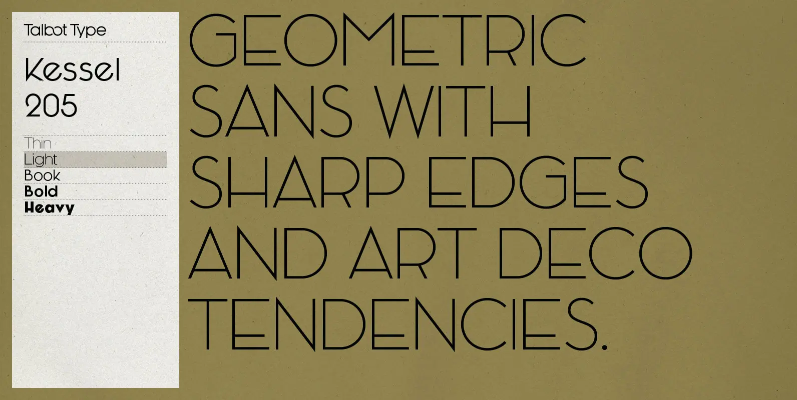
Kessel 205 Font
Kessel 205 is inspired by the classic, geometric sans-serifs such as Futura, but has shallower ascenders and descenders for a more compact look, and features an art deco influence with sharp points at the apex of many characters, lowered crossbars

Astaire Font
This is a deco-style text OpenType Pro font loosely based on Koch’s Locarno as seen in KochAltschrift a recent free German tribute to Koch’s work. I was familiar with Meek’s Letraset presstype version called Locarno, but I never liked the
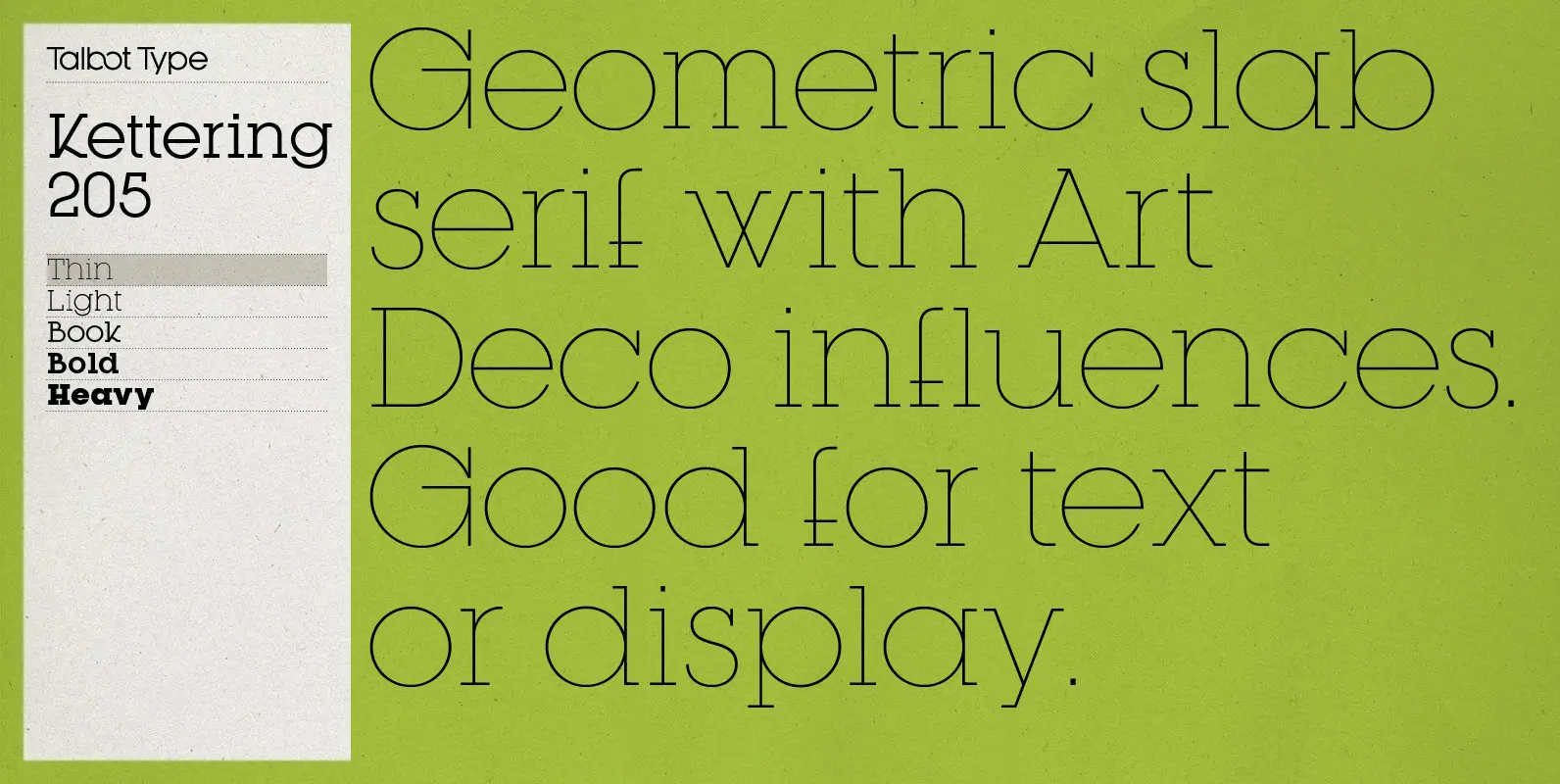
Kettering 205 Font
Kettering 205 is inspired by the classic, geometric slab-serifs such as Lubalin, but has shallower ascenders and descenders for a more compact look, and features art deco influenced, lowered crossbars and an oblique crossbar on the lower case e. It’s
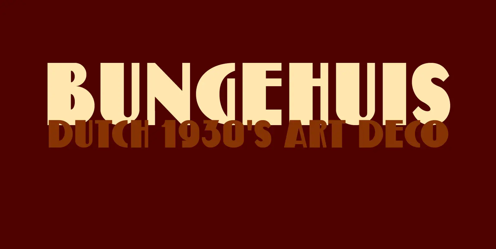
Bungehuis Font
Bungehuis font was modeled on the lettering found on an Amsterdam art deco building from 1931. This building on the Spuistraat, also called ‘Het Bungehuis’, used to house offices, but is now part of the University of Amsterdam. In 2015
